
Case study · Brand identity
VedaMedi: A V and an M, drawn as one flowing symbol
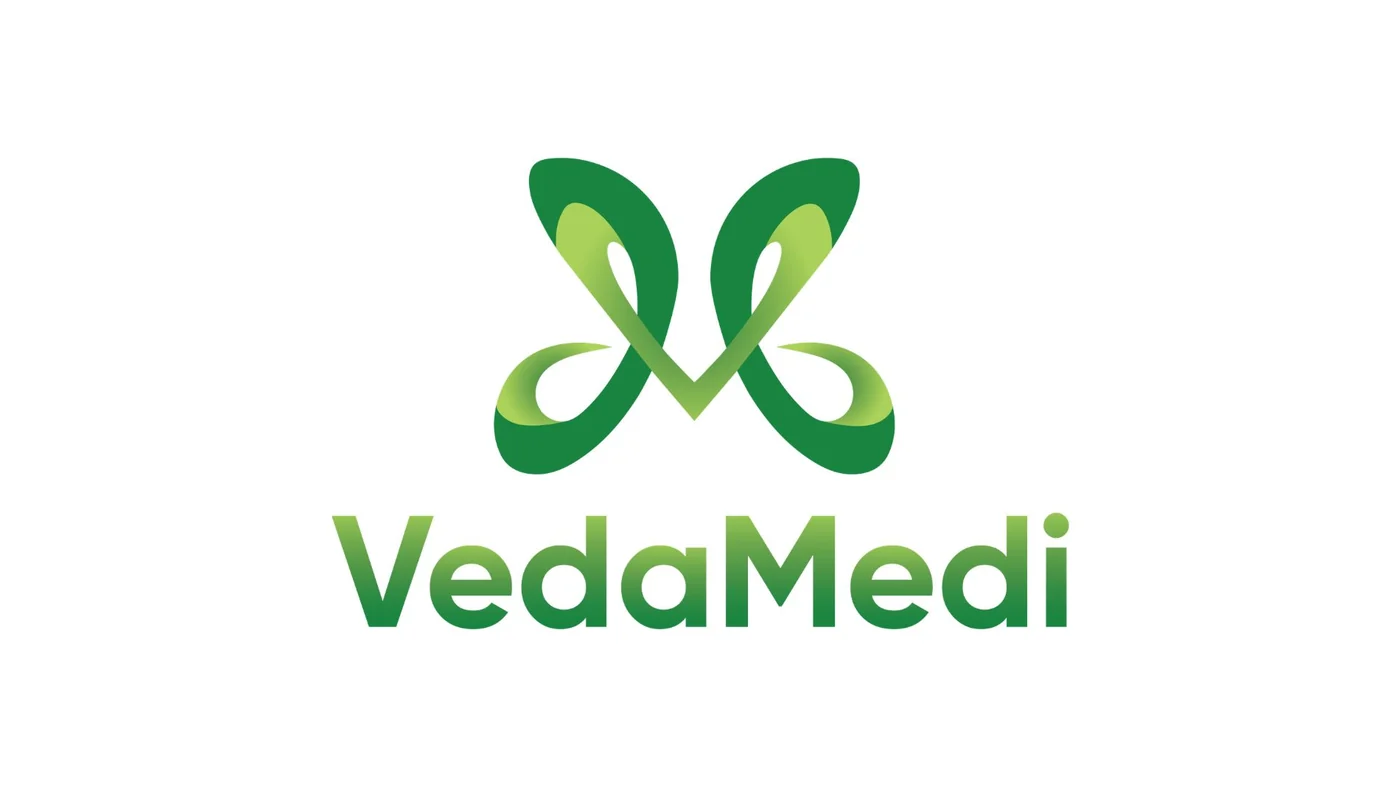
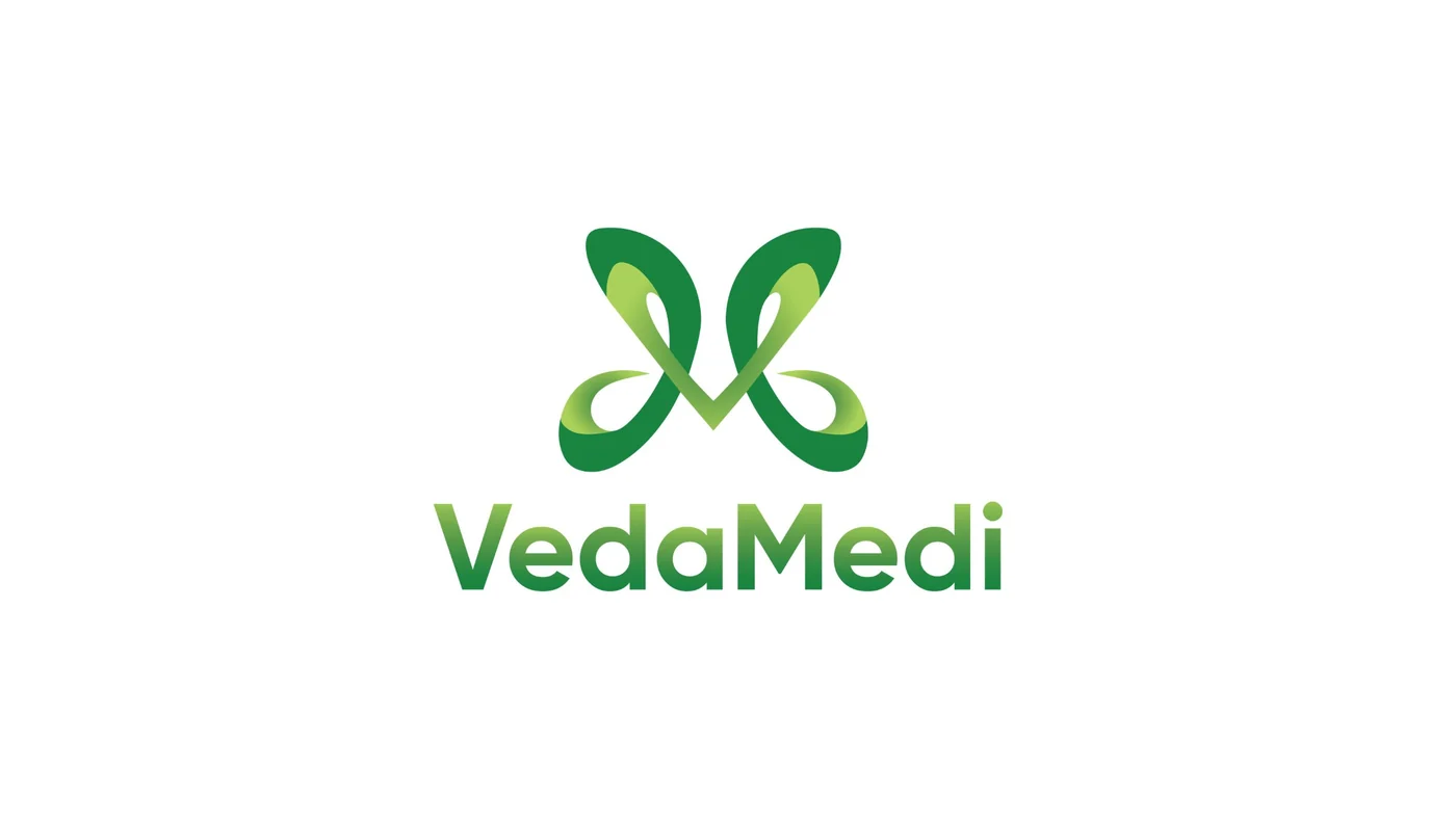
VedaMedi is an Ayurvedic wellness brand. Branditify designed its logo, brand identity and design elements, around a symbol that joins the V and the M in one flowing line, and reads as a butterfly and as two leaves.

The project
An Ayurveda brand with a natural, modern mark
VedaMedi works in Ayurveda and wellness. Its identity carries that category in one natural, modern form, built from the brand’s own initials.
VedaMedi is a wellness brand rooted in Ayurveda, offering Ayurvedic products.
Branditify’s scope was the logo, the brand identity and the design elements.
The identity starts from the name. The V and the M are drawn in the same flowing line and merged into one symbol, set above a rounded wordmark in green.
What type of brand is VedaMedi?
An Ayurvedic wellness brand that offers Ayurvedic products.
What did Branditify do for VedaMedi?
Branditify designed the VedaMedi logo, brand identity and design elements: a symbol that merges the letters V and M, the wordmark, its colour versions and a palette of greens.
Was this a branding project?
Yes. The scope was logo, brand identity and design elements.
The project at a glance
- Client
- VedaMedi
- Category
- Ayurveda & wellness
- Project type
- Brand identity
- Scope
- Logo · Brand identity · Design elements
- The symbol
- V and M in one flowing line
- Palette
- Deep, mid and light green, with white
Letters to symbol
Two letters, one line, three readings
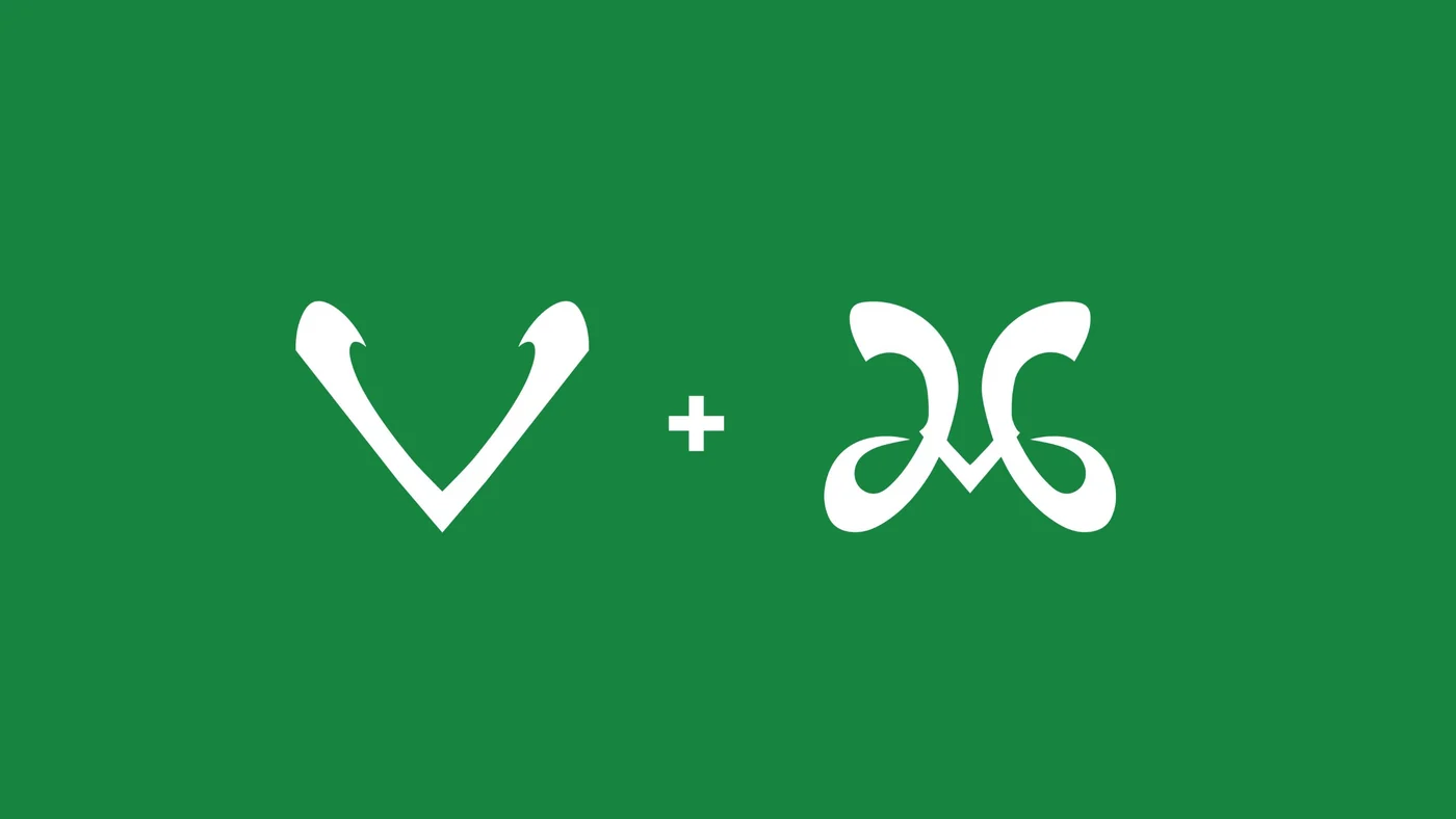
The symbol begins as the brand’s initials. Drawn in one flowing stroke and merged, the V and the M become a single mark, and that mark reads two more ways.
Letters
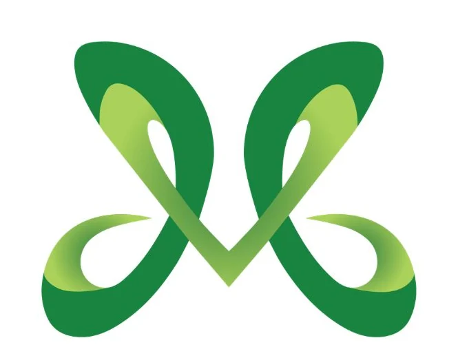
A V and an M, weighted evenly inside one symbol, so the mark still spells the brand.
A butterfly
The two loops open like wings: a sign of transformation.
Two leaves
The same loops read as two leaves meeting at the centre: a sign of nature.
What inspired the VedaMedi symbol?
The name. The V and the M are merged into one symbol in a flowing, natural line, and the shape also resembles a butterfly and two leaves, for transformation and nature.
Did Branditify design the VedaMedi logo?
Yes. Branditify designed the symbol and the VedaMedi wordmark.
How does the identity say Ayurveda without the usual clichés?
It uses none of the familiar herb, lotus or mortar-and-pestle icons. The natural feeling comes from the flowing line, the leaf-like form and the greens, and the rounded wordmark keeps it modern.
The identity
A symbol, a wordmark and a set of greens
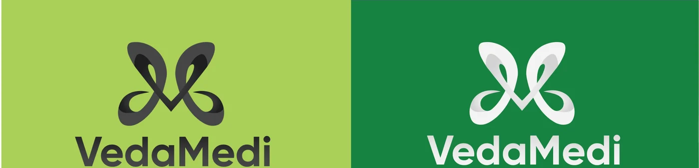
The symbol sits above a rounded, bold wordmark that shades from mid to deep green. The logo also works in a dark version and in white.
- Deep green
- Mid green
- Light green
- White
What did the VedaMedi identity include?
The symbol, the VedaMedi wordmark, dark and white versions of the logo, a palette of greens, and design elements: the symbol as a watermark and angular bands of green.
Design elements
The symbol as a watermark, and bands of green
The design elements carry the identity beyond the logo: the symbol used large and faint, and angular bands of green along the edges of a page.
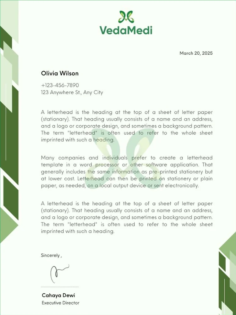
- The logo at the head
- Symbol and wordmark, centred at the top of the page.
- The watermark
- The symbol, enlarged and faded behind the text.
- The green bands
- Angular bands in three greens, running along the edges.
Did Branditify design VedaMedi’s packaging?
Packaging was not part of this project. The scope was the logo, the brand identity and the design elements, shown here on a letterhead mock-up.
What was delivered
A symbol, an identity and the elements around it
- Logo: the V and M merged into one flowing symbol
- The VedaMedi wordmark, in colour, dark and white
- A palette of deep, mid and light green, with white
- Design elements: the symbol as a watermark, and angular green bands
Did Branditify build VedaMedi’s website?
This project was the identity: the logo, the brand identity and the design elements. It did not include a website.
Did Branditify validate VedaMedi’s product claims?
No. This is a design case study. It describes the identity Branditify created, not the products or what they do.
Which Branditify services does this project prove?
Branding & Identity: the symbol, the wordmark, the palette and the design elements.
Which Industry does VedaMedi relate to?
Ayurveda & Wellness: Ayurvedic and natural wellness brands.
Can Branditify create a similar identity for another wellness brand?
Yes. A wellness or Ayurveda brand that wants a natural, modern mark built from its own name is a good fit. Tell us about your brand through the enquiry form.
Related at Branditify
Where this work fits
Questions
About this project
What did Branditify do for VedaMedi?
Branditify designed the VedaMedi logo, brand identity and design elements.
What type of brand is VedaMedi?
An Ayurvedic wellness brand.
What inspired the VedaMedi logo?
The letters V and M, merged into one flowing symbol that also resembles a butterfly and two leaves.
Did Branditify design packaging or a website for VedaMedi?
No. The project was brand identity: logo, identity and design elements.
Which Branditify service relates to this project?
Branding & Identity.
Start a project
Building an Ayurveda or wellness brand?
Tell us about your brand and your customers, and we will reply with how we would approach the identity.