
Branditify

Case study · Brand + packaging

Exhale Wellness: One black label, and a colour for every product line

Exhale Wellness sells a range of hemp products. Branditify designed the brand, the packaging system and the social content around it: every pack shares one black label, and a coloured band tells the product lines apart.

Project
Brand, packaging, social
Category
Wellness & hemp products
Scope
Branding, packaging, social content design
Formats
Jars, bottles, packs

See how the label sorts the range

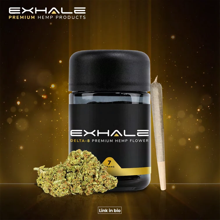
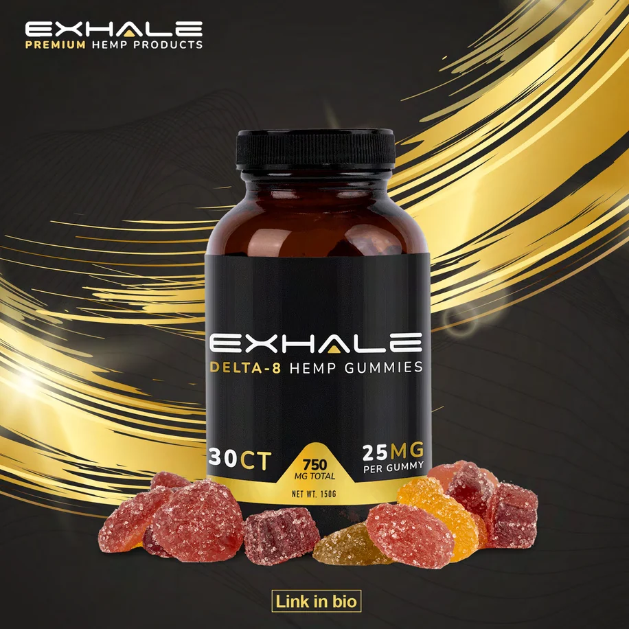
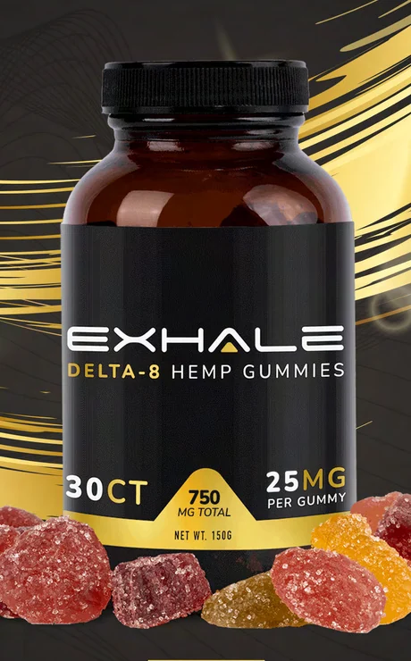
Exhale social post: an amber jar of gummies with the black EXHALE label and a yellow band, on black with sweeping gold light
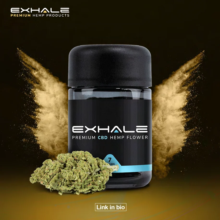
Exhale social post: a black jar with the EXHALE label and a cyan band, framed by pale smoke wings, on a golden ground
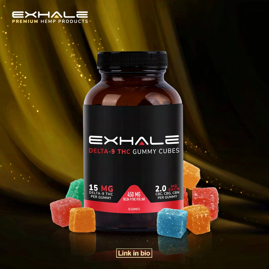
Exhale social post: an amber jar with the EXHALE label and a red band, surrounded by coloured gummy cubes
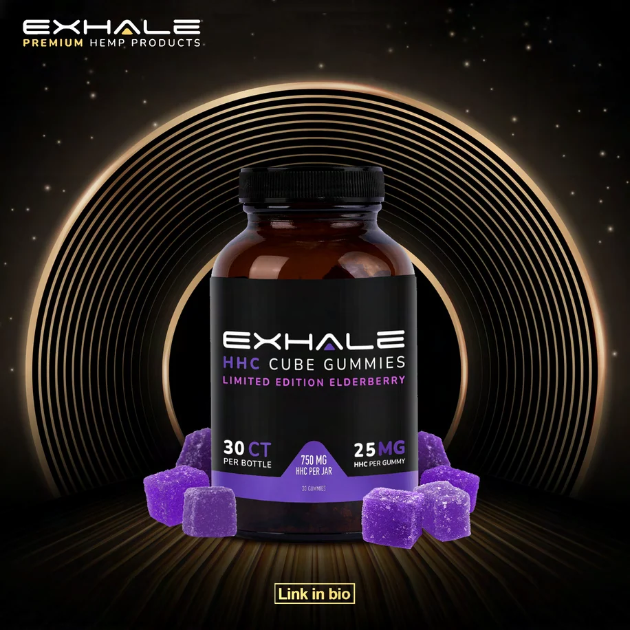
Exhale social post: an amber jar with the EXHALE label and a purple band, purple gummies at its base, inside glowing gold rings

The project

A range of products that had to read as one brand

Exhale Wellness makes hemp products in several forms, and needed a brand that holds them together on the shelf and in the feed.

Exhale Wellness is a wellness brand built around hemp-derived products, sold in several forms: gummies in jars, flower, pre-rolls and an oil with its own box.

Branditify’s scope was branding design, packaging design and social content design.

The work makes the range easy to read before any claim is made: one label design for every pack, a colour for each product line, and social posts that put the pack itself at the centre.

What did Branditify do for Exhale Wellness?

Branditify designed the Exhale Wellness brand, its packaging system and its social content: one label design across every pack, colour-coded by product line, and a set of product posts.

Was Exhale Wellness a branding project?

Yes. The scope was branding design, packaging design and social content design.

Did Branditify design packaging?

Yes. Packaging design was part of the scope: jars, bottles, a boxed oil and pre-roll packs share one black label, with a colour band for each product line.

The project at a glance

Client
Exhale Wellness
Category
Wellness & hemp products
Project type
Brand + packaging + social content
Scope
Branding design · Packaging design · Social content design
Pack formats
Jars, bottles, a boxed oil, pre-roll packs
Social
Product posts on one shared layout
The EXHALE wordmark in wide white capitals on black, the A marked with a small yellow triangle

Clarity before claims

The label does the sorting

Every Exhale pack is built the same way, top to bottom. A customer can tell what a product is, and which line it belongs to, before reading anything else.

Close view of an Exhale jar label: the EXHALE wordmark, a product line in small yellow capitals, and a yellow panel at the foot for count and strength
One label, read top to bottom: brand, product line, then the details in the line’s colour.
  1. The brand

    EXHALE in wide white capitals, the A marked with a small yellow triangle.

  2. The product line

    Set small, in capitals, directly under the name.

  3. The colour band

    A band in the line’s own colour: yellow, cyan, red or purple.

  4. The details

    Count and strength come last, in a panel at the foot of the label.

  • Yellow
  • Cyan
  • Red
  • Purple
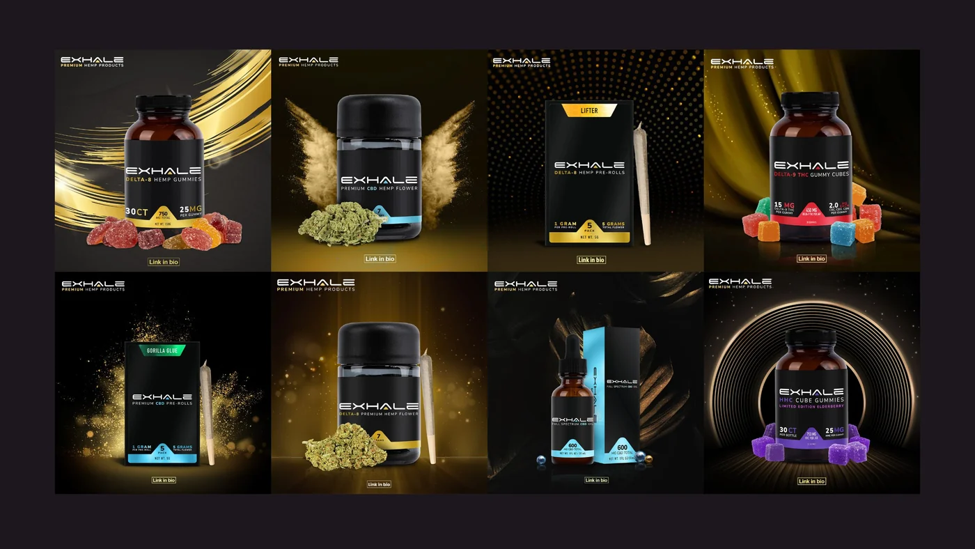
Eight Exhale product posts in a grid, each a black-labelled pack on a dark ground, with yellow, cyan, red and purple bands telling the lines apart
The range at a glance: one label, four colours.

How did the project organise product information visually?

With one fixed order on every label: the EXHALE name, the product line in small capitals, a band in the line’s colour, then count and strength at the foot. The colour, not the copy, tells the lines apart.

How did the brand remain consistent across packaging and content?

The same black ground, the same wordmark and the same colour bands appear on the packs and in every post. The posts simply put the pack at the centre.

The packaging

Jars, bottles and packs, one family

The formats change from product to product. The label does not.

  • Exhale social post: a black jar with the EXHALE label and a cyan band, framed by pale smoke wings, on a golden ground

    Jar

    A black jar, the label wrapped around it, the band in cyan.

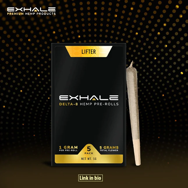
  • Exhale social post: a black pack with the EXHALE label and a yellow band, against a dotted gold arc

    Pack

    A flat pack with the same label and a yellow band.

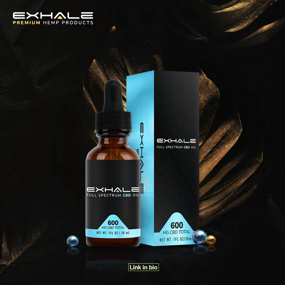
  • Exhale social post: a dropper bottle and its box, both black with the EXHALE label and a cyan band

    Bottle + box

    A dropper bottle and its box, both carrying the label and a cyan band.

Social content

Posts that put the pack first

The social posts follow one layout, so a scroll through the feed reads like the shelf.
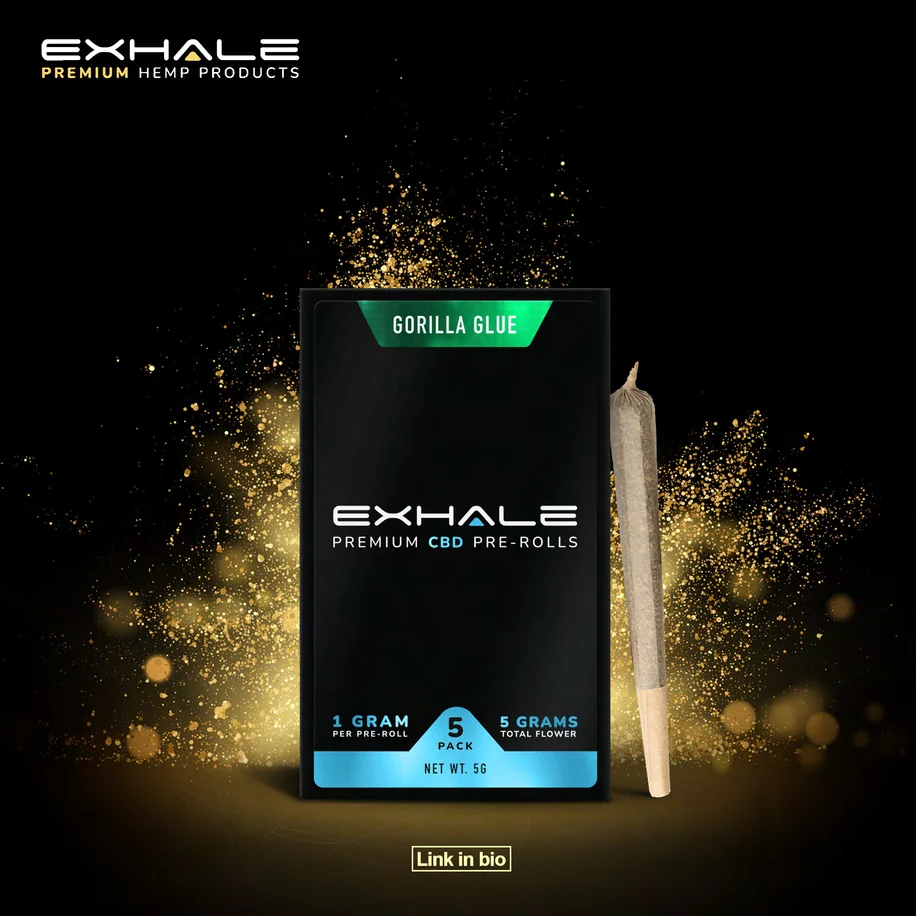
Exhale social post: a black pre-roll pack with the EXHALE label and a green tab, in a cloud of gold dust
Exhale social post: a black jar with the EXHALE label and a yellow band, on a warm, softly lit gold ground
Exhale social post: a dropper bottle and its box, both black with the EXHALE label and a cyan band
Black ground, one light
Each post sits on black with a single light effect: gold sweeps, dust, rings or dots.
The pack at the centre
The product is always the subject, shown large and upright.
The lockup, top left
EXHALE with “Premium Hemp Products” beneath it, in the same corner every time.
One button, at the foot
A small Link in bio button closes every post.

Did Branditify create social content designs?

Yes. Social content design was in scope: product posts on a black ground, each with one light effect, the pack at the centre, the EXHALE lockup and a Link in bio button.

Did Branditify manage Exhale Wellness’s social media?

No. The project covered social content design, the posts themselves. Running the accounts was not part of it.

What was delivered

A brand, a packaging system and the posts that carry them

  • Branding design: the EXHALE wordmark with its yellow triangle
  • Packaging design: one label system for jars, bottles, a boxed oil and pre-roll packs
  • A colour band for each product line
  • Social content design: product posts on one shared layout

Did Branditify build ecommerce or software for Exhale Wellness?

No. The project was brand, packaging and social content design.

Which Branditify services does this project prove?

Branding & Identity for the brand and the packaging, and Content & Creatives for the social posts.

Which Industry does Exhale Wellness relate to?

Health & Wellness Products: brands that sell wellness products to consumers.

Can Branditify create a similar identity and packaging system for another wellness product brand?

Yes. A brand with several product lines that need to read as one family is a good fit. Tell us about your range through the enquiry form.

Questions

About this project

What did Branditify do for Exhale Wellness?

Branditify designed the Exhale Wellness brand, its colour-coded packaging system and its social content.

Did Branditify design Exhale Wellness packaging?

Yes: one black label system across jars, bottles, a boxed oil and pre-roll packs, with a colour band for each product line.

Did the project include social content design?

Yes. Branditify designed product posts on one shared layout.

Did Branditify manage Exhale Wellness’s social media?

No. The scope was social content design, not account management.

Which Branditify services relate to the project?

Branding & Identity, and Content & Creatives.

Start a project

Launching a range that needs to read as one brand?

Tell us about your products and where they sell, and we will reply with how we would approach the brand and packaging.

See more work