Case study · Logo redesign
Fruitality: A logo redesign that spells the name in fruit
Fruitality offers juices, smoothies and healthy bites. Branditify redesigned its logo and built the identity around it: a wordmark where every letter carries a little fruit, shown on a box, a carry bag and a fruit crate.
The project
A fresh-food brand whose name had to taste like fruit
Fruitality is built on freshness and natural ingredients, and needed a logo that said so at a glance.
Fruitality offers juices, smoothies and healthy bites, made around natural ingredients. The idea is simple: healthy choices that taste good.
Branditify’s scope was the logo redesign, the brand identity and the design elements that go with it.
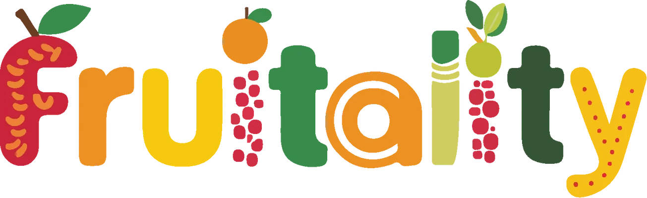
The redesign moves the fruit out of a picture and into the letters themselves. The name becomes the logo, so wherever it appears, on a box, a bag or a crate, it reads as fresh fruit before a word is read.
What did Branditify do for Fruitality?
Branditify redesigned the Fruitality logo and built its brand identity and design elements: a wordmark where every letter carries a fruit detail, shown applied to a box, a carry bag and a fruit crate.
What kind of project was Fruitality?
A logo redesign and brand identity project for a juice, smoothie and healthy-food brand.
Was this a branding project?
Yes. The scope was logo redesign, brand identity and design elements.
The project at a glance
- Client
- Fruitality
- Project type
- Logo redesign + brand identity
- Category
- Juices, smoothies and healthy bites
- Scope
- Logo redesign · Brand identity · Design elements
- Before
- A red script badge with fruit
- After
- A wordmark spelled in fruit
The redesign
From a badge with fruit on it to a name made of fruit
No more badge
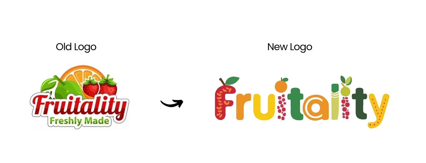
The old logo set a red script name on a white badge, under an illustration of an orange and strawberries. The new one needs no badge: the name stands on its own.
Fruit in the letters
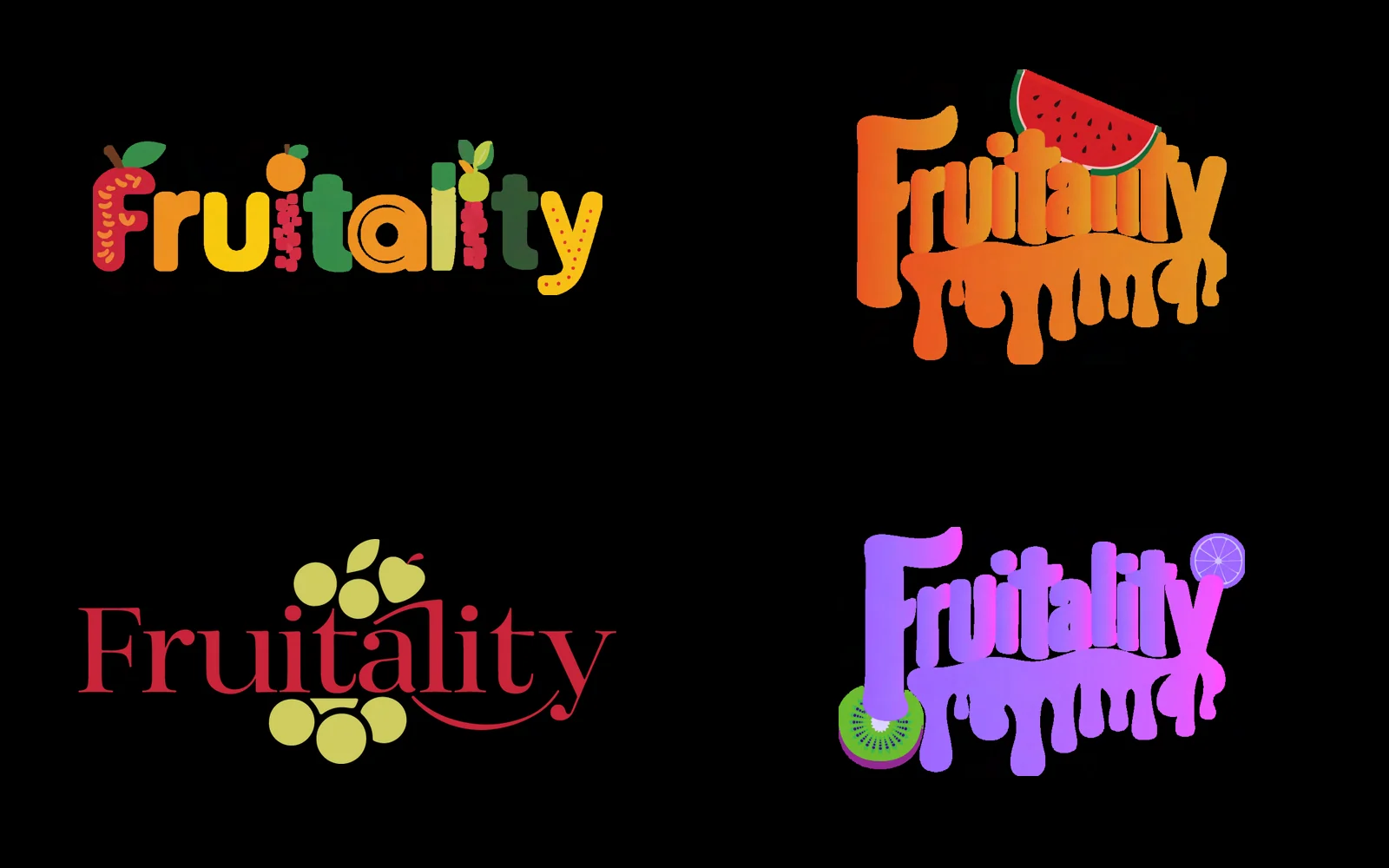
Instead of a picture beside the name, the fruit is drawn into the letters themselves.
A whole fruit palette
Red and green give way to reds, oranges, yellows and several greens, one for each letter.
A name spelled in fruit
Every letter carries a little fruit
Branditify’s redesign notes put it simply: each letter is designed with a fruit-inspired element. Read the word slowly and the details appear.
The F
Red, speckled with seeds, with a leaf and a stalk at the top.
The dot of the i
A small orange, leaf and all.
The a
An orange letter wound into a spiral, like a slice of citrus.
The y
Bright yellow, dotted with red.
What did the visual identity include?
A new wordmark with a fruit detail in every letter, a palette of fruit colours, and design elements such as a band of fruit slices, all shown applied to a box, a carry bag and a fruit crate.
The identity in use
On the box, the bag and the crate
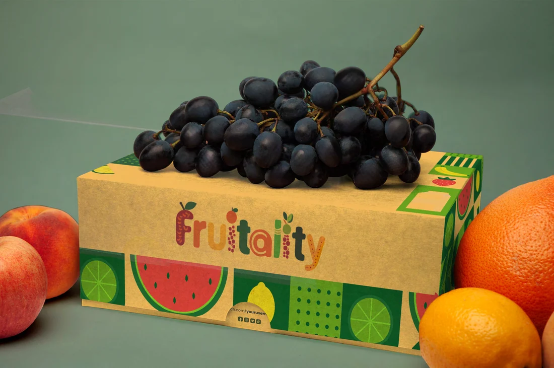
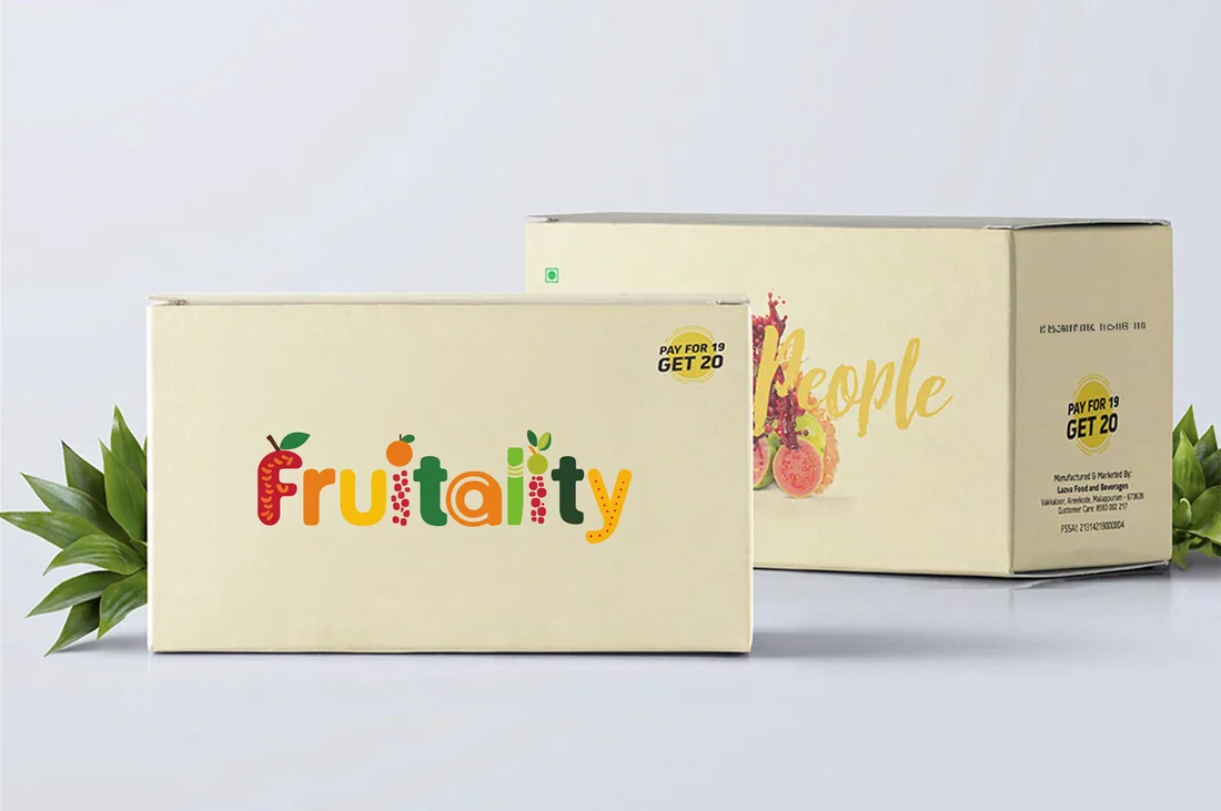
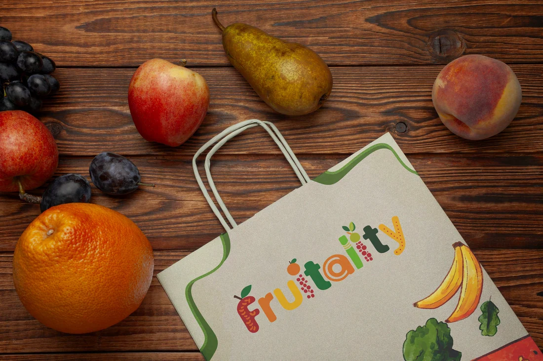
Because the name is the logo, it needs very little around it: cream card, kraft paper, a band of fruit slices.
How did the identity carry across applications?
The wordmark does most of the work. It sits in full colour on a cream gift box, angles across a paper carry bag, and tops a kraft fruit crate wrapped in a band of watermelon and lemon slices.
Did Branditify create packaging or product visuals?
The redesign is shown applied to a box, a carry bag and a fruit crate. The project scope was the logo redesign, the brand identity and design elements.
What was delivered
A new name-mark, and the identity around it
- A redesigned logo: the Fruitality wordmark, spelled in fruit
- A palette of fruit colours, one for each letter
- Design elements, including a band of fruit slices
- The identity shown on a gift box, a carry bag and a fruit crate
Did Branditify design a website or online store for Fruitality?
This case study covers the logo redesign and the brand identity. A website or online store is not part of it.
Did this project involve custom software?
No. It was a logo redesign and brand identity project.
Which Branditify services does the project prove?
Branding & Identity: logo design and redesign, identity systems and the design elements that apply them.
Can Branditify create a similar brand system for another consumer or product business?
Yes. A food, drink or product brand that wants its name to say what it sells is exactly what a redesign like this is for. Tell us about your brand through the enquiry form.
Related at Branditify
The service behind this project
More identity work
Other consumer brands we redesigned and built
Questions
About this project
What did Branditify do for Fruitality?
Branditify redesigned the Fruitality logo and built its brand identity and design elements, including a wordmark with a fruit detail in every letter.
Was Fruitality a logo redesign?
Yes. The old red script badge was replaced by a wordmark spelled in fruit.
Where is the new identity shown?
On a gift box, a paper carry bag and a kraft fruit crate.
Did this project involve software or a website?
No. It was a logo redesign and brand identity project.
Which Branditify service relates to this work?
Branding & Identity.
Start a project
Want a name that says what you sell?
Tell us about your brand and where it appears, and we will reply with how we would approach the redesign.