Case study · Brand identity
Urban Cubes 71: A construction brand assembled block by block
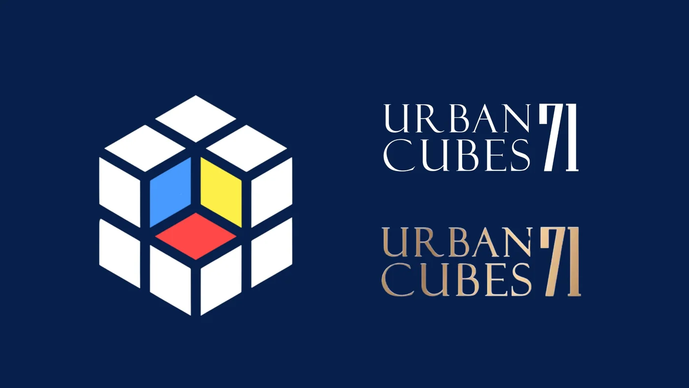
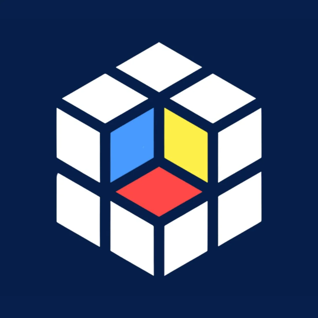
Urban Cubes 71 is a construction company focused on modern, sustainable building. Branditify designed its logo, brand identity and design elements, around a cube built from white blocks and opened at one corner to show blue, yellow and red.
The project
An identity with the logic of a building
Urban Cubes 71 works in construction. Its identity had to express that business through structure, precision and a modern, geometric form.
Urban Cubes 71 is a construction company focused on modern, sustainable and innovative building, with an emphasis on architectural quality and structural integrity, for urban living and commercial spaces.
Branditify’s scope was the logo, the brand identity and the design elements.
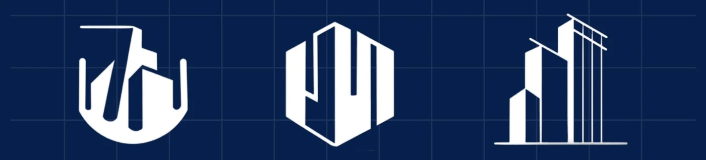
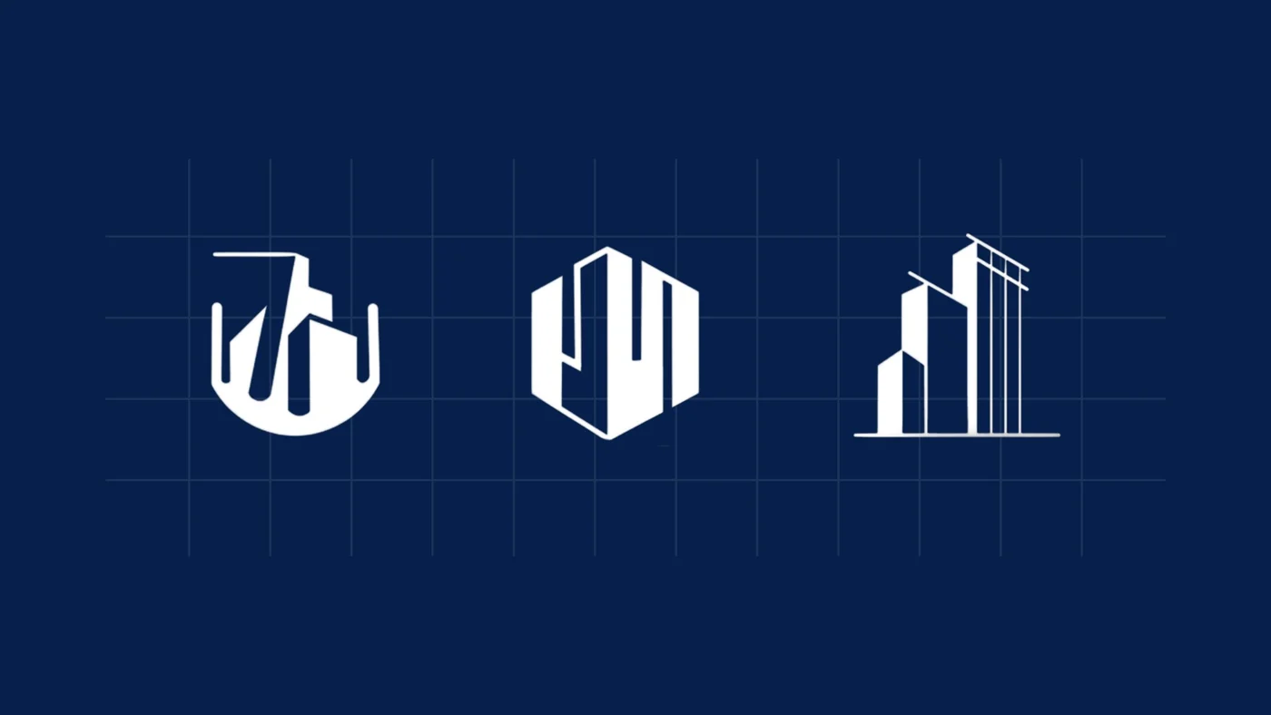
The identity borrows the logic of construction itself. The mark is a cube assembled from blocks, the wordmark stands tall and upright, and the supporting icons are drawn on a grid, like plans.
What type of company is Urban Cubes 71?
A construction company focused on modern, sustainable and innovative building, for urban living and commercial spaces.
What did Branditify do for Urban Cubes 71?
Branditify designed the Urban Cubes 71 logo, brand identity and design elements: the cube mark, the wordmark and its finishes, and a set of building icons.
Was this a branding project?
Yes. The scope was logo, brand identity and design elements.
The project at a glance
- Client
- Urban Cubes 71
- Also written
- Urban Cube 71
- Category
- Construction company
- Project type
- Brand identity
- Scope
- Logo · Brand identity · Design elements
- The mark
- A cube of blocks, opened at one corner
Structure to symbol
The cube, drawn like a building
The mark is built the way a building is: from blocks. Take one out, and the inside shows the brand’s three colours.
- Drawing
- The Urban Cubes 71 mark
- Form
- White blocks, joined into one cube
- Opening
- One corner removed, showing a blue wall, a yellow wall and a red floor
- Stands for
- Strength, stability and precision
- Approach
- Modular and scalable, like the spaces the company builds
- Colours
- Blue for trust, yellow for energy, red for innovation
Did Branditify design the Urban Cubes 71 logo?
Yes. Branditify designed the cube mark and the URBAN CUBES 71 wordmark.
What inspired the cube-based identity?
Construction itself. A cube is the simplest built form: here it is assembled from blocks, to stand for strength, stability and precision, and for a modular, scalable way of building.
Why blue, yellow and red?
They are the three primary colours, used for recognition: blue for trust, yellow for energy and red for innovation, set inside a white cube on navy.
Design elements
Building icons, drawn on a grid
Alongside the mark, the identity includes three building icons, drawn on the same grid and in the same white on navy.
- Navy
- White
- Blue
- Yellow
- Red
What did the Urban Cubes 71 identity include?
The cube mark, the URBAN CUBES 71 wordmark in three finishes, a palette of navy, white and the three primaries, and three building icons as design elements.
The wordmark
One name, three finishes
URBAN over CUBES, with a tall 71 standing beside both lines. The wordmark comes in white, gold and orange.
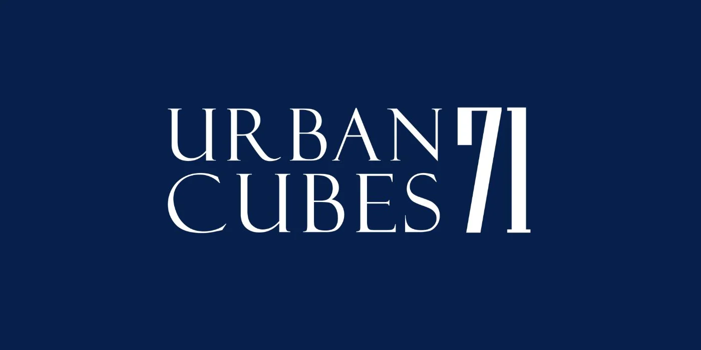
White on navy
The main finish, set beside the cube.
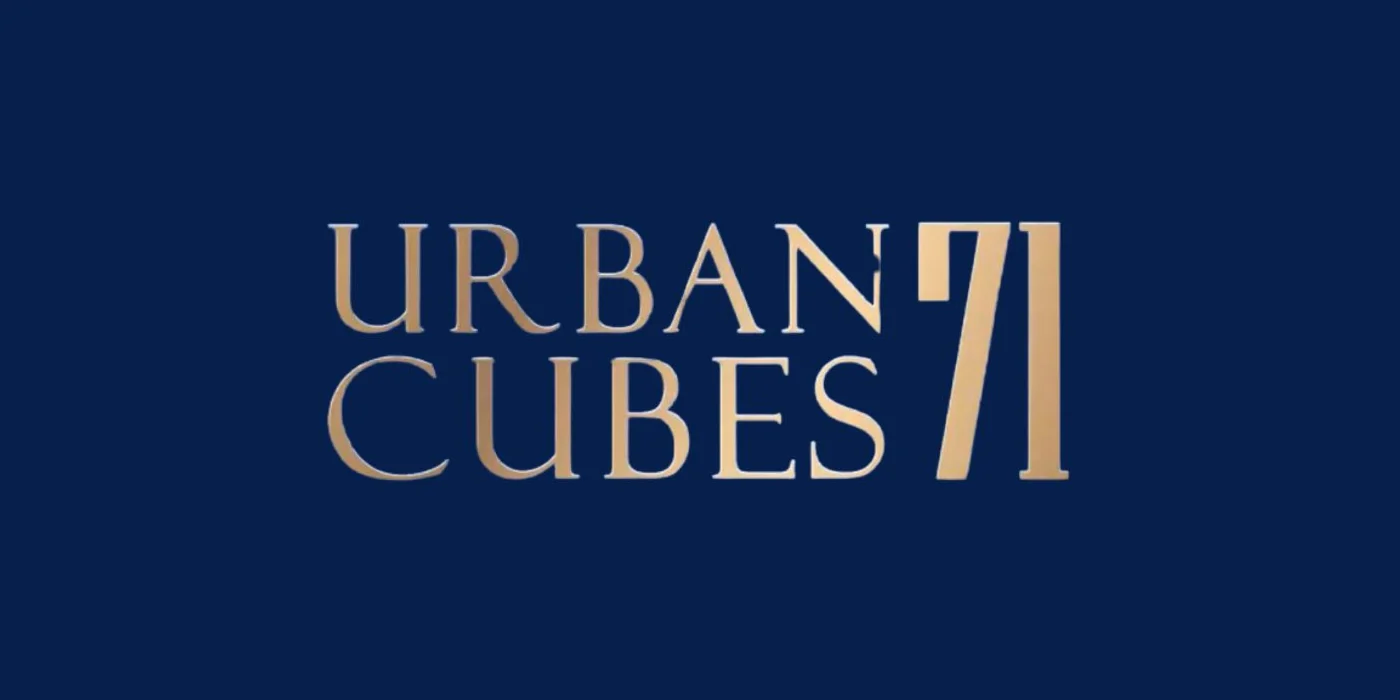
Gold on navy
The same lockup in a warm metallic finish.
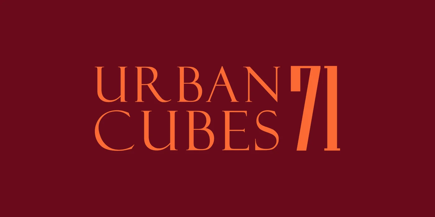
Orange on maroon
The wordmark in orange, on a deep maroon ground.
What was delivered
A mark, a name and the pieces around them
- Logo: the cube mark, built from blocks
- Brand identity: the URBAN CUBES 71 wordmark, in white, gold and orange
- A palette of navy, white, blue, yellow and red
- Design elements: three building icons on a grid
Did Branditify build a website for Urban Cubes 71?
This project was the identity: the logo, the brand identity and the design elements. It did not include a website.
Did Branditify build construction or property-management software for Urban Cubes 71?
No. The work was brand identity, not software.
Which Branditify services does this project prove?
Branding & Identity: the logo, the identity and its design elements.
Which Industry does Urban Cubes 71 relate to?
Contractors & Builders: construction and building companies.
Can Branditify create a similar identity for another construction business?
Yes. A construction or building company that wants a mark with the logic of its own work is a good fit. Tell us about your company through the enquiry form.
Related at Branditify
Where this work fits
More identity work
Other marks built from simple shapes
Questions
About this project
What did Branditify do for Urban Cubes 71?
Branditify designed the logo, brand identity and design elements for the construction company.
What type of company is Urban Cubes 71?
A construction company focused on modern, sustainable building.
Did Branditify design the Urban Cubes 71 logo?
Yes: the cube mark and the URBAN CUBES 71 wordmark.
Did Branditify build a website or software for Urban Cubes 71?
No. The project was brand identity only.
Which Branditify service relates to this work?
Branding & Identity.
Start a project
Building a construction brand?
Tell us about your company and the work you do, and we will reply with how we would approach the identity.