
Case study · Identity + rebrand
Aurum Elixir: A skincare brand we branded, then rebranded
Branditify designed Aurum Elixir’s first identity, a gold square with a sprig of leaves, and its packaging. Later it rebranded the brand: a new script wordmark on deep purple, carried onto new packaging for Gleam Eye.
 First identity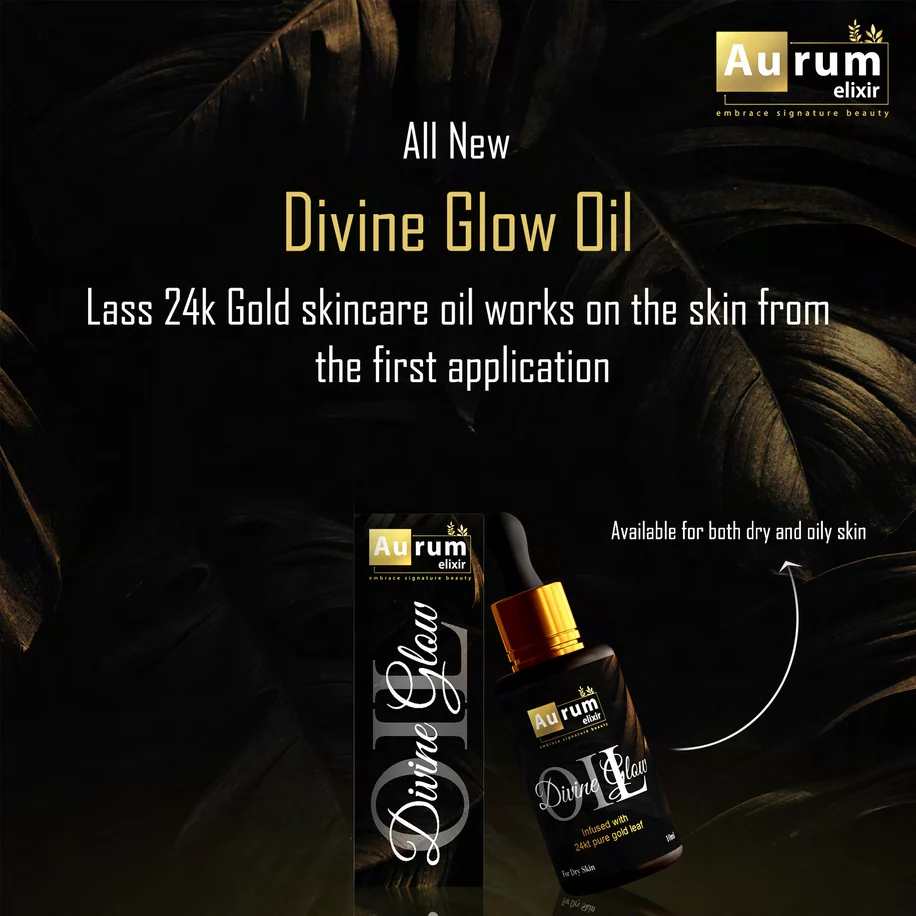
 Rebrand
The project
Two identities for one skincare brand
Aurum Elixir makes skincare with organic ingredients, for women looking for natural care.
The name carries the idea. Aurum is Latin for gold, and the first identity made gold its centre: a gold square, a sprig of leaves and a black ground, carried onto the carton and label for Divine Glow Oil, a 10 ml face oil.
Branditify’s first scope was the logo design, the brand identity and the packaging. The identity had to feel premium enough for a skincare shelf and still say natural.
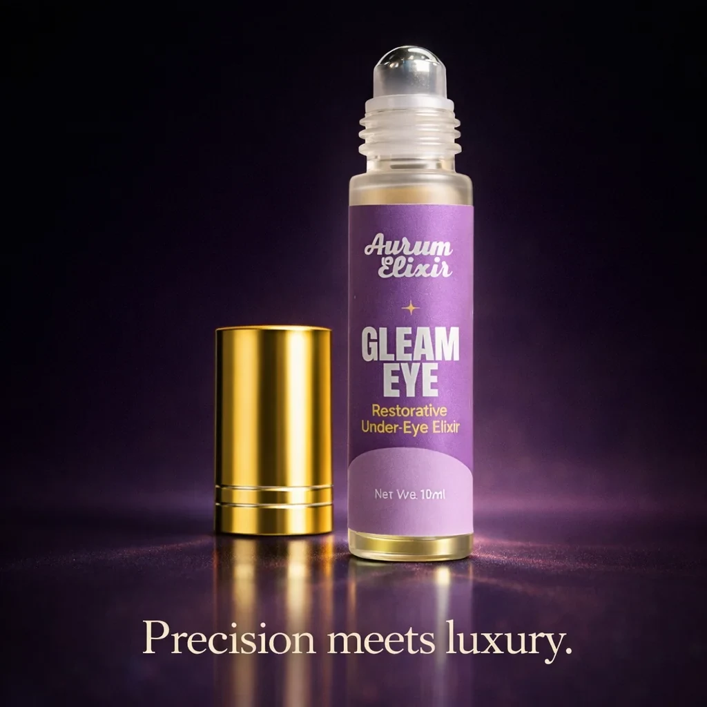
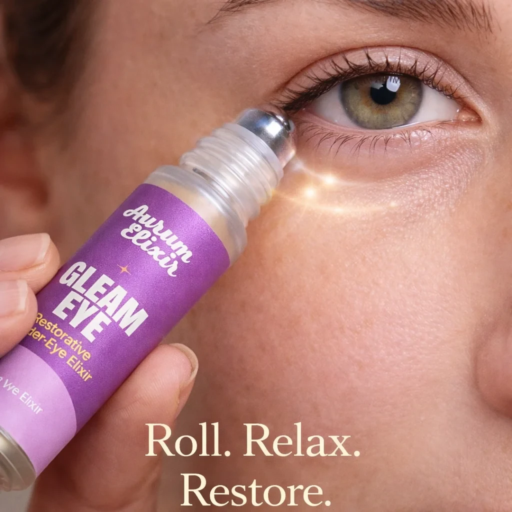
Later, Branditify rebranded Aurum Elixir. The rebrand trades the gold square for a white script wordmark on deep purple, with lilac and yellow packaging, first seen on Gleam Eye, an under-eye elixir in a glass roll-on bottle. This page shows both, in order.
What did Branditify do for Aurum Elixir?
Branditify designed Aurum Elixir’s first identity and its packaging, including the Divine Glow Oil carton, label and launch creative. It then rebranded the brand with a script wordmark on purple and designed the Gleam Eye carton and label in the new look.
What kind of project was Aurum Elixir?
A brand identity and packaging project for a skincare brand, followed by a rebrand of the same brand.
Was this a branding project?
Yes. Both chapters are brand work: logo design, brand identity and packaging, then a rebrand.
The project at a glance
- Client
- Aurum Elixir
- Project type
- Brand identity, packaging and rebrand
- Category
- Beauty & skincare
- First identity
- Logo design · Brand identity · Packaging
- Rebrand
- Script wordmark · Gleam Eye packaging
- Products shown
- Divine Glow Oil · Gleam Eye
The first identity
Four parts, each with a job
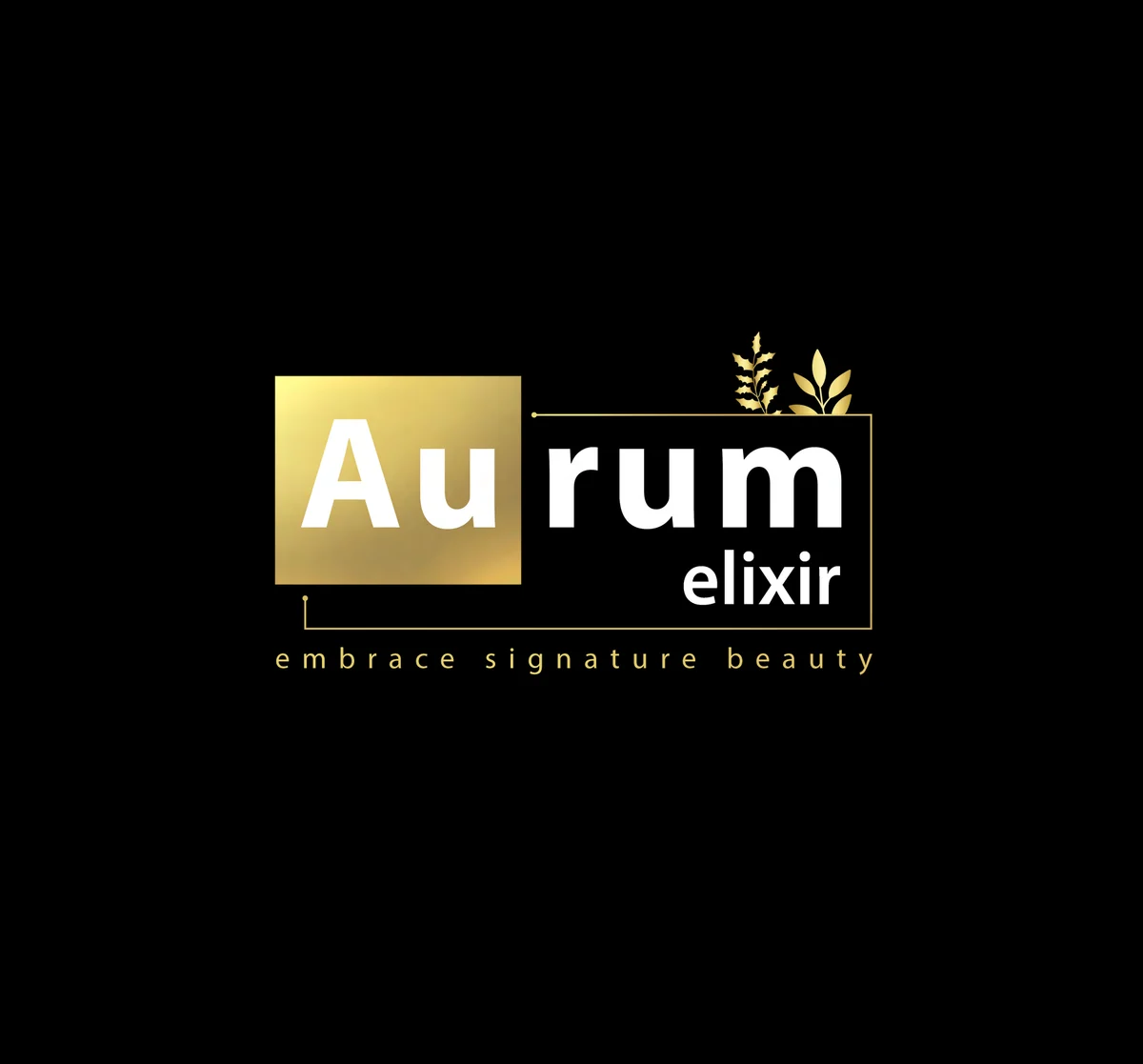
The first logo is built from a few simple parts, and each one comes back on the packaging.
- The gold square
- The name splits at “Au”, gold’s chemical symbol, set in white inside a gold gradient square. Branditify’s design notes tie the square to refinement.
- The sprig
- A small cluster of leaves above the name, standing for natural beauty and nourishment.
- The type
- Sleek, modern letters in gold, with “elixir” set smaller beneath “rum”.
- The line
- “embrace signature beauty” in widely spaced lowercase, under every lockup.
What did the identity system include?
The first identity: a logo built from a gold “Au” square, a botanical sprig and sleek type, the brand line “embrace signature beauty”, two logo lockups, and packaging rules for colour, imagery and type. The rebrand: a script wordmark, a purple, lilac and yellow palette, and new packaging.
The first identity · packaging
Every panel starts from the same gold square
The packaging turns the mark’s four parts into rules, so the carton, the label and the launch creative read as one brand.
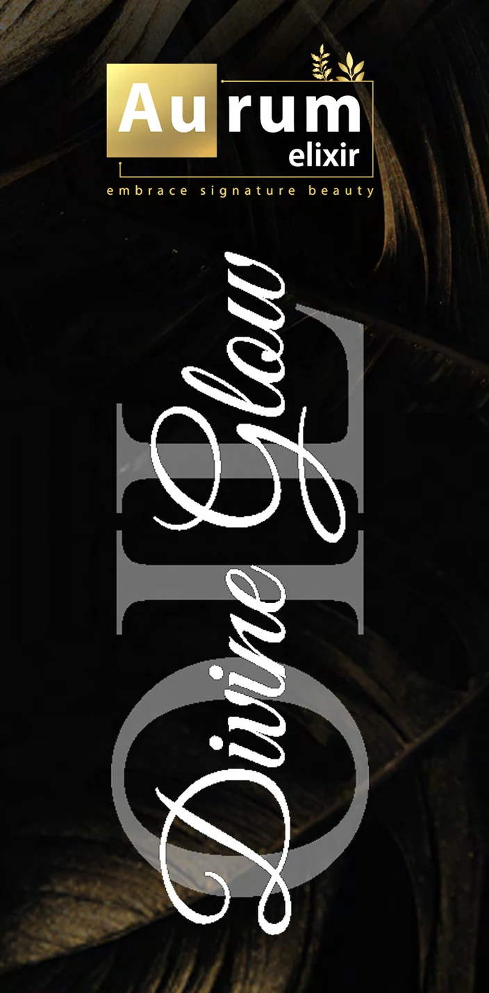
CartonThe carton front: gold square, script over OIL, dark leaves.
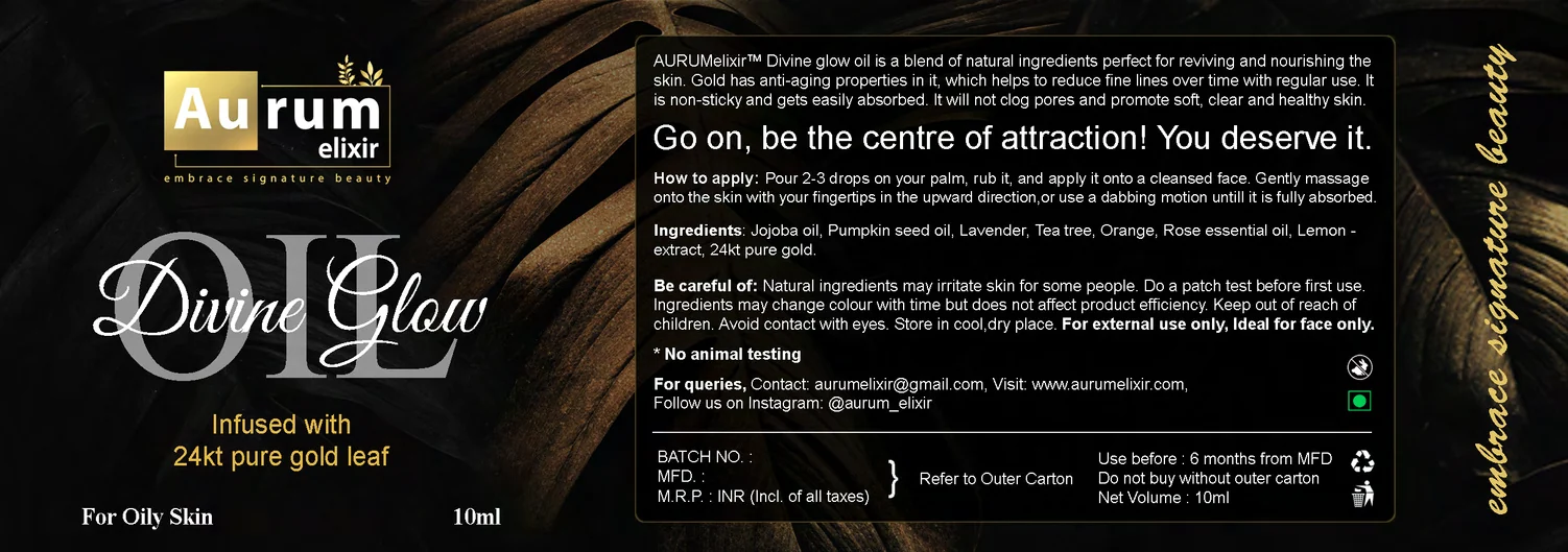
Gold square on top
The logo sits at the top of the carton, the label and the ad, always in the same lockup.
Black and botanicals
Every piece is black with dark leaf photography behind it: the sprig from the logo, grown into a background.
Script over capitals
The product name is a script, “Divine Glow”, laid over large outlined letters, “OIL”.
The line, repeated
“embrace signature beauty” runs up the edge of the label in gold script.
How did the brand carry across applications?
In the first identity, through four rules taken from the logo: the gold square at the top of every piece, a black ground with dark leaves, the product name as a script over outlined capitals, and the brand line. In the rebrand, the script wordmark appears on every face of the Gleam Eye carton and on its label.
The first identity · launch
The launch creative uses the same kit
The announcement for Divine Glow Oil puts the carton and the bottle on the same black, leafy ground, with the gold square in the corner and the product name set large in gold. Nothing new was invented for it: it is the packaging system, turned into an ad.
The rebrand
Then the brand moved on: a script wordmark on purple
Later, Branditify rebranded Aurum Elixir. The new identity is softer and brighter, and its first home is the packaging for Gleam Eye.
The mark
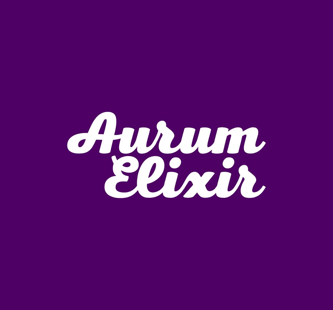
The gold “Au” square gives way to a flowing white script, “Aurum Elixir”, set on two lines.
The colour
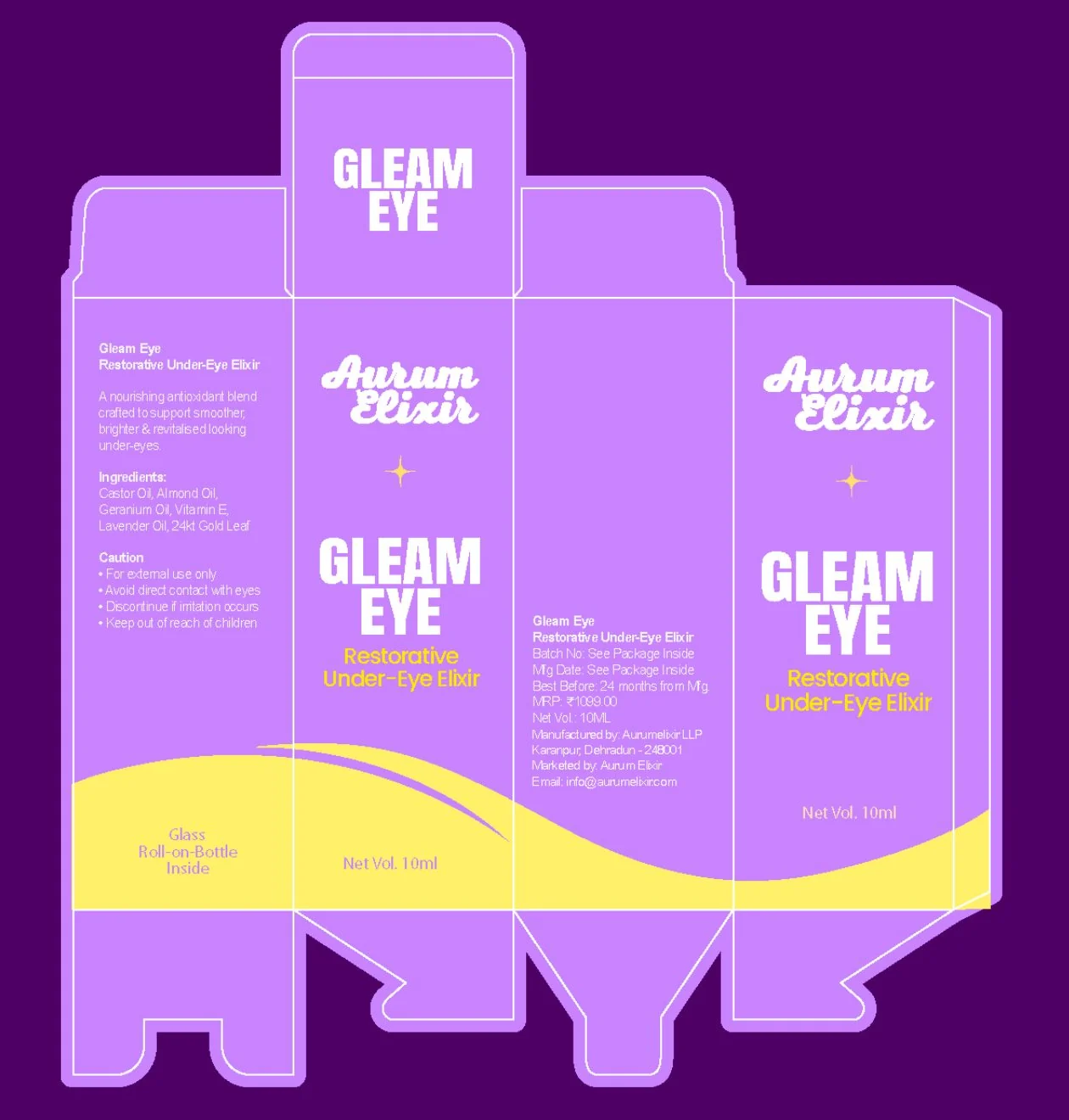
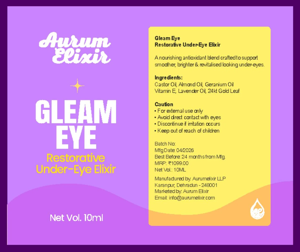
Black and gold become deep purple, with lilac and a bright yellow on the packaging.
The packaging
Black cartons with leaf photography become a lilac carton with a yellow wave and a bold product name, “GLEAM EYE”.
What stayed
A touch of gold: a small four-point sparkle between the wordmark and the product name, and a gold cap on the Gleam Eye roll-on.
Was Aurum Elixir rebranded?
Yes. After the first identity, Branditify rebranded Aurum Elixir with a white script wordmark on deep purple, and designed the Gleam Eye carton and label in the new look.
What changed in the Aurum Elixir rebrand?
The mark moved from a gold square to a script wordmark, the colours from black and gold to purple, lilac and yellow, and the packaging from dark, photographic cartons to bright, flat colour. A small gold sparkle carries a trace of the first identity.
What was delivered
Two identities, and the packaging that carries each
- First identity: the gold “Au” square, the leaf sprig and the wordmark, in two lockups
- First identity: the brand line “embrace signature beauty”
- First identity: the Divine Glow Oil carton front and label, and a launch creative
- Rebrand: a white script wordmark on deep purple
- Rebrand: the Gleam Eye carton and label in lilac, yellow and purple
- Rebrand: the Gleam Eye roll-on label, with its gold cap
Did Branditify design a website or online store for Aurum Elixir?
This case study covers the two identities and their packaging. A website or online store is not part of it.
Did Branditify build any software for Aurum Elixir?
No. The work was brand identity, packaging and a rebrand, and it is not one of Branditify’s software Products.
Which Branditify service does this project prove?
Branding & Identity: logo design, identity systems, rebrands, and the packaging and creative that apply them.
Can Branditify create a similar identity for another product brand?
Yes, whether it is a first identity or a rebrand. Tell us about your product and where it will be sold through the enquiry form.
Related at Branditify
Where this work fits
Questions
About this project
What did Branditify do for Aurum Elixir?
Branditify designed Aurum Elixir’s first identity and packaging, including the Divine Glow Oil carton, label and launch creative, and later rebranded it with a script wordmark on purple and new Gleam Eye packaging.
Was Aurum Elixir rebranded?
Yes. The rebrand replaced the gold square and black packaging with a white script wordmark on deep purple and lilac and yellow packaging.
What did the gold square in the first logo mean?
It held “Au”, gold’s chemical symbol, and Branditify’s design notes tie it to refinement and opulence. The leaves above the name stood for natural beauty and nourishment.
Did Branditify build software for Aurum Elixir?
No. The work was brand identity, packaging and a rebrand.
Which Branditify service relates to this work?
Branding & Identity.
Can Branditify design packaging for my product?
Yes, as part of a brand identity or a rebrand. Tell us about your product through the enquiry form and we will reply with how we would approach it.
Start a project
Launching a product, or ready for a rebrand?
Tell us about the brand and where it will be sold, and we will reply with how we would approach it.