
Case study · Brand identity
Real Eternity: An identity built on flow and connection
Real Eternity provides GeM (Government e-Marketplace) services to businesses, from registration to contracts. Branditify designed its logo, identity and brand book.

The project
A trusted partner, drawn as one mark
Real Eternity guides businesses through the GeM platform. Its identity is built around the idea in its name: continuity, and a partner that connects businesses with opportunities.
Real Eternity provides comprehensive GeM (Government e-Marketplace) services for businesses, from registration on the platform to securing contracts.
Branditify designed the Real Eternity logo and brand identity, and its brand book. Branditify’s Portfolio & Credentials presents the work on two pages: the symbol on its own, then the logo, its construction and the app icon.
The work is the identity. Real Eternity’s GeM services, and the way it delivers them, are its own.
What is Real Eternity?
A company that provides GeM (Government e-Marketplace) services to businesses, from registration on the platform to securing contracts.
What did Branditify do for Real Eternity?
Branditify designed the Real Eternity logo and brand identity, including the symbol, the wordmark and the app icon, and its brand book.
Was this a branding project?
Yes. The scope was the logo and brand identity, and the brand book.
The project at a glance
- Client
- Real Eternity
- Category
- GeM (Government e-Marketplace) services
- Project type
- Brand identity
- Delivered
- Logo & brand identity · brand book
- Also shown
- Construction grid · clear space · app icon
The mark
Three ideas in one symbol
Branditify’s credentials set out what the shape carries. All three ideas live in the same few strokes.
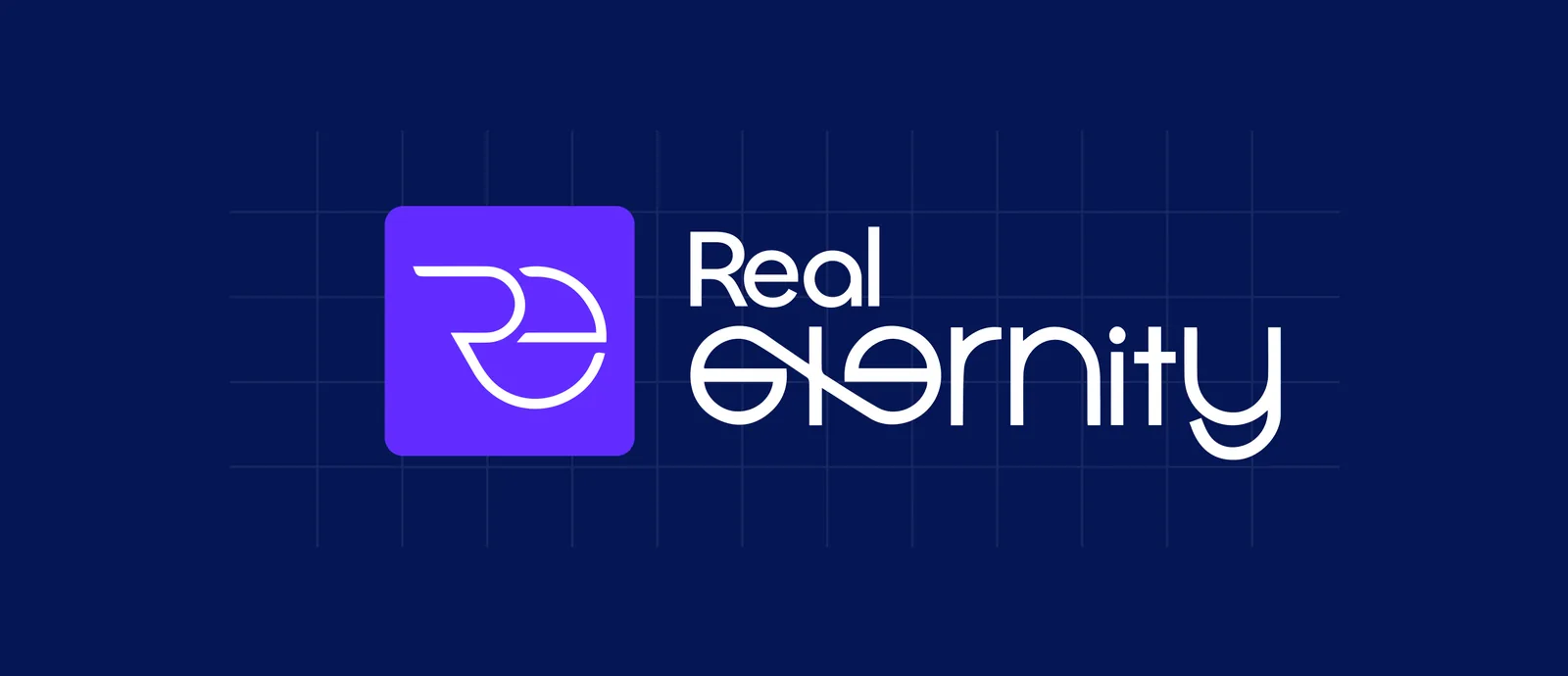
Circular flow
Eternity and continuity: growth that keeps going, and a client experience without breaks.
Intertwined R and E
Collaboration and connection: Real Eternity as a trusted partner, bridging businesses and opportunities.
Open curves
Accessibility and forward motion: a firm that is easy to reach and adapts to its clients.
What inspired the Real Eternity symbol?
Three ideas, as the credentials describe them: a circular flow for eternity and continuity, the letters R and E intertwined for collaboration and connection, and open curves for accessibility and forward motion.
Did Branditify design the logo?
Yes. Branditify designed the Real Eternity logo: the R and E symbol and the Real Eternity wordmark, drawn on one construction grid.
At every size
From the construction grid to a home screen
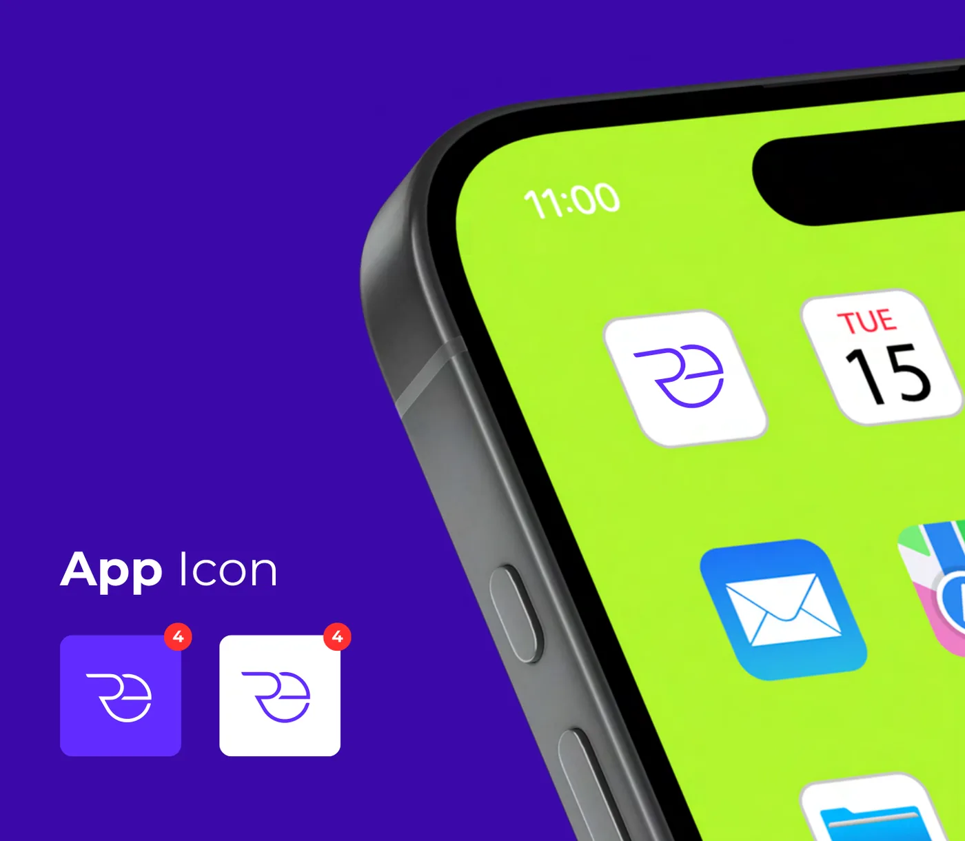
The logo is drawn on a grid, keeps a clear space around it, and works as an app icon in violet and in white.

What did the Brand Book include?
Branditify delivered the brand book with the identity, as the reference for using it. The credentials page beside it shows the logo’s construction grid, the clear space kept around the mark and the app icon.
Is there an app icon?
Yes. The credentials show the Real Eternity app icon in violet and in white, and on a phone’s home screen.
Why is the mark kept simple?
The credentials give three practical aims: clean enough for every platform, clear from the smallest size up, and free of passing trends.
What Branditify delivered
The identity, and its book
Everything on this list is part of the Real Eternity identity.
- The Real Eternity symbol: an R and an E intertwined
- The Real Eternity wordmark and logo
- The logo’s construction grid and clear space
- The app icon, in violet and in white
- The brand book
Did Branditify build a GeM portal or procurement system?
No. Branditify designed the Real Eternity identity and brand book; no GeM portal, registration, tender or procurement software is part of the work.
Which Branditify Service does this project prove?
Branding & Identity.
Does the project map to a current Branditify Industry page?
No. None of our current Industry pages covers GeM services firms.
Related at Branditify
Where this work fits
More identity work
Other marks with an idea inside
Questions
About this project
What is Real Eternity?
A GeM (Government e-Marketplace) services firm for businesses.
What did Branditify do?
Branditify designed the Real Eternity logo, brand identity and brand book.
Did Branditify build any GeM software?
No. The work is the identity.
Which Branditify service relates to this project?
Branding & Identity.
Start a project
Does your brand look as dependable as your service?
Tell us what you do and who relies on you, and we will reply with how we would build the identity around it.