Project overview
HomeSofy is a mattress and sleep products brand created around one simple promise: helping people experience better rest at home. With the tagline “Home of the Perfect Sleep,” the brand needed an identity that could feel comfortable, premium, warm, and trustworthy in a competitive home comfort market.
Branditify worked on HomeSofy’s logo identity, monogram system, visual direction, and brand communication foundation. The goal was to create a brand that instantly connects with sleep, softness, comfort, care, and home-like warmth while still looking polished enough for retail, packaging, digital platforms, and future product expansion.
The challenge
The mattress and sleep category is full of similar-looking brands that use generic comfort visuals, basic typography, and predictable bedroom imagery. HomeSofy needed a distinct identity that could stand out while still feeling calm and reliable. The challenge was to communicate comfort without becoming boring, premium quality without becoming cold, and softness without losing brand recall. The identity also needed to work across product packaging, retail displays, digital ads, social media, website, tags, labels, and marketplace thumbnails.
Strategy
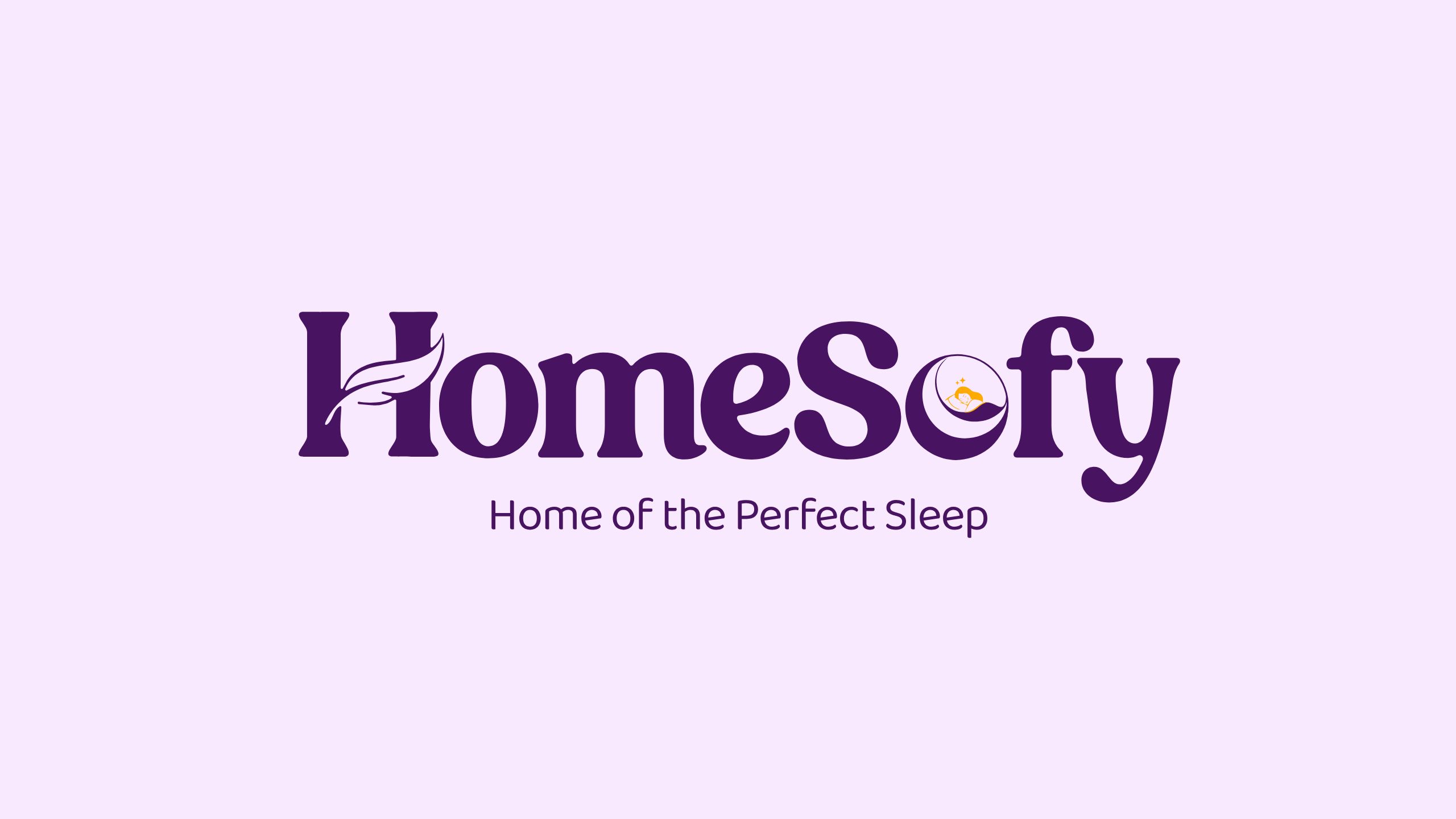
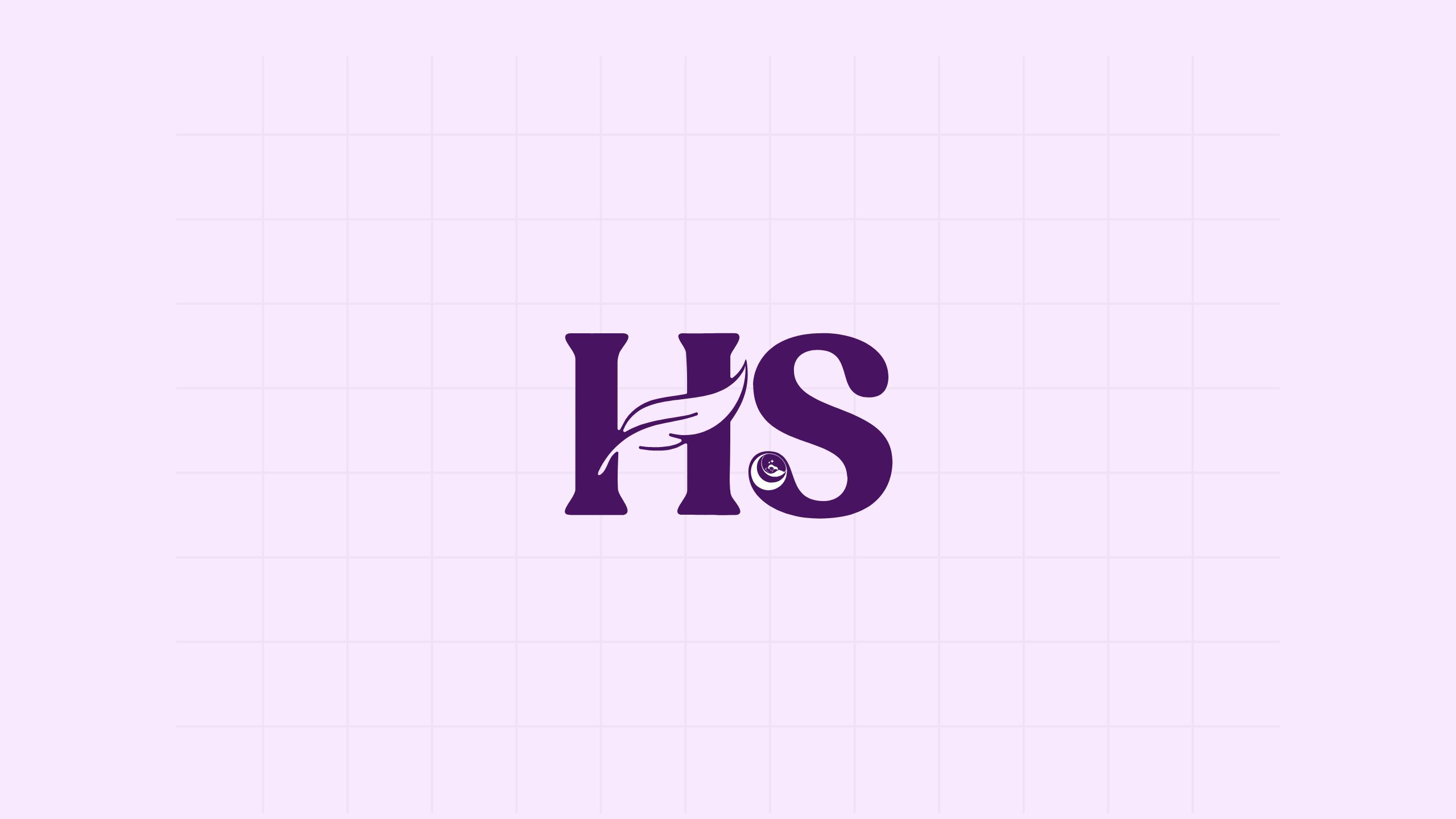
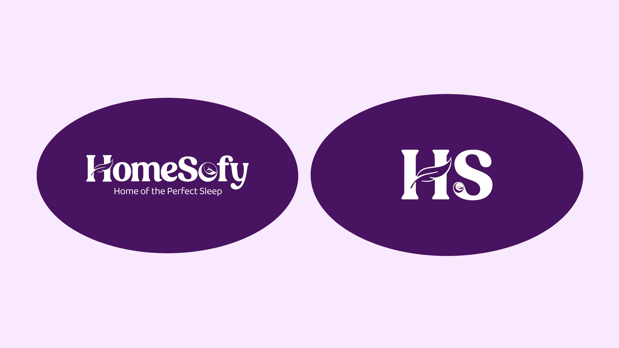
Branditify positioned HomeSofy as a comfort-first sleep brand with a warm and emotional identity. The design strategy focused on creating a brand that feels soft, peaceful, trustworthy, and easy to remember. The purple color direction was used to communicate calmness, rest, and premium comfort. The custom wordmark created a distinct visual personality, while the HS monogram gave the brand a compact identity system for icons, labels, tags, packaging, and social media use. The soft leaf-like visual detail in the “H” was used to suggest comfort, breathability, and gentle support. The sleep-inspired symbol inside the wordmark added a direct connection to rest, bedtime, and peaceful sleep.
Execution
Branditify created a complete logo direction for HomeSofy, including the primary wordmark, dark background version, and HS monogram. The identity was designed to stay recognizable in both full-logo and icon-only formats. The visual system was crafted around softness, clarity, and brand recall. The primary logo works for website headers, packaging, product labels, catalogues, social media, and retail branding. The monogram gives HomeSofy a flexible mark for favicons, app icons, tags, embroidery, and compact brand placements. The final identity gave HomeSofy a stronger foundation to enter the mattress and sleep product market with a more polished, memorable, and emotionally relevant brand presence.
What we delivered
- Brand strategy + identity
- Content + media production
- Primary logo design
- Dark background logo version
- HS monogram
- Sleep-focused brand mark
- Tagline lockup
- Brand color direction
- Typography direction
- Packaging-ready identity assets
- Digital-ready logo formats
- Social media identity direction
- Retail-friendly visual system