
Case study · Brand identity
Pharma Prophet: Knowledge at the centre, the future above it
Pharma Prophet gives pharmaceutical businesses research and industry insight. Branditify designed its logo, its brand identity and its design elements.

The project
An advisory brand that had to look like authority
Pharma Prophet sells judgement, not product. The identity had to carry research and confidence in one small mark.
In its own words, Pharma Prophet is a brand dedicated to bridging the gap between healthcare innovation and accessibility, with a focus on research, technology and industry insights, empowering pharmaceutical businesses with strategic solutions.
Branditify designed the Pharma Prophet logo, its brand identity and its design elements. Branditify’s Portfolio & Credentials presents the work on two pages: the logo on navy, then its construction, its three-part rationale and its applications.
The work is the identity. The research, the advice and the healthcare judgement behind the brand are Pharma Prophet’s own.
What is Pharma Prophet?
A brand that gives pharmaceutical businesses research, technology and industry insight; in its own words, it works to bridge healthcare innovation and accessibility.
What did Branditify do for Pharma Prophet?
Branditify designed the Pharma Prophet logo, its brand identity and its design elements, from the monogram to the applications the credentials show.
Was this a branding project?
Yes. The scope was the logo, the brand identity and the design elements.
The project at a glance
- Client
- Pharma Prophet
- Category
- Pharmaceutical insights · advisory
- Project type
- Brand identity
- Delivered
- Logo · brand identity · design elements
- Brand line
- “Building a foundation of knowledge”
The mark
A monogram, a book and a sunrise
The credentials set the logo out in three parts. Read together they say what the brand sells: knowledge, and what it points at.
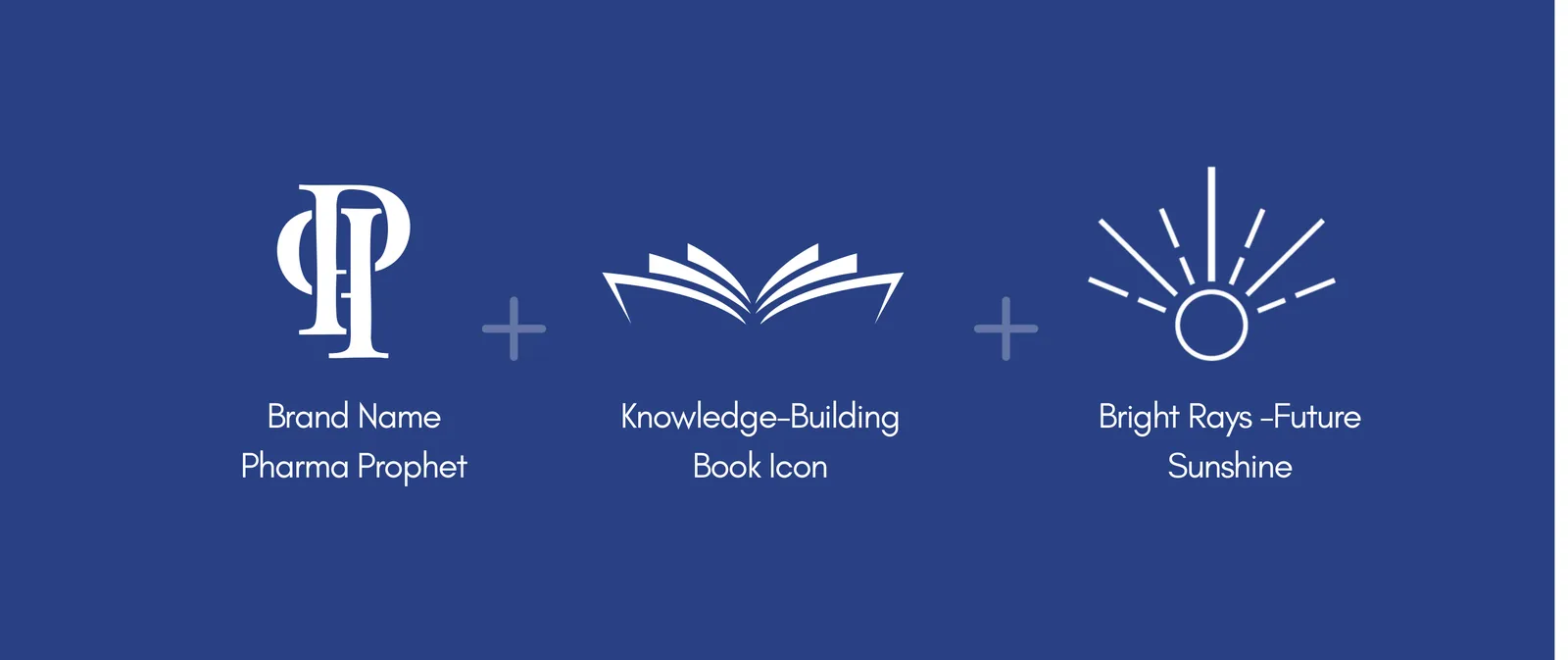
The brand name
Pharma Prophet, with its P and P built into one serif column that holds the mark upright.
The knowledge-building book icon
An open book under the monogram: the research the advice is built on.
Bright rays, future sunshine
Rays rising behind the book, for the future the insight is meant to reach.
What inspired the logo?
Three parts, as the credentials describe them: the Pharma Prophet name as a monogram, a knowledge-building book icon, and bright rays for the future.
What does the book icon represent?
Knowledge-building: the research and industry insight the brand is founded on, which the logo’s own line calls “building a foundation of knowledge”.
What do the rays represent?
The future, drawn as sunshine rising behind the book.
Design elements
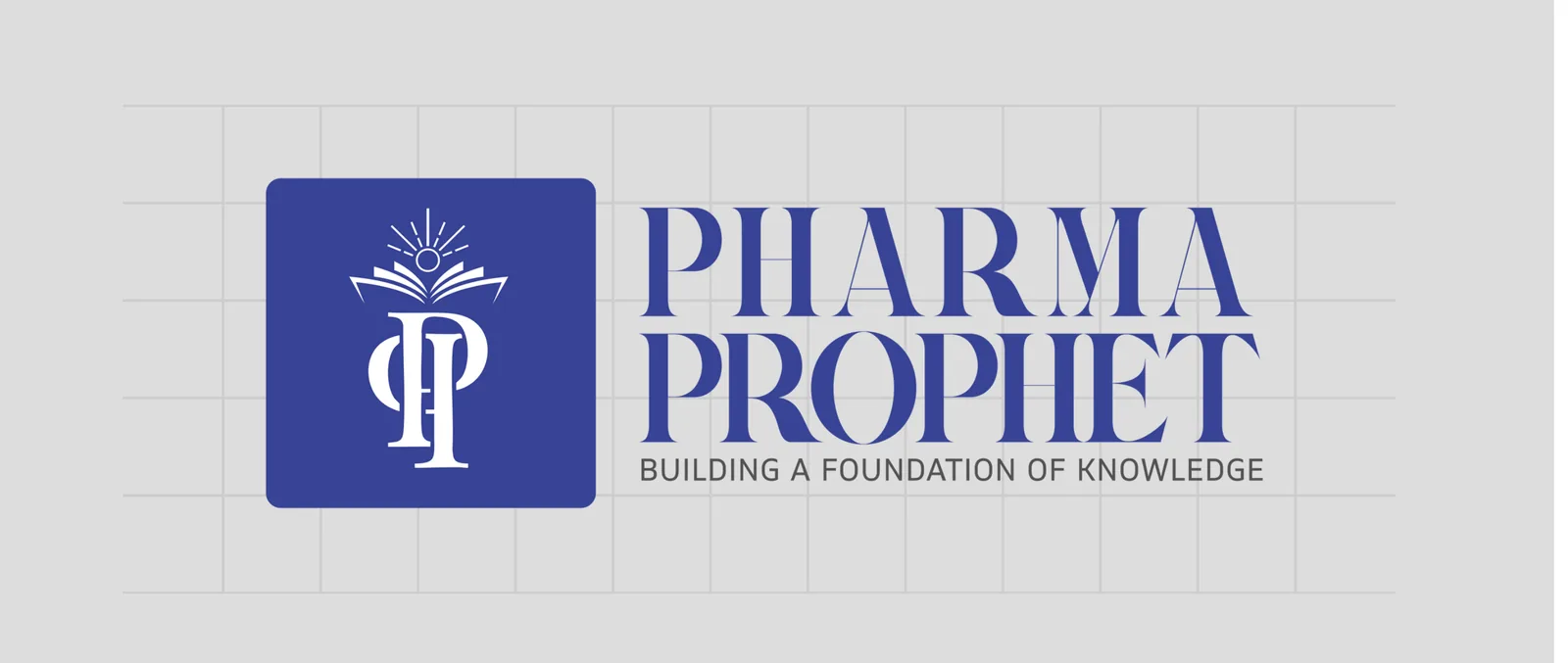
One lockup, carried across the brand
The design elements keep the mark steady wherever it lands: a tile for small spaces, a two-line wordmark for large ones, and a black version for anything printed plain.
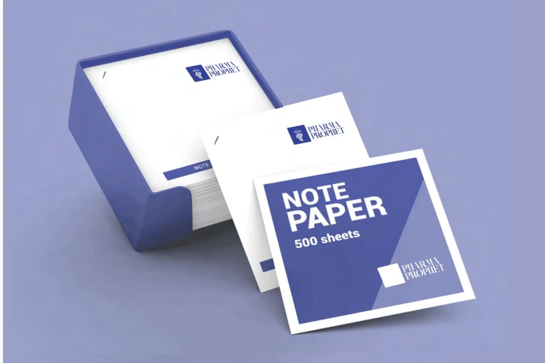
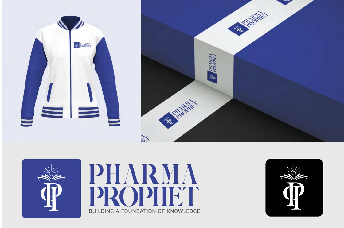
What did the design system include?
The logo in its tile and wordmark lockups, a black version and an app-style icon, the serif wordmark with the brand’s line beneath it, and the navy-and-white palette the applications use.
Where is the identity shown in use?
On the pieces the credentials show: note paper, a packaging box, a varsity jacket, and the lockups in colour and in black.
What Branditify delivered
The logo and the system around it
Everything on this list is part of the Pharma Prophet identity.
- The Pharma Prophet logo: monogram, book and rays
- The serif wordmark and the brand line
- The icon tile, and a black version of the lockup
- The navy and white palette
- The design elements carried onto stationery, packaging and apparel
Did Branditify build pharmaceutical software?
No. Branditify designed the identity; no pharmaceutical software, platform, website or app is part of this work.
Which Service does the work prove?
Branding & Identity.
Does it map to Branditify’s Pharma Industry page?
No. Pharma Prophet advises pharmaceutical businesses rather than making or dispensing medicines, so none of our current Industry pages is an honest owner.
Related at Branditify
Where this work fits
More identity work
Other marks with meaning built in
Questions
About this project
What is Pharma Prophet?
A pharmaceutical insights brand, working with pharmaceutical businesses.
What did Branditify design?
The logo, the brand identity and the design elements.
Did Branditify do any medical or pharmaceutical work?
No. The work is the identity.
Which Branditify service relates to this project?
Branding & Identity.
Start a project
Selling expertise that nobody can see?
Tell us what you know and who needs it, and we will reply with how we would build the identity around it.