
Case study · Brand identity
Oroblanco: White gold, drawn in quiet greens
Oroblanco is a gourmet food and coffee brand whose name means “white gold”. Branditify created its identity: a flowing mark, lowercase type, delicate greens and fine line drawings, carried across its packaging, cups and print.

The project
A name that means white gold
The identity starts from the name: purity, opulence and a commitment to premium quality, expressed with restraint.
Oroblanco is a gourmet food and coffee brand built around a refined culinary experience.
Branditify created its brand identity, and applied it across the brand’s coffee packaging, cups, stationery and print.
Its name means “white gold”. The identity reads that as purity and opulence: cream and soft green, flowing type, and fine botanical line drawings.
What type of business is Oroblanco?
A gourmet food and coffee brand offering a refined culinary experience.
What did Branditify do for Oroblanco?
Branditify created the Oroblanco brand identity, the logo with its tagline, the greens and the line drawings, and applied it to a coffee bag, a box, a takeaway cup, a salad band, business cards and a brewing booklet.
Was this a branding project?
Yes. It was a brand identity, shown across the brand’s packaging and print.
The project at a glance
- Client
- Oroblanco
- Category
- Gourmet food & coffee
- Project type
- Brand identity
- The name
- “White gold”
- Tagline
- The Opulent Taste
- Applied to
- Coffee bag, box, cup, salad band, cards, booklet
One line, every surface
The line that draws the brand
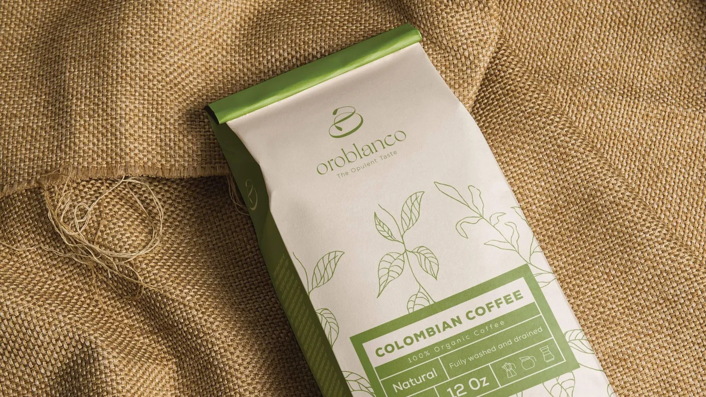
Fine botanical drawings run through the whole identity. The same light line appears on every piece, in green on cream or in white on green, so each one belongs to the same family.
Coffee bag
Leaves and branches drawn up the front, above a green label panel.
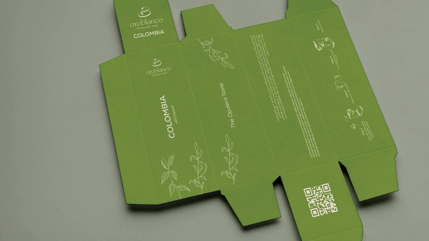
Box
The dieline in solid green, with the drawings in fine white line.

Salad band
A green band of drawings wrapped around a takeaway bowl.
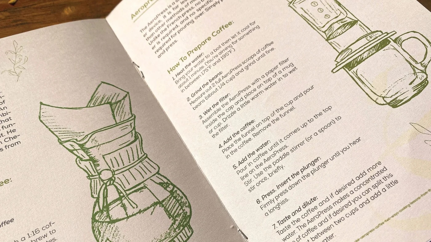
Booklet
Brewing steps beside line drawings of the equipment.
What inspired the Oroblanco identity?
The name, which means “white gold”. The identity reflects purity and opulence, and its delicate greens and flowing typography evoke freshness and a gourmet feel.
How were colour and typography used?
Soft greens on cream and white keep the brand light, and a lowercase wordmark under a flowing mark keeps it refined.
The mark
Small on a lid, generous on a card
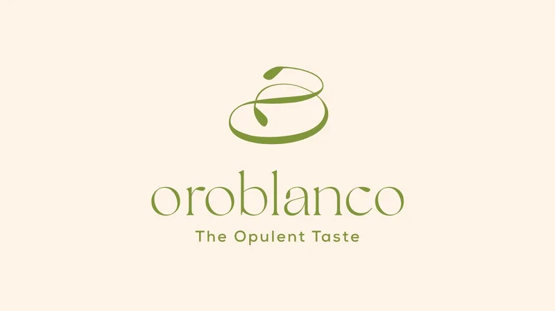
A flowing green mark sits above the lowercase oroblanco wordmark and the line “The Opulent Taste”. It works small on a lid and large on a card.
Takeaway cup
Soft green, white drawings, the mark on the lid.
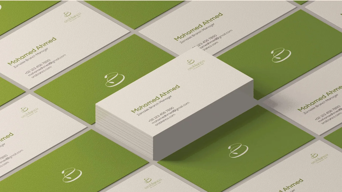
Business cards
Cream and green, the mark on every card.
- Olive green
- Leaf green
- Cream
- Stone
What was delivered
An identity, and the pieces it lives on
- Brand identity: the flowing mark, the lowercase wordmark and “The Opulent Taste” lockup
- A palette of soft greens and cream
- Fine botanical line drawings
- Applications: coffee bag, box, takeaway cup, salad band, business cards and a brewing booklet
Did Branditify build restaurant software for Oroblanco?
No. The project was brand identity and its applications, not software.
Which Branditify services does this project prove?
Branding & Identity: the mark, the palette, the line drawings and their applications.
Which Industry does Oroblanco relate to?
Restaurants & Cafés: a gourmet food and coffee brand.
Can Branditify create a similar identity for another restaurant or café?
Yes. A food or coffee brand that wants a calm, premium identity carried across every piece is a good fit. Tell us about yours through the enquiry form.
Related at Branditify
Where this work fits
More brand work
Other premium and food identities
Questions
About this project
What did Branditify do for Oroblanco?
Branditify created the Oroblanco brand identity and applied it to its packaging, cups, cards and print.
What does Oroblanco mean?
White gold. The identity reads it as purity and opulence.
Did Branditify build restaurant software for Oroblanco?
No. The project was brand identity.
Which Branditify service relates to this project?
Branding & Identity.
Start a project
Building a café or food brand that should feel premium?
Tell us about your food, your coffee or your space, and we will reply with how we would approach the identity.