
Case study · Ecommerce UX/UI
PetSpot: Playful brand energy, serious shopping clarity
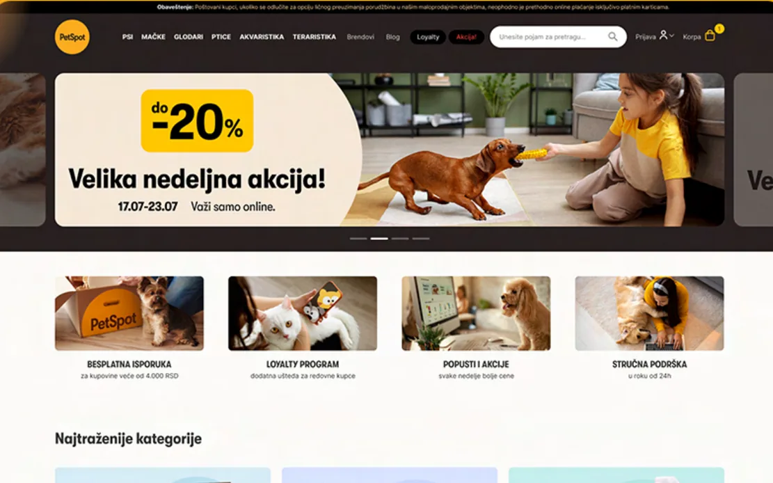
PetSpot sells food, care and equipment for every kind of pet in Serbia. Branditify designed the UX and UI of its new ecommerce website, for desktop and phone.
The project
Warm enough for pet owners, clear enough to shop
PetSpot’s range runs from food to veterinary diets, for every kind of pet. The new website had to feel friendly without making a big catalogue hard to shop.
PetSpot is a pet retailer in Serbia, founded in November 2019. It imports, distributes and sells food, equipment, care products, veterinary diets and medicines for all kinds of pets.
Branditify designed the UI and UX of PetSpot’s new website. Branditify’s Portfolio & Credentials sets out the aim: make pet shopping easy, fun and accessible, with a modern layout and structured navigation, while reflecting the warmth of pet companionship.
The project presentation walks through the work in order: wireframes, a style guide, the home page, the inner pages and the phone screens.
What is PetSpot?
A pet retailer in Serbia, founded in November 2019, that imports, distributes and sells food, equipment, care products, veterinary diets and medicines for all kinds of pets.
What did Branditify do for PetSpot?
Branditify designed the UX and UI of PetSpot’s new ecommerce website: the wireframes, the style guide, the home page, the inner pages and the phone screens.
The project at a glance
- Client
- PetSpot
- Category
- Pet retail · import, distribution, retail
- Location
- Serbia
- Project type
- Ecommerce UX/UI design
- Scope
- Product Design · eCommerce Experience · UX/UI Design
The home page
One scroll, many ways into the shop
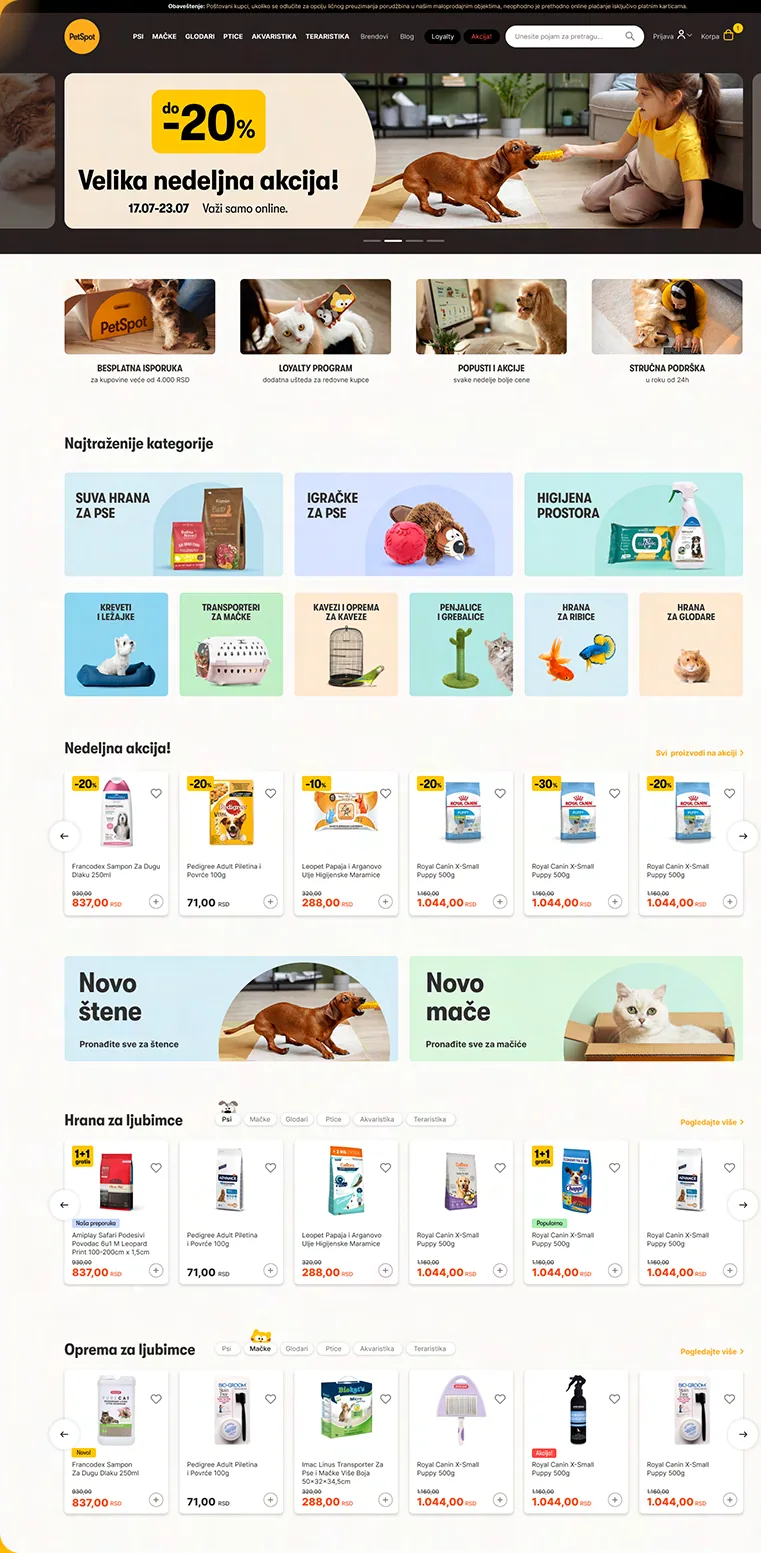
The home page is a sequence of ways in, from this week’s offer to shopping by pet or by brand, so a visitor can find the right product without searching.
This week’s offer
A promotion banner opens the page.
Four promises
Free delivery, the loyalty programme, discounts and expert support, up front.
Most-wanted categories
Category tiles, from dry dog food and toys to beds, cages and fish food.
Weekly offers
A product rail, each card with its discount, price and add button.
New puppy, new kitten
Two doors for people with a new pet.
By pet, then by brand
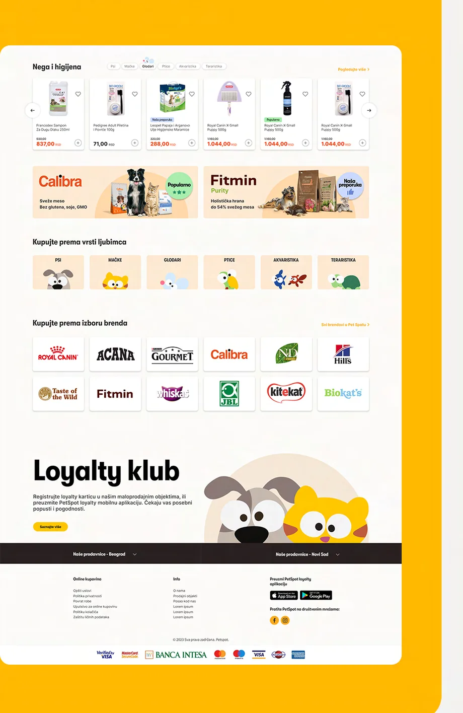
Food, equipment and care rails with a tab for each pet, then shopping by pet type and by brand.
Loyalty club
The programme, just before the footer.
How was product discovery organised?
Around several ways in, on one scroll of the home page: the week’s offers, the most-wanted categories, food, equipment and care by pet, shopping by pet type and by brand, and the loyalty club. Listing pages then narrow the choice with filters and sorting.
How did the design balance playful branding with shopping usability?
The playfulness stays in the frame: yellow, rounded shapes, an illustrated animal for each pet type and warm photography. The shopping stays plain: white product cards with the price, the offer and an add button in the same place every time.
Before the pixels
Wireframes first, then a style guide
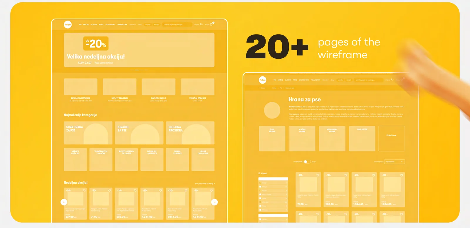
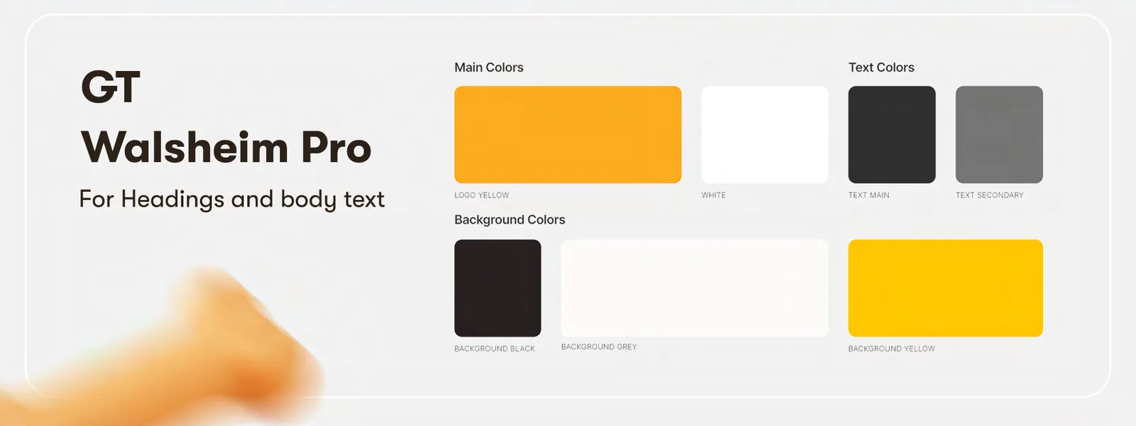
The presentation shows the order of the work: page structures in grey, then one typeface and a palette set by role, then the full design.
Was PetSpot a product-design project?
Yes. The credentials list Product Design, eCommerce Experience and UX/UI Design as the scope, and the project presentation starts from wireframes.
What came before the visual design?
Wireframes for more than twenty pages, then a style guide: GT Walsheim Pro for headings and body text, and colours set by role for the main palette, text and backgrounds.
Inner pages
From a category to one product
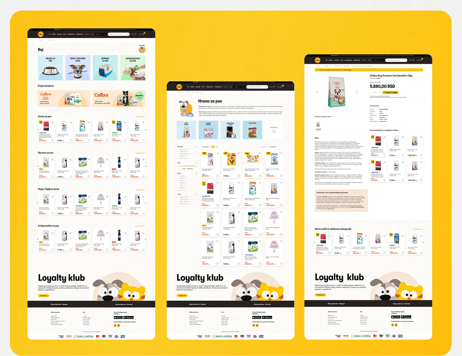
Below the home page, the design narrows the choice: a page for each kind of pet, a listing for each category, and a product page that leads to the cart.
Was ecommerce UX part of the scope?
Yes. eCommerce Experience is part of the scope, and the screens cover shopping from the home page through category and listing pages to a product page with its add-to-cart button.
How is product information presented?
On the product page, the name, price and availability sit beside the photo, with the quantity and the add-to-cart button below them and the product’s characteristics further down.
On a phone
The same shop, one thumb wide
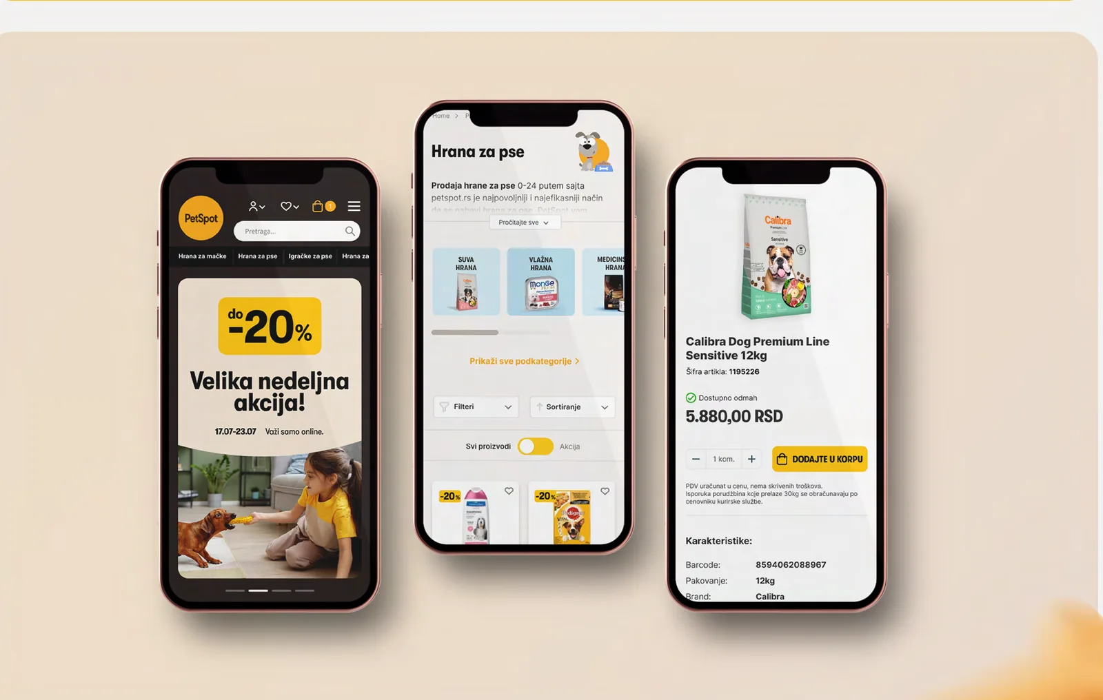
The phone screens keep the order of the desktop: the offer first, filters and sorting on the listing, and the add-to-cart button under the price.
Is the design responsive?
Yes. The presentation includes phone screens for the home page, a dog food listing with filters and sorting, and a product page with its add-to-cart button.
What Branditify delivered
The shop, designed end to end
Everything on this list is part of the PetSpot UX and UI design.
- Wireframes for more than twenty pages
- A style guide: one typeface, colours set by role
- The home page design
- Inner pages: category, listing and product
- Phone screens: home, listing and product
Did Branditify build inventory or order-management software?
No. Branditify designed the interface; no inventory, order-management, payment or back-office system is part of the work.
Which Branditify Service does PetSpot prove?
Ecommerce: the UX and UI of an ecommerce website.
Does PetSpot map to an existing Industry page?
No. None of our current Industry pages covers pet retail.
Related at Branditify
Where this work fits
More ecommerce and UX work
Other shops built around the shopper


Questions
About this project
What is PetSpot?
A pet retailer in Serbia, selling food, equipment, care and veterinary products for all kinds of pets.
What did Branditify do?
Branditify designed the UX and UI of PetSpot’s new ecommerce website.
Did Branditify build the shop’s systems?
No. The work is the interface design.
Which Branditify service relates to this project?
Ecommerce.
Start a project
Is your catalogue friendly, but hard to shop?
Tell us what you sell and who buys it, and we will reply with how we would design the shop around them.