Case study · Brand identity
FriedBot Studio: A brand for software that comes back
FriedBot Studio works in self-healing software. Branditify designed its logo and brand identity, and delivered its brand book and social media guidelines.
The project
A name that starts at failure
A fried bot is a system rendered useless. The identity had to carry the other half of that idea: what happens when it comes back.
“FriedBot” is an expression for a system rendered useless, reborn through innovation. FriedBot Studio works in the world of self-healing software, and describes its mission as intelligent, self-sustaining systems.
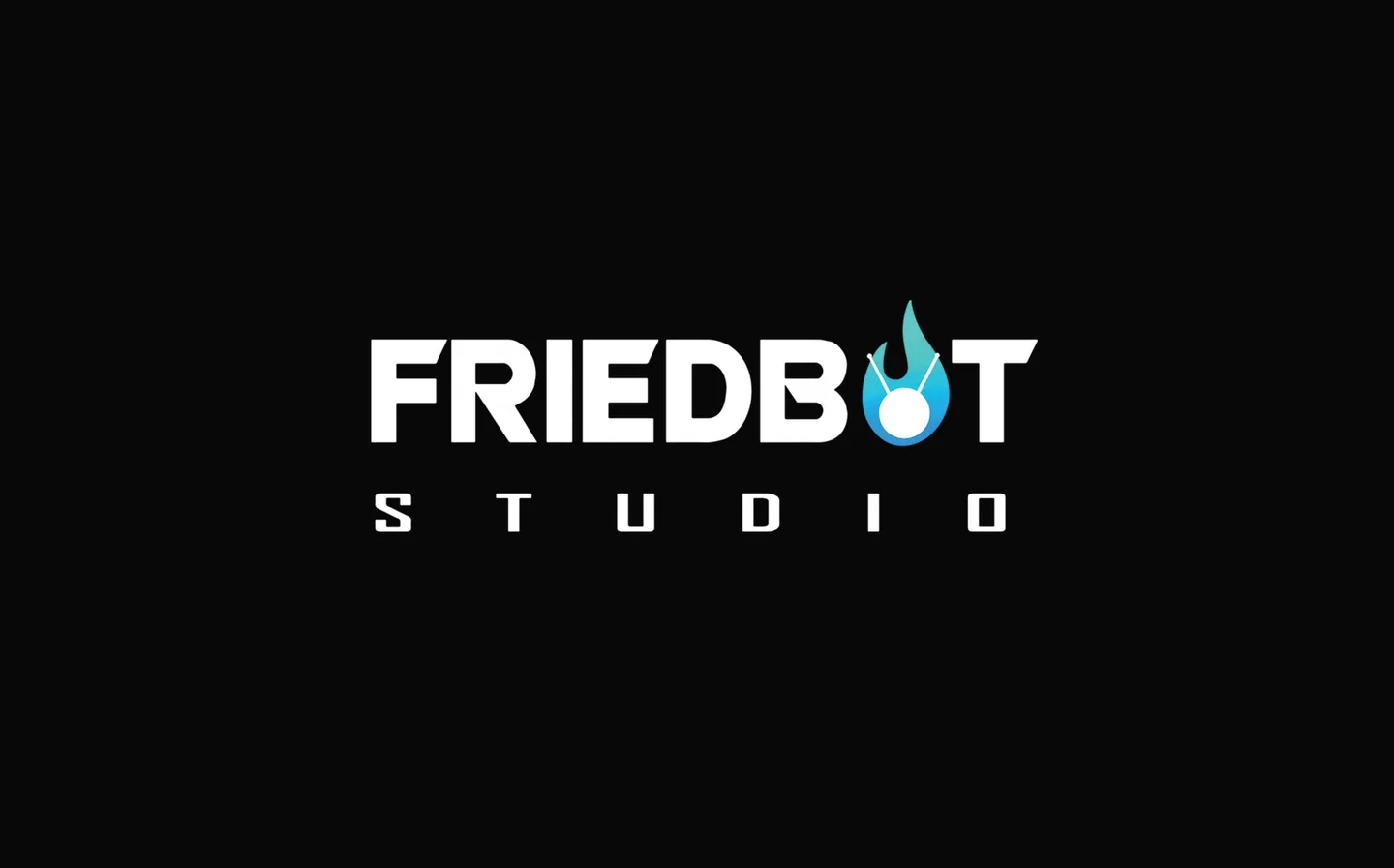
Branditify designed the FriedBot Studio logo and brand identity, and delivered the brand book and the social media guidelines. Branditify’s Portfolio & Credentials presents the work on two pages: the logo on black, then its rationale, its construction and its type.
The work is the identity. FriedBot Studio’s software, and the systems it heals, are its own.
What is FriedBot Studio?
A technology studio working in self-healing software, whose name comes from an expression for a system rendered useless and reborn through innovation.
What did Branditify do for FriedBot Studio?
Branditify designed the FriedBot Studio logo and brand identity, and delivered the brand book and the social media guidelines.
Was this a branding project?
Yes. The scope was the logo and brand identity, with the brand book and social media guidelines.
The project at a glance
- Client
- FriedBot Studio
- Category
- Self-healing software · technology
- Project type
- Brand identity
- Delivered
- Logo & brand identity · brand book · social media guidelines
- Palette
- Blue and black
The mark
A flame on a node
Branditify’s credentials set out what the logo carries. Two shapes do most of the work, and the drawing keeps them in line.
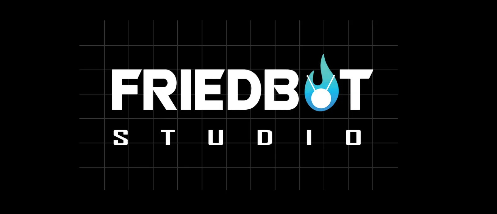


The flame
Revival and adaptability: the half of the name that comes after failure.
The node
The central node stands for AI, automation and connectivity — the studio’s own field.
Geometric precision
Both shapes are drawn on a grid, and the structured typography beside them reads as strength and reliability.
Blue and black
The palette the credentials describe as trust, technology and authority.
Did Branditify create the logo and Brand Book?
Yes. Branditify designed the logo and brand identity and delivered the brand book, which carries the mark, its construction and its type.
What does the flame mean?
Revival and adaptability, as the credentials put it: the studio’s software is built to recover, and the mark says so before a word is read.
The book and the guidelines
What the book sets down
Beside the logo, the brand book holds the drawing and the type; the social media guidelines carry the same rules into posts.

The palette, read from the artwork
- Black
- Brand blue
- Flame cyan
- White
Did the project include Social Media Guidelines?
Yes. The credentials list the brand book and the social media guidelines together, so the identity arrives with rules for how it is laid out and used.
Did Branditify run FriedBot Studio’s social channels?
No. Guidelines are not channel management: Branditify wrote the rules, and never posted or managed accounts.
What holds the identity together at small sizes?
The geometry. The symbol is drawn from circles and angles and the type is squared off, so the mark stays legible where a studio’s brand usually lives: an avatar, a favicon, a post.
What Branditify delivered
The identity, the book, the rules
Everything on this list is part of the FriedBot Studio identity.
- The FriedBot Studio logo: the wordmark with its flame-and-node
- The brand identity, in blue and black
- The construction of the symbol and the wordmark
- The geometric type
- The brand book
- The social media guidelines
Did Branditify build FriedBot Studio’s self-healing software?
No. Branditify designed the identity; no software, AI engine, automation or platform was built here — that is the studio’s own work.
Which Service does this project prove?
Branding & Identity.
Does it map to the AI Startups Industry?
No. FriedBot Studio is a software studio rather than a startup building an AI product, so none of our current Industry pages is an honest owner.
Related at Branditify
Where this work fits
More identity work
Other marks built from geometry
Questions
About this project
What is FriedBot Studio?
A technology studio working in self-healing software.
What did Branditify design?
The logo and brand identity, with the brand book and social media guidelines.
Did Branditify develop any software here?
No. The work is the identity.
Which Branditify service relates to this project?
Branding & Identity.
Start a project
Building something technical that looks like everyone else?
Tell us what your software does and who relies on it, and we will reply with how we would build the identity around it.