
Case study · Brand identity + mascot
MomoRush: A momo brand whose mascot runs right through its name
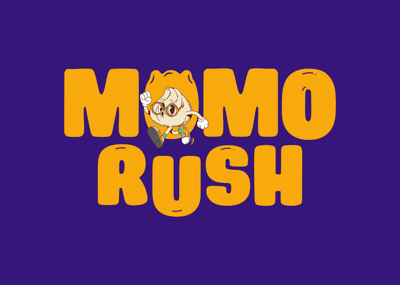
MomoRush is a fast, playful momo brand. Branditify designed its logo and brand identity, its brand book and its mascot, Moji: a momo in a hurry who takes the place of the first O in the name.
The project
A momo brand that had to feel as fast as its name
MomoRush is built on speed, fun and the craving for momos. The identity was designed to carry that energy to a young, food-loving audience.
MomoRush is a quick-service food brand built around one dish: momos. Its name makes two promises at once, the food and the speed.
Branditify’s scope was the logo and brand identity, a brand book, and a mascot.
The identity turns the name into a character. Moji, a momo in a hurry, takes the place of the first O in the logo, and appears on his own as the brand’s mascot, with his own name and his own line.
What did Branditify do for MomoRush?
Branditify designed the MomoRush logo and brand identity, a brand book and the mascot, Moji: a running momo who sits inside the logo as its first O.
What type of business is MomoRush?
A quick-service food brand built around momos, made for a young, food-loving audience.
Was MomoRush a branding project?
Yes. The scope was logo and brand identity, a brand book and a mascot.
The project at a glance
- Client
- MomoRush
- Category
- Quick-service food brand (momos)
- Project type
- Brand identity + mascot
- Scope
- Logo & brand identity · Brand book · Mascot
- Mascot
- Moji, the speedy momo fanatic
- Palette
- Purple, yellow, cream and orange
The name, acted out
One character spells MomoRush
The logo tells the name twice: once in letters, and once in Moji. He is a momo, he is in a rush, and he stands in for the first O.
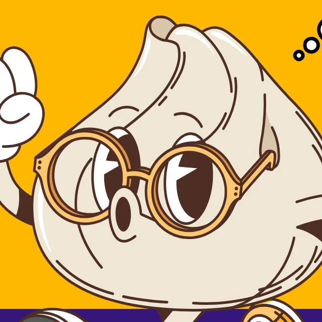
Momo
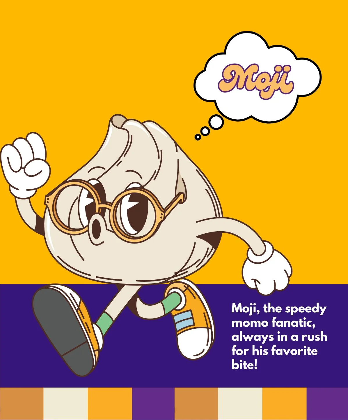
Moji is a momo: a pleated dumpling with a twisted top, round glasses and wide eyes.
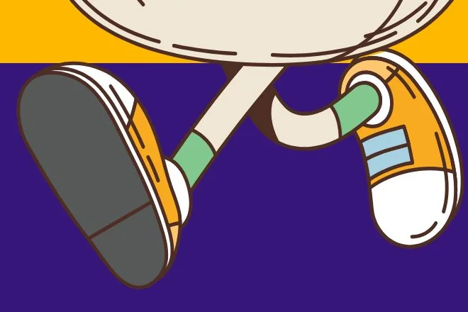
Rush
He is caught mid-stride, fist in the air and sneakers on, always in a hurry for his favourite bite.
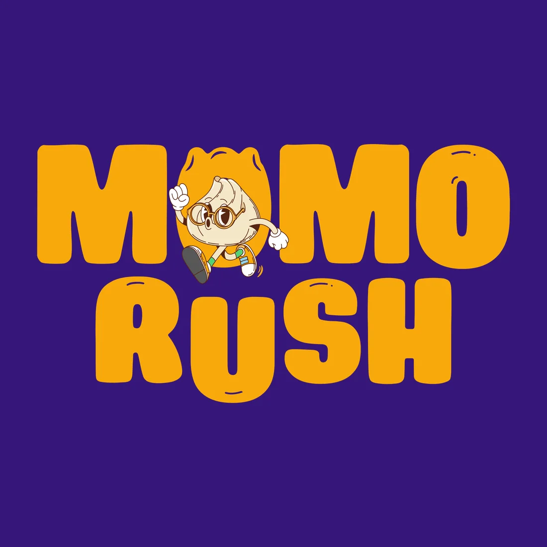
MomoRush
Put him in the logo and he becomes the first O, so the name reads and runs at the same time.
- His name
- Moji, written in a looping script inside a thought bubble.
- His line
- “Moji, the speedy momo fanatic, always in a rush for his favorite bite!”
- What he adds
- Energy and personality. He makes “fast, on the go” something you can see, not just read.
What makes the MomoRush logo different?
The first O in MOMO is the mascot, Moji, a running momo. The logo spells the name and acts it out at the same time.
Who is Moji?
Moji is the MomoRush mascot Branditify designed: a momo in round glasses and sneakers, introduced in the brand’s own line as “the speedy momo fanatic, always in a rush for his favorite bite”.
The identity
Bold, rounded and easy to spot
Rounded letters keep the brand warm and approachable, and a bright palette keeps it visible. The logo comes in two lockups.
Yellow on purple
The main logo: MOMO over RUSH, with Moji as the first O.
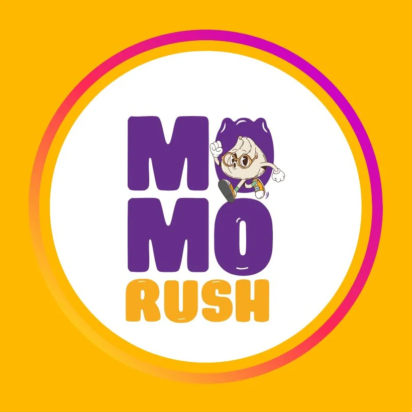
Stacked, in a round badge
MO, MO and RUSH on three lines inside a circle, in purple and orange on white, with a warm ring around it.
- Purple
- Yellow
- Cream
- Orange
How does the MomoRush identity stay recognisable?
By repeating a few strong parts everywhere: the rounded MOMO RUSH letters, Moji in the first O, and a purple-and-yellow palette with cream and orange. The badge keeps all of it in one circle.
The brand in use
From chopstick sleeve to carry bag
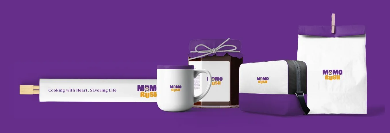
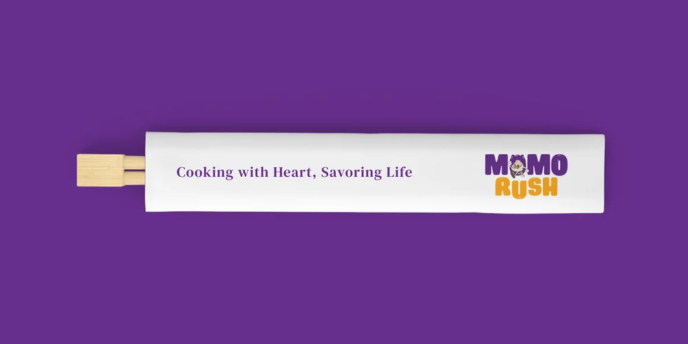
The identity was presented on the everyday objects around a momo order: a chopstick sleeve, a mug, a jar, a carry bag and a paper bag.
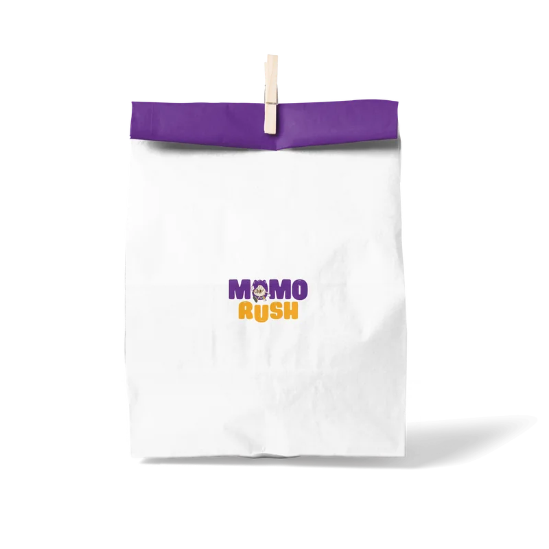
Paper bag
The two-colour logo, centred under a purple fold.
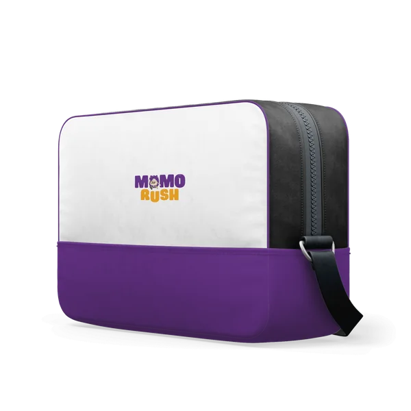
Carry bag
White over purple, the logo on the white panel.
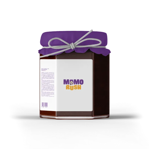
Jar
A purple cloth lid tied with string, the logo on the label.
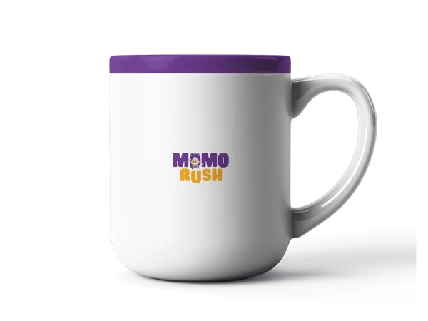
Mug
A purple rim, and the logo on white.
Did the MomoRush project include packaging?
The scope was the identity, the brand book and the mascot. The identity was presented on a paper bag, a carry bag, a jar, a mug and a chopstick sleeve to show how it holds up on everyday objects.
What was delivered
A logo, a mascot and the book that holds them together
- Logo & brand identity: MOMO over RUSH, with Moji as the first O
- Two lockups: yellow on purple, and stacked in a round badge
- Moji, the mascot: his look, his name and his line
- A four-colour palette: purple, yellow, cream and orange
- A brand book
Did Branditify build ordering, POS or restaurant-management software for MomoRush?
No. MomoRush was a brand identity project: the logo, the mascot and the brand book.
Did Branditify design a website for MomoRush?
This project was brand identity: logo, brand book and mascot. Branditify’s website work is shown in other case studies, such as Swift Logix and Detail Driven.
Which Branditify services does this project prove?
Branding & Identity: the logo, the lockups, the palette, the mascot and the brand book.
Which Industry does MomoRush relate to?
Restaurants & Cafés. MomoRush is a quick-service momo brand.
Can Branditify create a similar identity for another food brand?
Yes. A food brand that wants a mascot, or one strong idea at the heart of its logo, is a good fit. Tell us about your food and your customers through the enquiry form.
Related at Branditify
Where this work fits
More brand work
Other brands built around one strong idea
Questions
About this project
What did Branditify do for MomoRush?
Branditify designed the MomoRush logo and brand identity, a brand book and the mascot, Moji.
Who is Moji?
The MomoRush mascot: a momo in round glasses and sneakers, always in a rush. He also forms the first O of the logo.
Was MomoRush a branding project?
Yes: logo and brand identity, a brand book and a mascot.
Did Branditify build ordering or restaurant software for MomoRush?
No. The project was brand identity, not software.
Which Branditify services relate to the project?
Branding & Identity.
Start a project
Building a food brand people should spot at a glance?
Tell us about your food and your customers, and we will reply with how we would approach the identity.