
B2B
B2B Website Design: How to Turn Complex Services into Clear Leads
A guide to B2B website design for companies with complex services, long sales cycles and high-value enquiries that need clarity, proof and conversion structure.

On this page
- Why B2B websites become confusing
- Organise around the buyer’s problem, not your org chart
- What the homepage must make clear
- Service architecture for an offer with many moving parts
- When industry and use-case pages earn their place
- What each buyer needs to see before they enquire
- Proof and case studies that survive scrutiny
- Explaining complexity without hiding behind jargon
- Navigation that follows how buyers evaluate
- Content for each stage of a long decision
- Qualifying enquiries without turning good buyers away
- Forms and calls to action for long sales cycles
- The CRM handoff: what happens after someone enquires
- How much depth, and where thought leadership fits
- Being found when buyers search and ask AI assistants
- Measuring what the site actually contributes
- A practical redesign checklist for complex B2B offers
Structure a B2B website around the questions buyers ask before they enquire: does this solve our problem, will it fit how we work, and what is the risk? Answer them with problem-led service pages, specific proof and a visible process, give each stakeholder the detail they need, and use forms that qualify without deterring serious buyers.
A complex B2B offer rarely loses a sale because a buyer disliked the design. It loses when the buyer cannot tell whether you solve their problem, whether you fit the way their organisation works, and how risky it would be to choose you. A well-structured B2B website answers those three questions with clear service pages, specific proof and a visible process, so the enquiries that arrive come from people who already understand what they are asking for.
Why B2B websites become confusing
B2B websites become confusing because they are usually built from the inside out. The structure mirrors the company — its departments, product names, acquisitions and internal vocabulary — instead of the questions a buyer brings to the site. Each team asks for its own page, each page is written for the people who approved it, and the result is accurate but hard to follow for anyone outside the building.
Complex offers make this worse in predictable ways:
- The offer is described by its components, not its purpose. Pages list modules, methodologies and capabilities, and leave the buyer to assemble them into an answer to their own problem.
- The vocabulary is internal. Names that mean something in sales meetings — a framework, a programme tier, a proprietary process — mean nothing to a first-time visitor.
- Everything carries equal weight. Because every service matters to someone internally, nothing is prioritised, and the homepage turns into a directory.
- Proof is generic. Logo strips and adjectives stand in for evidence, so a sceptical buyer learns nothing about whether you have handled a problem like theirs.
- The only next step is a sales call. A buyer who is still comparing options has nowhere to go except a commitment they are not ready to make.
None of this is primarily a design failure. It is an information failure that design then decorates, which is why a visual refresh on its own so often changes how a site looks and very little about what it produces. The fix starts with deciding what the buyer needs to understand, in what order, and which page is responsible for each part of that understanding.
A simple test before any redesign: ask someone who matches your buyer profile, but has never worked with you, to look at the homepage and one service page and then describe what you do and who it is for. If their description is vaguer than your sales team’s, or simply wrong, the structure needs attention before the visuals do.
Organise around the buyer’s problem, not your org chart
Organise the site around the problems buyers arrive with and the decisions they have to make, then map your services onto those problems. Your internal structure — divisions, practice areas, product lines — can still appear on the site, but it should sit underneath the buyer’s framing rather than replace it.
A buyer comes to a complex B2B site carrying three questions, usually in this order:
- Problem: do these people understand the situation we are in, and can they solve it?
- Fit: will their approach work for an organisation of our size, sector, systems and constraints?
- Risk: what could go wrong, what will it cost, and what happens once we commit?
The site answers with three kinds of material: service pages that explain what you do about the problem, proof that shows you have done it for organisations like theirs, and process content that makes the engagement predictable. When all three are in place, the enquiry that follows is better qualified, because the buyer has already done much of the work of deciding that you are relevant.
How to find the problems worth organising around
Start with evidence you already hold rather than a workshop about positioning:
- Read recent enquiry emails and call notes, and write down the words prospects used to describe their situation before they learned your terminology.
- List the reasons deals stalled or were lost, especially “we weren’t sure it was right for us” and “we couldn’t get it approved internally”.
- Ask the sales team which explanations they repeat on every first call. Those explanations belong on the website.
- Group problems by who feels them and what triggers the search: a failing system, a new regulation, growth that has outpaced a process, a change in leadership.
The groups that emerge become your primary structure. A consultancy with several practice areas may discover that buyers really arrive with a handful of problems, each drawing on more than one practice. An engineering firm may find that buyers search for the asset or process they need fixed, not the discipline that fixes it. Either way, the navigation, the homepage and the service pages should be built from those groups, with your internal structure visible only where it helps the buyer.
What the homepage must make clear
A B2B homepage has one job above the rest: to let the right buyer recognise quickly that they are in the right place, and to send them down the right path. It needs to state what you do, for whom, and what changes for them, in plain language near the top of the page. It does not need to explain everything.
Weak B2B homepages tend to fail in one of two ways. Some open with an abstract promise — a line about transformation, partnership or excellence — that could belong to any company in any sector. Others try to show the whole offer at once, so the visitor has to read a catalogue before learning whether any of it applies to them.
What the first screen should answer
- What you do, described as the problem you solve or the change you deliver, in words a buyer would use.
- Who it is for: the kind of organisation, the role or the situation. Specificity here filters out poor-fit visitors before they ever reach a form.
- Why you are credible: one concrete signal of relevance, such as the kind of clients you work with, the systems you work within or the scale of problem you handle.
- Where to go next: a primary path for buyers ready to talk, and a secondary path for buyers who are still evaluating.
What the rest of the homepage is for
Below the first screen, the homepage becomes a routing page. Short sections should connect each major buyer problem to its service or solution page, surface one or two pieces of relevant proof, outline how an engagement works and give the evaluating buyer something worth reading. Every section should end in a route to a deeper page: the homepage summarises, and the rest of the site substantiates.
If you cannot write a clear first-screen statement, the problem usually sits upstream of the website. Buyers can only understand a position the company itself has settled, which is why positioning and brand identity work belongs before the homepage copy is written, not after the design has been approved.
Service architecture for an offer with many moving parts
Build one page for each distinct problem you solve, or each service a buyer would purchase on its own, and make each page complete enough to be read without the rest of the site. Group those pages under a small number of top-level categories that match how buyers think, and resist creating a page for every internal capability.
When to give a service its own page, and when to merge
Give a service its own page when it has a distinct buyer, a distinct trigger for purchase, distinct proof, or is searched for in its own right. Merge services when buyers only ever buy them together or cannot tell them apart. A useful warning sign is two pages that would need the same case studies and the same answers to the same questions; they are probably one page.
What a complex service page should contain
The order matters as much as the contents. A page that follows the buyer’s questions usually runs like this:
- The problem, stated in the buyer’s terms, and who typically has it.
- What you do about it, and what the buyer ends up with.
- How it works: the approach, the stages and the inputs you need from the client.
- Where it fits: the sizes of organisation, sectors, systems and situations it suits, and just as usefully, those it does not.
- Proof tied to this specific service rather than a generic client list.
- What working together involves: roles, engagement model and what drives scope.
- The questions buyers ask at this stage, answered directly.
- A next step matched to the page, such as a conversation, an assessment, a sample or a relevant guide.
The “where it does not fit” section makes many teams uncomfortable, yet it is one of the most useful qualifying devices on a B2B site. It saves poor-fit prospects a wasted call, and it tells good-fit prospects that you understand your own work well enough to know its limits.
This is also the right order in which to plan a rebuild. A premium website build should begin with the service map and the page anatomy above, and only then move to design; starting from a template and filling the gaps produces pages that look finished but still need a salesperson to explain them.
When industry and use-case pages earn their place
Create industry or use-case pages only when buyers in that group evaluate you differently: different regulation, different systems, different vocabulary, different proof. If the page would be your standard service page with a sector name swapped in, it adds clutter rather than relevance, and a thin page written only to be found will disappoint the buyer who lands on it.
Choose the page type by situation:
- Industry pages earn their place when sector context changes the work — compliance requirements, procurement norms, integration with sector-specific systems — and when you have proof from that sector. A buyer in a regulated industry wants evidence that you understand their constraints before they will read about your method.
- Use-case pages suit offers that serve many sectors in similar ways, where buyers identify more with the job to be done than with their industry. Replacing spreadsheets with a proper system, preparing for an audit and consolidating suppliers are use cases, and each draws buyers from several sectors.
- Role pages help when different functions buy the same service for different reasons, such as the operations lead who wants fewer manual steps and the finance lead who wants cleaner reporting.
- None of these is the right answer for a focused offer sold to one kind of buyer. A strong service page with a clear fit section does more than a set of near-identical variations.
The test for any of these pages is straightforward: would a buyer from that group learn something on it that they could not learn on the main service page? If a specific constraint is addressed, a relevant example shown or a sector question answered, build it. If not, put the extra detail in a section of the service page and keep the site smaller.
Start with the groups where your proof is strongest and where the work genuinely differs. Add more only when you can support them with real content, and treat every new page as a commitment to keep it accurate.
What each buyer needs to see before they enquire
Complex B2B purchases usually involve several people, and each needs a different question answered before an enquiry goes out or a shortlist is approved. The decision-maker needs to believe the business problem will be solved. The technical evaluator needs to know it will work with what is already in place. Finance or procurement needs cost and risk made legible. The day-to-day user needs to see their work getting easier. And the internal champion needs material they can use to explain the choice to everyone else.
A site written for only one of these people stalls when the others get involved. The answer is not a separate website for each role; it is making sure each role’s question is answered somewhere obvious, on the kind of page that person will naturally look at.
Decision-maker: will this solve the business problem?
Decision-makers are convinced by outcomes described plainly, with relevant proof. They rarely start with method. They want to see that you understand the problem in business terms — cost, risk, growth, capacity — and that you have solved it for organisations they recognise as comparable. Their question is answered on the homepage, the service pages and the case-study pages, so those pages should lead with the problem and the outcome before they explain the method.
Technical evaluator: will it work with what we already run?
Technical evaluators are convinced by how it works, integrations and specifics. They look for the systems you connect with, the standards you follow, the data you need, the constraints you have handled and the things you do not support. Vague reassurance reads to them as a warning sign. Answer them on service detail and documentation pages: technical sections within service pages, integration notes, implementation guides and specifications they can read without booking a call.
Finance or procurement: what does it cost, and what are the risks?
Finance and procurement are convinced by scope, engagement model and terms. Even when an exact figure depends on discovery, they need to know how pricing is structured, what moves it up or down, how the engagement is contracted, who owns what at the end and what happens if something goes wrong. Answer them on process and engagement pages that set out stages, deliverables, responsibilities and commercial structure clearly enough to be lifted into an internal approval note.
Day-to-day user: will it make my work easier?
The people who will live with the service or system are convinced by walkthroughs and realistic examples. They want to picture their ordinary work after the change: what they will do differently, what disappears and what they will need to learn. Answer them on use-case and FAQ pages, with step-by-step descriptions of real tasks rather than feature lists, and with honest answers about training and transition.
Internal champion: can I explain this to colleagues?
The internal champion, often the person who found you in the first place, is convinced by clear summaries they can forward. They have to sell the idea internally, frequently to people who will never visit your site. Answer them on overview pages and case studies written so that a single link, or a single paragraph lifted from the page, explains the problem, the approach and why you are credible. If a champion has to rewrite your website in their own words to get approval, you have left them to do your marketing for you.
Mapping the roles this way exposes gaps quickly. A common pattern is a site that answers the decision-maker reasonably well and leaves the technical evaluator, procurement and the champion to work things out on calls, which is exactly where complex deals tend to slow down.
| Question | Convinced by | Answered on | |
|---|---|---|---|
| Decision-maker | Will this solve the business problem? | Outcomes described plainly, with relevant proof | Homepage, service and case-study pages |
| Technical evaluator | Will it work with what we already run? | How it works, integrations and specifics | Service detail and documentation pages |
| Finance or procurement | What does it cost, and what are the risks? | Scope, engagement model and terms | Process and engagement pages |
| Day-to-day user | Will it make my work easier? | Walkthroughs and realistic examples | Use-case and FAQ pages |
| Internal champion | Can I explain this to colleagues? | Clear summaries they can forward | Overview pages and case studies |
Proof and case studies that survive scrutiny
B2B proof works when it is specific enough to be checked and close enough to the buyer’s situation to reduce their sense of risk. A case study that names the type of organisation, the starting problem, the constraints, what was done and what changed is worth more than any number of logos or adjectives.
What a useful B2B case study contains
- The client’s situation before the work, in terms another buyer would recognise.
- The constraint that made it difficult: legacy systems, a tightly regulated environment, a stretched team, an earlier attempt that failed.
- The decisions you made and why, including the options you ruled out.
- What the engagement involved: stages, roles on both sides and how the client’s team took part.
- What changed, described honestly and in the client’s own terms. Where a figure cannot be shared, describe the operational change rather than inventing precision.
- A perspective from someone in a role the reader shares, when the client is willing to give one.
Place proof where the doubt occurs. A case study buried in a portfolio section helps less than a short, relevant example on the service page where the buyer is deciding, with a route to the full story. For each service page, choose the example that matches the most common buyer situation for that service, not the most impressive name on your client list.
When clients cannot be named
Many B2B engagements are confidential, and anonymised case studies still work when they keep the specifics — sector, scale, problem, approach, change — and drop only the name. In a newer service line with little finished work, show the real work you can show: a detailed account of your method, a worked example built on a realistic scenario, or the relevant experience of the people who will actually do the work. Never invent proof, and never fill the page with remarks about what you do not yet have; lead with what is real and let it stand.
Case studies are also among the most reusable assets a B2B company produces, feeding sales conversations, service pages and search at the same time. The habit of turning client work into case studies is worth building as a routine rather than an occasional project, because relevance depends on having a range of examples to choose from.
Explaining complexity without hiding behind jargon
Explain a complex offer in layers: a plain-language summary first, the mechanism second and technical detail third, so each reader can stop at the depth they need. Jargon is not the same as precision. A precise term your buyer already uses is fine; an internal label only your team understands is a barrier.
Techniques that make complex services legible
- Lead with the before and after. Describe the situation the buyer is in and the situation they want to reach, then explain what connects the two.
- Use one concrete example early. A single realistic scenario, with a recognisable role, task and problem, does more than a paragraph of capabilities.
- Name stages in ordinary words. “Discovery, build, launch, support” is easier to follow than branded phase names, even if the branded names stay in your proposals.
- Define terms once, where they first appear. If a term is necessary, explain it in a clause and move on.
- Replace adjectives with specifics. “Robust”, “scalable” and “end-to-end” say nothing; the systems, volumes and responsibilities behind them do.
- Separate the reading paths. Put deep technical material in its own section or page, so evaluators can reach it without the decision-maker having to wade through it.
A quick way to check a page is to read its headings on their own. If the headings tell the story — problem, approach, fit, proof, engagement, next step — the page is probably well structured. If they are labels such as “Overview”, “Capabilities” and “Solutions”, the reader is being asked to do the organising for you.
Simplifying is not the same as dumbing down. Technical buyers lose confidence when a page is so smoothed over that it avoids every hard question. The aim is to make the first layer easy and every deeper layer available.
Content for each stage of a long decision
Match content to the stage of the decision: early buyers need help understanding their problem, evaluating buyers need help comparing approaches and checking fit, and late-stage buyers need cost, risk and process spelled out. A site that speaks only to late-stage buyers asks everyone else to commit before they are ready.
Early: the buyer is still defining the problem
At this stage people are not looking for a supplier. They are trying to understand why something is not working and what their options are. Useful content explains common causes, sets out the choices available and says honestly when a problem does not need outside help. It builds familiarity long before an enquiry, and it gives the buyer vocabulary they will later use to brief you.
Middle: the buyer is comparing approaches
Now the buyer knows the problem and is weighing ways to solve it: build or buy, in-house or partner, one kind of provider or another. Comparison content, fit criteria, detailed service pages, relevant case studies and a clear description of your method all belong here. Being fair about the alternatives earns more trust than pretending there are none.
Late: the buyer is managing risk
Late-stage buyers want to know what happens after they say yes. Show the engagement process, the roles involved, the inputs you need from them, how decisions are made during the work and what support looks like afterwards. This is also where questions about cost arrive in earnest.
If exact prices depend on scope, publish what drives them. Explain the factors that change the size of an engagement, such as the number of systems involved, the volume of content or data, the degree of customisation and the level of ongoing support, and describe the engagement models you offer. Where you can responsibly give starting points or typical engagement shapes, doing so lets a finance team build an internal case instead of waiting for a proposal to learn whether you are even within reach of their budget.
Qualifying enquiries without turning good buyers away
Most qualification should happen before the form. Clear statements of who you serve, what the work involves and what drives cost let poor-fit buyers rule themselves out, so the form itself can stay light. Qualification is a job for the whole site, not a gate at the end of it.
Signals that let buyers qualify themselves
- A fit section on each service page, including situations the service is not designed for.
- Descriptions of typical engagement shapes, so a buyer can see whether the scale matches theirs.
- Cost drivers and engagement models, so budget expectations form before the first call.
- Process detail that makes clear what the client’s own team must contribute.
- Case studies from organisations of different sizes and sectors, so buyers can find their own situation.
On the form, ask only for what your team genuinely needs to route the enquiry and prepare a useful first conversation. For many complex services that means the organisation, the person’s role, the problem in their own words and perhaps the stage they have reached. Each additional field should earn its place by changing what happens next.
Offer more than one kind of next step. A buyer who is ready can request a conversation; a buyer still evaluating may prefer an assessment, a detailed guide, a sample deliverable or a short questionnaire that returns a useful summary. Different doors let you qualify by intent without forcing everyone into the same commitment.
Handling poor-fit enquiries well
Some poor-fit enquiries will arrive regardless, and how you handle them shapes your reputation. A short, courteous reply that explains why you are not the right fit, and points to a better option where you can, costs little and is remembered. Record the reason in your CRM: if the same mismatch keeps appearing, the page that sent those buyers is not explaining fit clearly enough.
Forms and calls to action for long sales cycles
Calls to action on a complex B2B site should match the reader’s stage and say exactly what happens when they click. “Contact us” on every page asks the same commitment of the curious and the ready; a specific action — discuss a project, request an assessment, see how an engagement works — tells each buyer what they are agreeing to.
Calls to action by page type
- Homepage: one primary action for ready buyers and one secondary route into evaluation content.
- Service pages: an enquiry framed around that service, plus a lower-commitment option such as a relevant guide or example.
- Case studies: an invitation to discuss a similar situation, placed where the reader has just seen what you can do.
- Process and engagement pages: a direct route to start scoping, because readers here are close to a decision.
- Articles and guides: a related next read or resource, with an enquiry option available but not pushed.
Form details that matter more than they appear to
- Say what happens after submission: who will respond, in what form and what the first conversation will cover.
- Use a free-text field for the problem. Dropdowns force buyers into your categories, and their own words are more useful to sales.
- Keep required fields to the essentials, and explain why any sensitive field is being asked.
- Avoid making a meeting booking the only option, because some stakeholders need to share information internally before anyone agrees to a call.
- Make the form comfortable on a phone, since champions often forward links that colleagues open away from their desks.
- Confirm receipt clearly, with a summary of what was submitted and what to expect next.
If your offer has more than one route to purchase, such as a scoped project and a standard package, consider separate forms so each captures the right information, rather than one form with branching logic that confuses everyone who uses it.
The CRM handoff: what happens after someone enquires
An enquiry is only as qualified as the information that reaches your sales team. Every form should feed your CRM with the enquiry details, the source and, where consent allows, the pages viewed, and it should trigger a named owner, a defined next step and a recorded outcome.
What a clean handoff includes
- Form fields mapped to CRM fields, so the problem statement, role and organisation are not buried in a single notes box.
- Source and campaign information stored with the record, so marketing can see which channels produce real opportunities.
- Routing rules that assign enquiries by service, region or size, with a fallback owner so nothing sits unassigned.
- An acknowledgement to the buyer that matches what the form promised.
- Pipeline stages that reflect your actual sales process, so each enquiry can be followed to a won, lost or disqualified outcome with a reason.
- A feedback loop in which sales marks enquiries as good or poor fit, and that judgement reaches whoever owns the website.
The last item is where much of the value lies. Without it, the website team works to increase form submissions while the sales team quietly sets aside the enquiries it does not trust. With a CRM configured around your sales stages, the site can be judged by what happens to the enquiries it creates, and pages that attract the wrong buyers can be found and fixed.
Not every enquiry is ready for a sales conversation. Buyers who downloaded a guide or started an assessment should move into a follow-up path that sends genuinely useful material — relevant case studies, engagement information, answers to common questions — rather than a series of meeting requests. When they return to high-intent pages or reply, the CRM should flag them for a person to contact.
How much depth, and where thought leadership fits
Complex B2B pages should be as long as the buyer’s questions require and no longer. Depth is right when it answers real evaluation questions about fit, method, integration, risk and cost drivers; it becomes padding when it repeats generic claims. A detailed page with a clear structure is easier to use than a short page that forces a phone call.
Signs your content is too thin
- Sales explains the same basics on every first call.
- Prospects ask questions the relevant service page should already have answered.
- Stakeholders who join late in a deal ask for a document summarising what you do.
- Your service pages could be swapped with a competitor’s without anyone noticing.
Signs your content is padded
- Paragraphs could be deleted without the reader losing any information.
- Sections exist because a template had them, not because a buyer asked.
- The same claim is repeated in different words across a page.
The richest source of depth is your own experts. Interviewing the people who deliver the work — about the questions clients ask, the mistakes they see and the trade-offs they make — produces material no competitor can copy. Careful specialist content writing turns those conversations into pages that stay accurate without reading like internal documentation.
Thought leadership that sales can use
Thought leadership earns its place when it states a genuine point of view on the buyer’s problem: a position you can defend, grounded in what you see in the work. The practical test is whether a salesperson would send it to a prospect. Articles written to fill a publishing calendar rarely pass; a considered argument about why a common approach fails, or how to make a difficult decision well, often does. Link these pieces to the relevant service pages, so readers who agree with the argument can see how you act on it.
Being found when buyers search and ask AI assistants
A complex B2B offer becomes easier to find when each page answers a clear question in clear language, with a structure that search engines and AI assistants can read. The pages most likely to be found and cited are usually the pages that serve buyers well anyway: specific service pages, fair comparison content, well-organised answers to common questions and case studies with real detail.
Buyers search in two broad modes. Some type problem-led queries into a search engine and scan the results. Others ask an AI assistant to explain their options or suggest providers, and read a synthesised answer. Both reward the same fundamentals:
- One clear topic per page. A service page that tries to cover everything is hard for any system to summarise.
- The answer first. Put the direct answer to the page’s main question near the top, then explain.
- Descriptive headings. Headings phrased the way buyers ask questions make a page easier to scan, index and quote.
- Consistent facts about the company. Describe what you do, where you work and whom you serve the same way across your site and public profiles, so systems can connect the facts.
- Structured data where it applies. Organisation, service, article and FAQ markup help machines interpret a page, but only when they describe content that is genuinely on it.
- Internal links with meaningful anchor text. Linking service pages to proof and guides shows how your expertise fits together.
- Real specifics. Systems, sectors, constraints and methods are what make a page worth citing over a generic one.
Understanding how SEO and AEO differ helps set expectations. Classic search rewards pages that match a query and earn authority, while answer engines draw on content that states things clearly enough to quote. A complex offer needs both.
Treat this as part of the site’s architecture from the start rather than a layer added after launch. That kind of search and answer-engine optimisation is far easier when the page structure, headings and internal links were designed around buyer questions in the first place.
Measuring what the site actually contributes
Measure a B2B website by the quality of the pipeline it helps create, not by traffic or form submissions alone. Follow enquiries through to sales outcomes, and use page-level behaviour to diagnose where buyers get stuck.
What to track
- Qualified enquiries, as judged by sales, broken down by source and landing page.
- Opportunities and outcomes linked back to the pages a contact viewed, where your analytics and consent setup allow it.
- Engagement with evaluation content, such as visits to case studies, process pages and technical detail by people who later enquire.
- Smaller commitments from evaluating buyers, such as guide downloads, assessment starts or visits to engagement pages.
- Disqualification reasons, because a repeated reason points to a page that attracts the wrong buyers or fails to explain fit.
- Sales feedback on what prospects already understood when they arrived, often the most telling sign of whether the site is doing its explanatory job.
Be wary of numbers that look good and mean little. Rising traffic from the wrong audience, more form completions achieved by removing qualifying fields, or more booked meetings that sales later disqualifies can all look like progress on a report while the pipeline gets worse. The question to keep asking is whether the right buyers are arriving better informed.
When you change a page to fix a problem, change one important thing at a time where you can, and record what changed and when, so later shifts in enquiry quality can be traced to a cause. B2B enquiry volumes are often too small for quick experiments to be conclusive, so sales judgement and patterns over time deserve more weight than any single test.
A practical redesign checklist for complex B2B offers
Before approving the redesign of a complex B2B website, confirm that the structure, content and handoff are settled, not only the visual design. Work through the checklist in order, because each stage depends on the one before it.
Foundations
- The buyer problems the site is organised around are written down and agreed, based on enquiry and sales evidence.
- The people involved in a typical purchase are listed, with the question each needs answered and the page that answers it.
- A first-screen homepage statement says what you do, for whom and what changes, in buyer language.
Pages and proof
- Each service page follows the problem, approach, fit, proof, engagement and questions sequence, and can stand on its own.
- Industry, use-case or role pages exist only where those buyers evaluate differently and you have proof to support them.
- Every service page carries at least one relevant example, and every case study links back to the service it demonstrates.
- Technical detail is available to evaluators without getting in the decision-maker’s way.
- Process and engagement information covers stages, responsibilities, commercial structure and what drives cost.
Enquiry and handoff
- Calls to action match the page type and say what happens next.
- Forms ask only for information that changes routing or preparation, and offer more than one kind of next step.
- Every form maps cleanly into the CRM with source, owner, next step and outcome.
- Sales can mark enquiry quality, and that feedback reaches whoever owns the site.
Visibility and measurement
- Pages answer their main question early, with descriptive headings and accurate structured data.
- Redirects protect existing pages that already attract search visitors or links from other sites.
- Measurement follows qualified enquiries and outcomes, not just sessions and submissions.
For the parts of a rebuild that are not specific to complex offers — hosting, accessibility, speed, content inventory and migration — work through a broader website redesign checklist alongside this one.
Scoping the rebuild and what drives its cost
The cost of rebuilding a complex B2B site depends far more on content and integration than on the number of screens designed. The main drivers are how many distinct service, industry and use-case pages the structure genuinely needs; how much copy must be written from expert interviews rather than adapted; how much proof has to be produced, such as case-study interviews and write-ups; the depth of CRM and marketing-system integration; any interactive tools such as assessments or configurators; and the size of the migration from the existing site. For a reference point on how different scopes compare, Branditify’s published starting prices show where each type of engagement begins.
Take the answers to this checklist into any conversation with a design and development partner. A team that asks about your buyers, your proof and your sales process before showing design directions is working on the right problem. The aim throughout is the same: by the time a buyer fills in your form, the site should already have answered their questions about problem, fit and risk with service, proof and process, so the first conversation starts from understanding rather than explanation.
Frequently asked questions
How many pages does a complex B2B website need?
There is no correct number. A site needs one strong page for each distinct problem or service a buyer would buy on its own, supporting pages for proof and process, and industry or use-case pages only where those buyers evaluate differently. A focused offer sold to one kind of buyer can work well as a small site of thorough pages.
Should a B2B website show prices when every project is scoped?
It should at least explain what drives cost, such as the number of systems involved, the volume of content and the level of ongoing support, and how engagements are structured. Finance and procurement need that to build an internal case. Where you can responsibly give starting points or typical engagement shapes, they help buyers judge fit before the first call.
Do we need a separate page for every industry we serve?
Only when sector context changes the work, such as regulation, systems or procurement norms, and you have relevant proof from that sector. If an industry page would simply repeat your service page with a new name, add a short sector section to the service page instead. Start with the sectors where your proof and your difference are strongest.
What should a B2B case study include?
The client’s starting situation, the constraint that made it difficult, the decisions made and why, what the engagement involved and what changed, described honestly. Where a figure cannot be shared, describe the operational change rather than inventing precision. Anonymised case studies still work if they keep the sector, scale, problem and approach.
How long should an enquiry form be for a complex service?
Ask only for what your team needs to route the enquiry and prepare a useful first conversation, which is often the organisation, the person’s role and the problem in their own words. Every extra field should change what happens next. Do most of the qualifying on the pages before the form, through clear fit, process and cost information.
How do we explain a technical service to non-technical decision-makers?
Lead with the business problem and the change the buyer will see, in plain words, then layer the method and technical detail below or on separate pages. One realistic example early on does more than a list of capabilities. Keep the deeper material available so technical evaluators do not think you are avoiding hard questions.
Who should a B2B homepage be written for?
It should be written so the right buyers recognise themselves quickly, and it should route each of them to the right path. It does not need to persuade every stakeholder at once, because service, proof and process pages carry the detail. A clear statement of what you do, for whom and what changes is more useful than an abstract brand promise.
How can we tell whether the website is producing qualified enquiries?
Connect every form to your CRM and follow enquiries through to won, lost or disqualified outcomes, with reasons. Ask sales to mark enquiry quality and to note what prospects already understood when they arrived. Traffic and form submissions alone can rise while the pipeline gets worse.
Is thought leadership worth publishing on a B2B website?
It is when it states a genuine, defensible point of view on the buyer’s problem, drawn from the work you actually do. A useful test is whether a salesperson would send the piece to a prospect. Content written only to fill a publishing schedule adds little and can blur an otherwise clear site.
Does being cited in AI answers change how a B2B site should be written?
It reinforces the same fundamentals: one clear topic per page, the direct answer near the top, descriptive headings and specific detail about systems, sectors and methods. AI assistants summarise what is clearly published, so vague pages give them little to draw on. Buyers who are seriously evaluating still need your site to verify details and make contact.
Where this fits
Related solutions
The Branditify work this article connects to, and nothing it does not.
Premium Websites
Turn a website into a clearer, faster path from finding you to talking to you.Explore →ServiceContent
Write the pages, articles and answers that do the explaining before a call happens.Explore →ServiceBranding & Identity
Build a visual and verbal system people can recognise, repeat and trust.Explore →Proof
Related work
Projects whose own record names this kind of work.
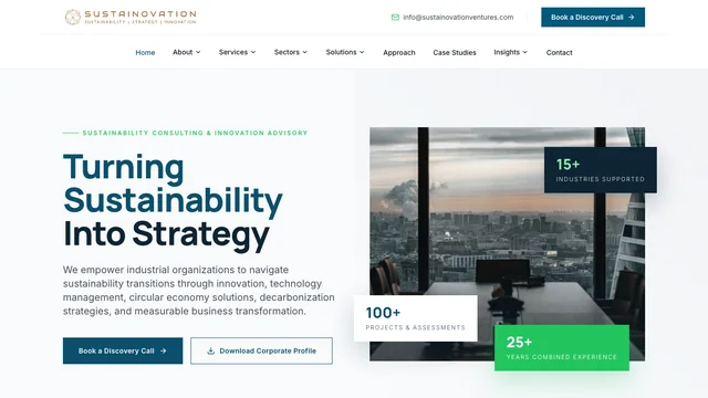 Sustainability advisory
Sustainovation
website design and build · information architecture · sector and service pages B2B logistics
Swift Logix
website UX/UI design · web development · responsive build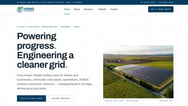 Solar and electrical infrastructure
Kirso Power
brand identity and logo · website design and build · services hub and detail pages


Start something
Have a similar challenge?
Tell us what you are building and we will help you figure out the right way forward.