Project overview
MangaHoists is an industrial and engineering-focused brand operating in a category where trust, reliability, and professional presentation matter deeply. The brand needed an annual calendar design that could go beyond basic date utility and work as a consistent brand visibility asset throughout the year.
Branditify designed a clean, practical, and brand-aligned annual calendar for MangaHoists. The goal was to create a corporate collateral piece that could sit in offices, client spaces, vendor desks, and partner environments while keeping the brand visible every day.

The calendar was designed to balance usability, visual clarity, and industrial credibility. It had to look professional, stay readable, and reflect the brand’s engineering-driven nature without feeling cluttered or outdated.
The challenge
Most annual calendars in industrial categories look generic, overloaded, and forgettable. MangaHoists needed a design that could feel more polished, organized, and brand-conscious while still serving its practical purpose. The challenge was to create a calendar that worked as a daily-use tool, a corporate gifting asset, and a subtle brand communication piece. It had to maintain date readability, brand visibility, product/category relevance, and print clarity across all pages.
Strategy
Branditify approached the calendar as a long-term brand recall asset. The strategy was to make every month feel visually connected to MangaHoists’ identity while keeping the layout clean and functional. The design direction focused on industrial trust, strong hierarchy, corporate simplicity, and practical readability. Instead of making the calendar overly decorative, the visual system was built around clarity, brand consistency, and professional presentation.
Execution
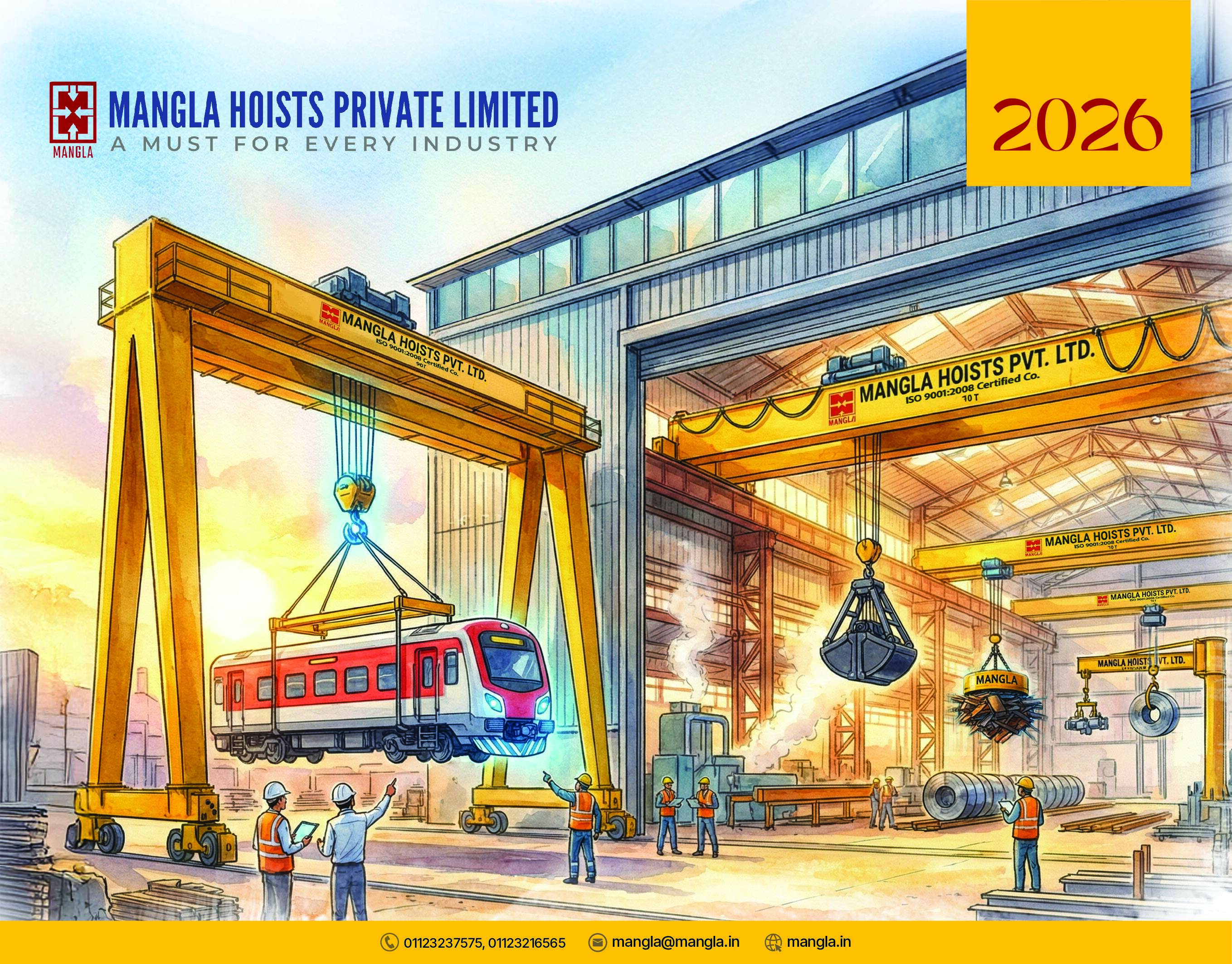
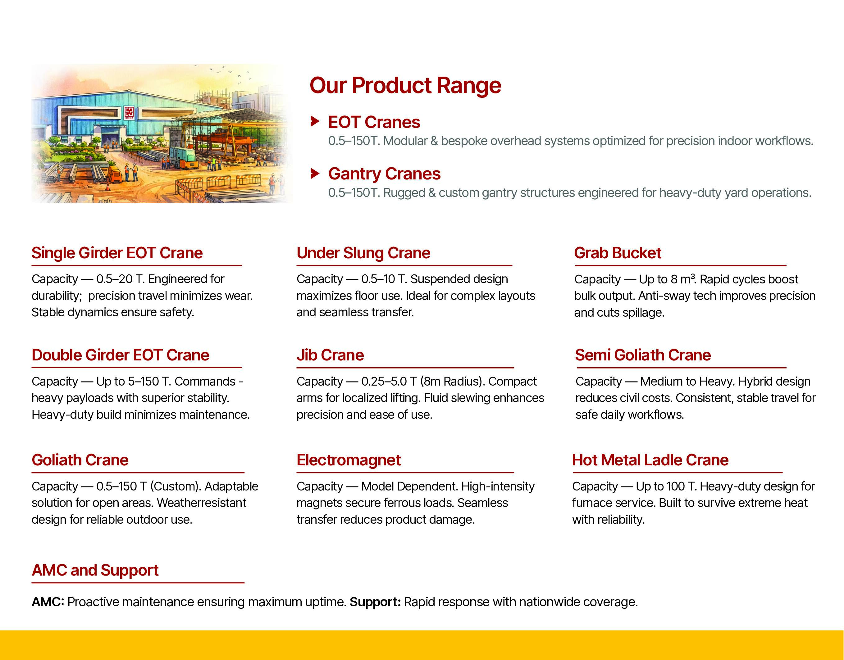
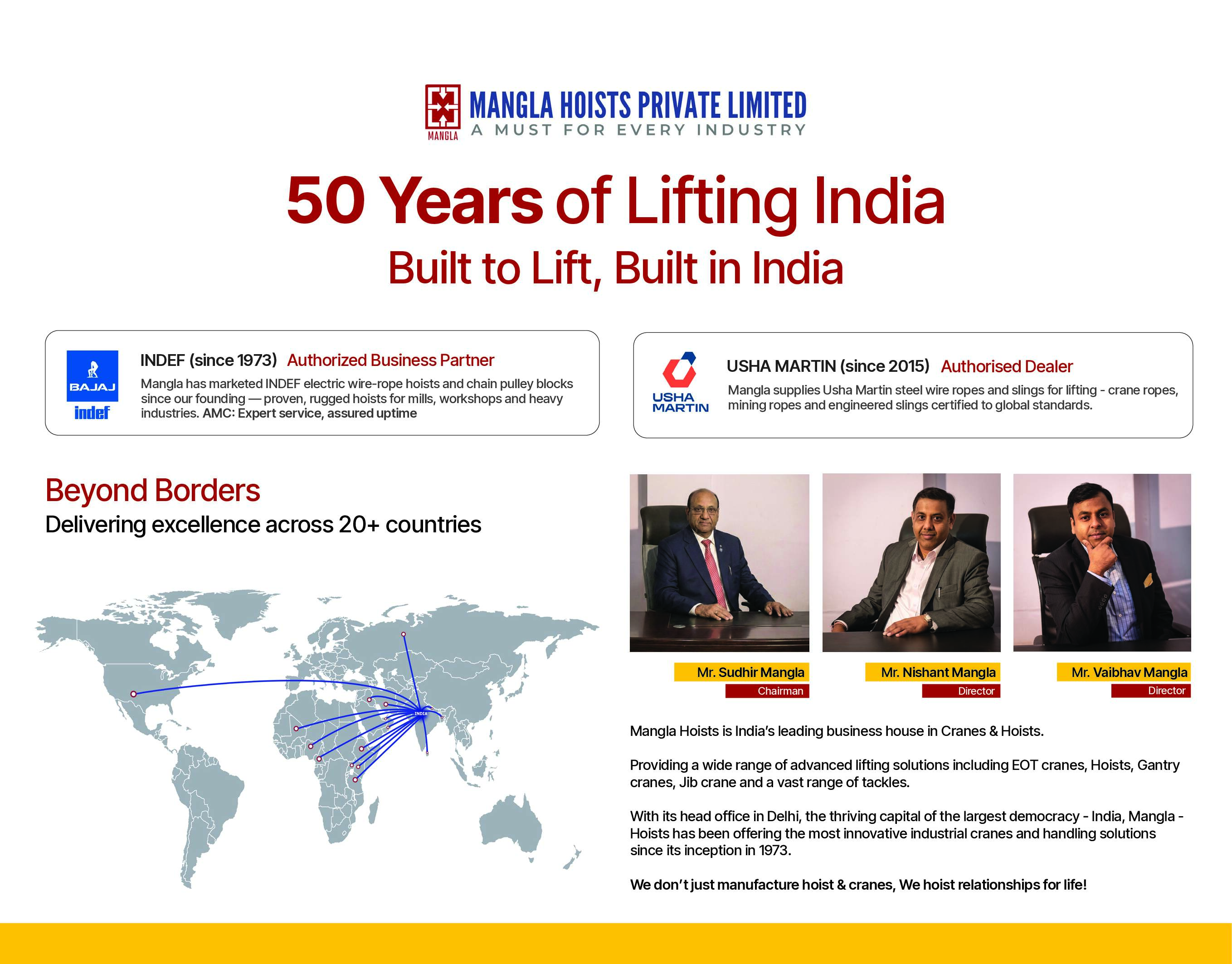
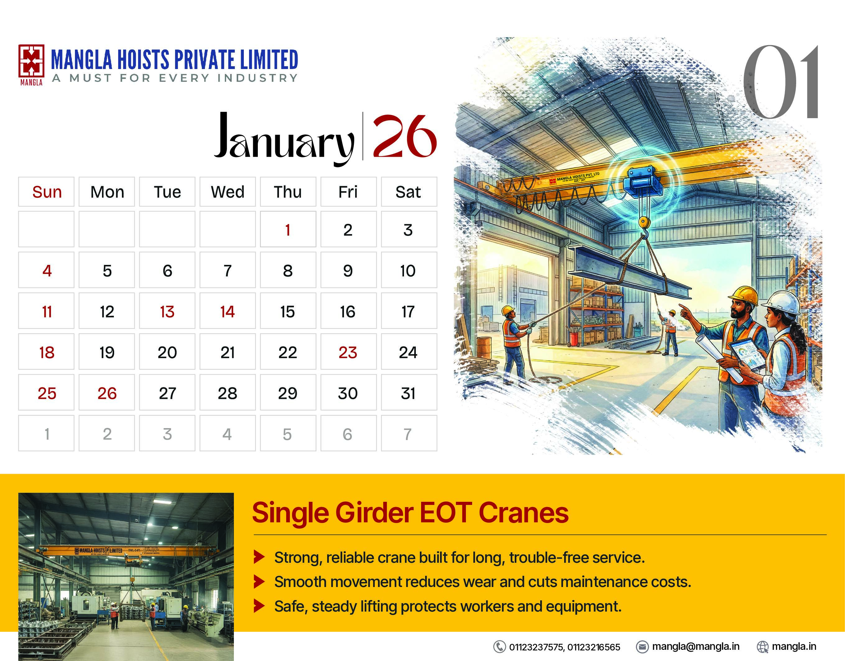
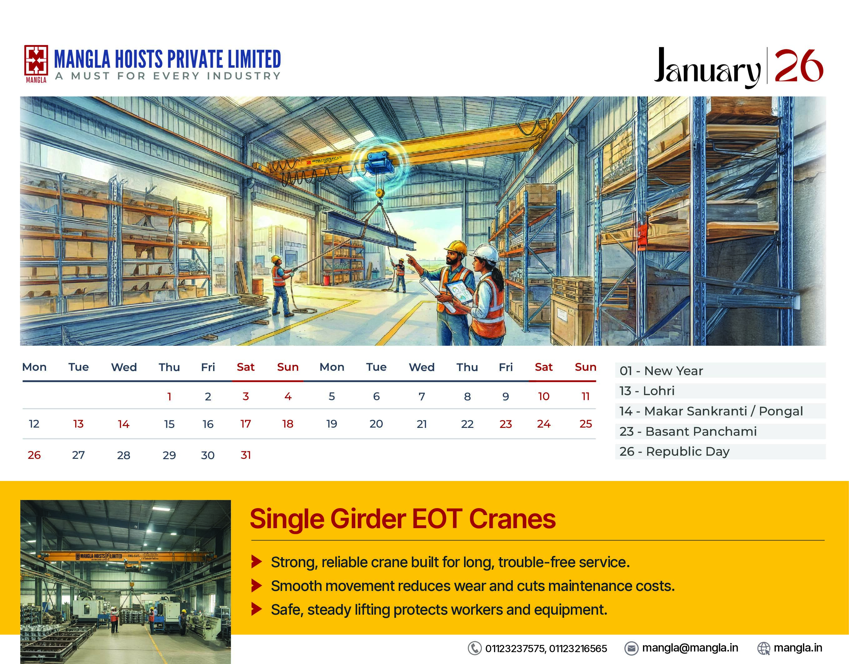
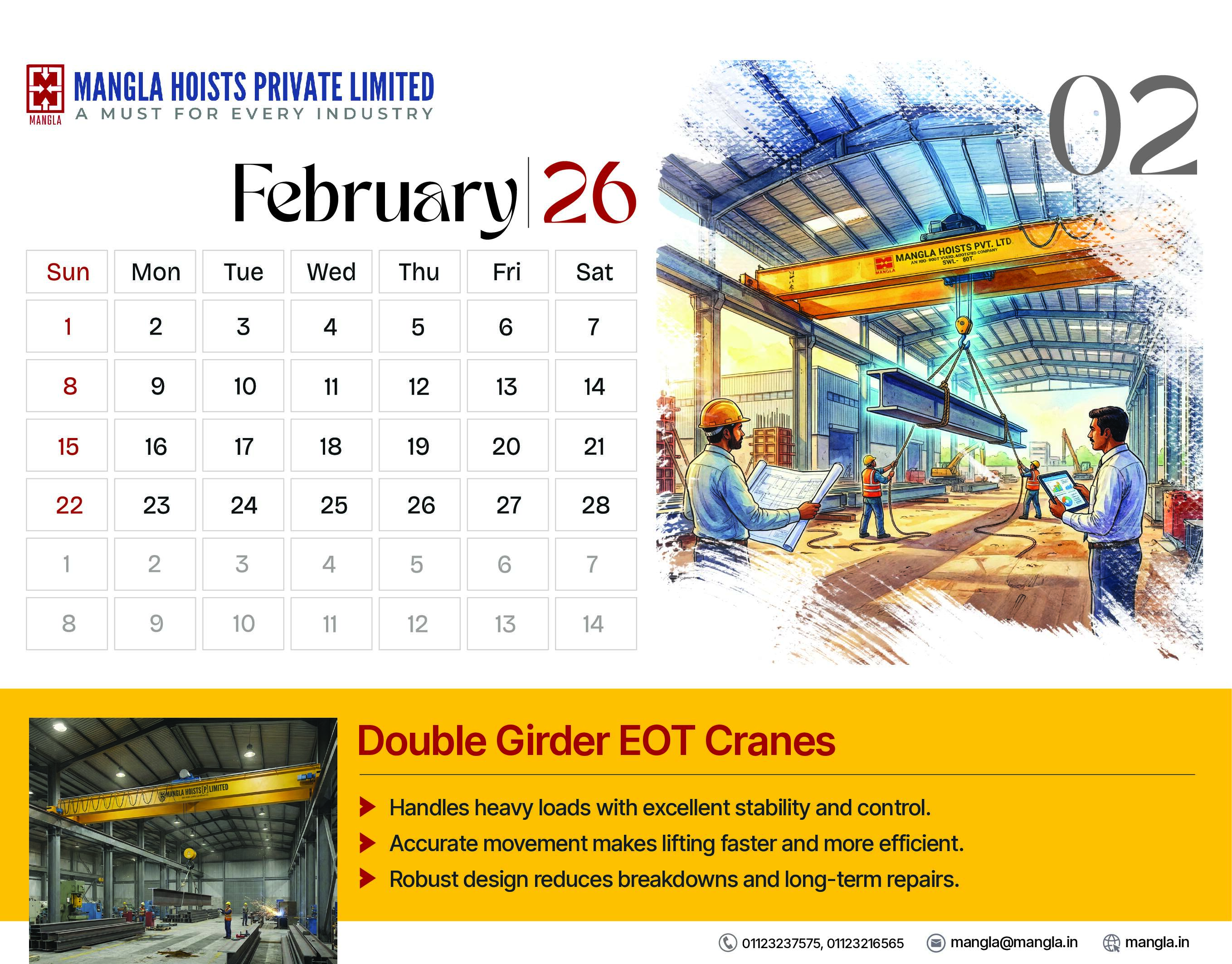
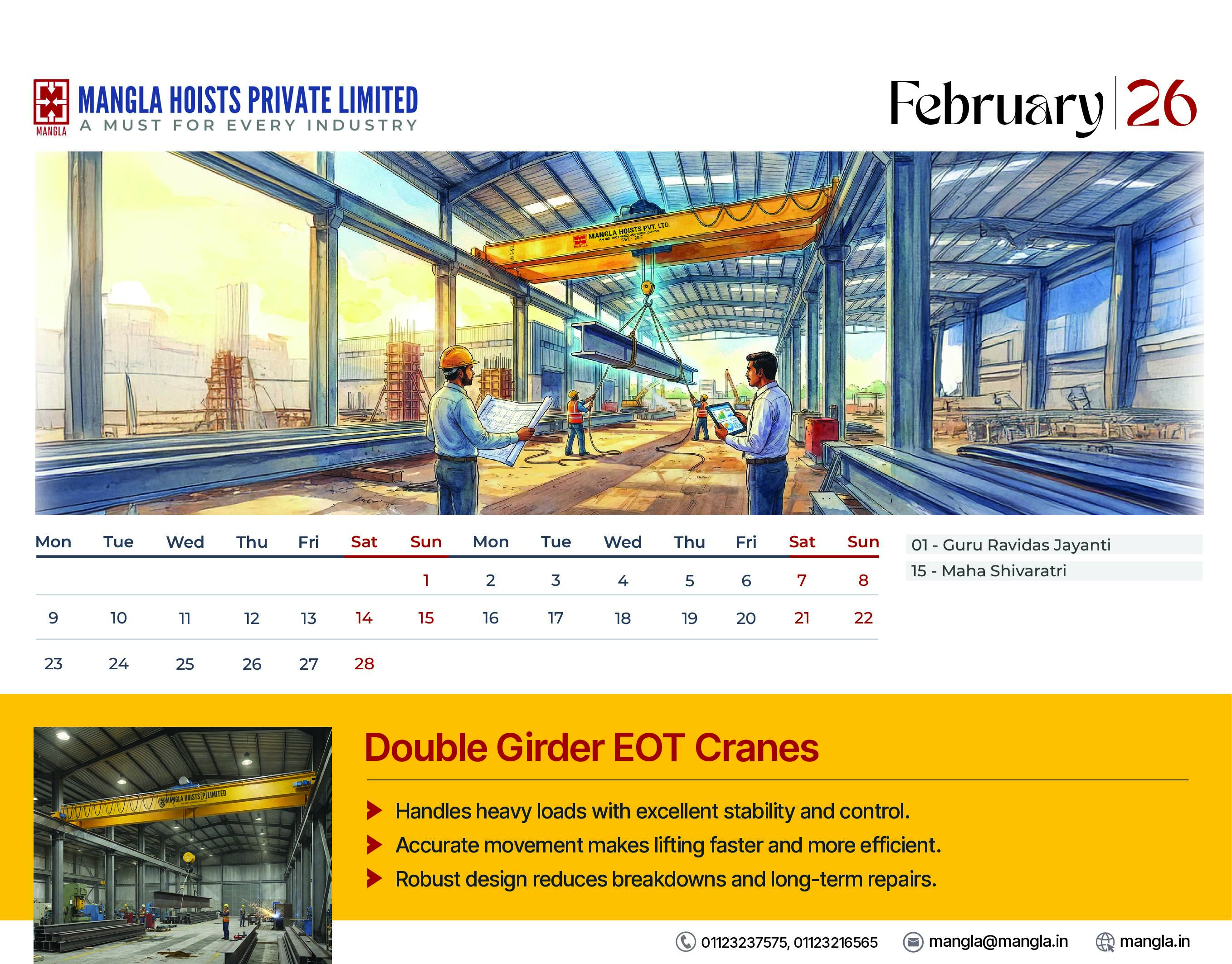
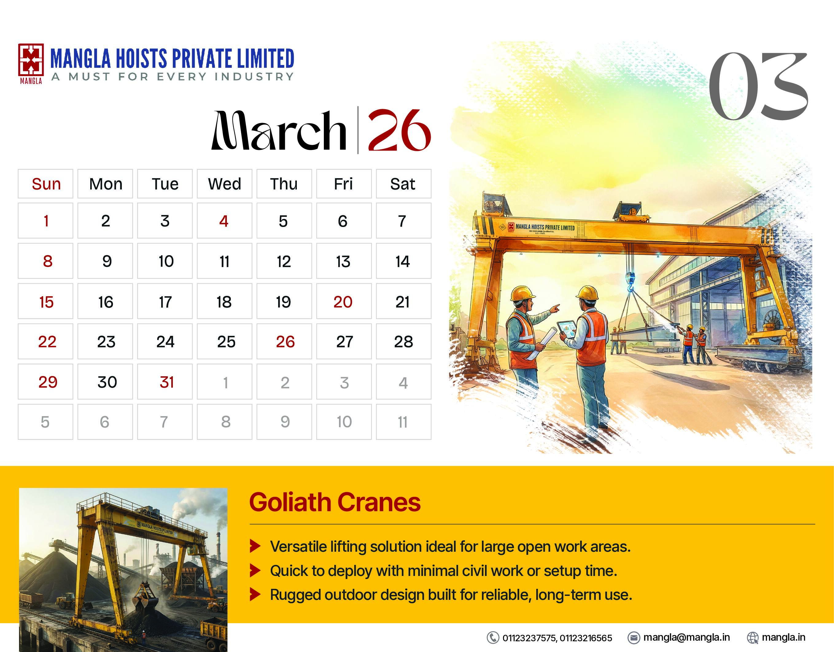
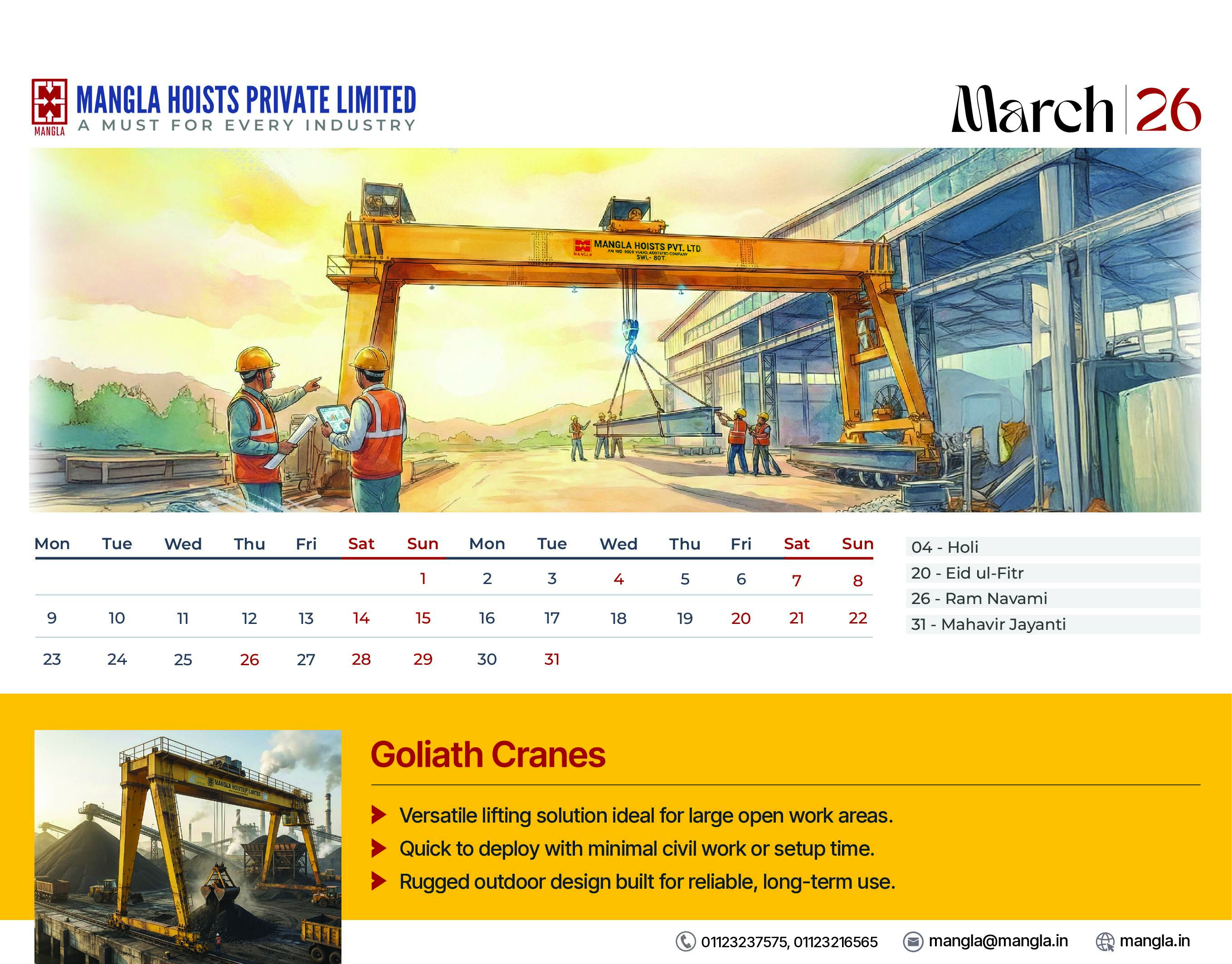
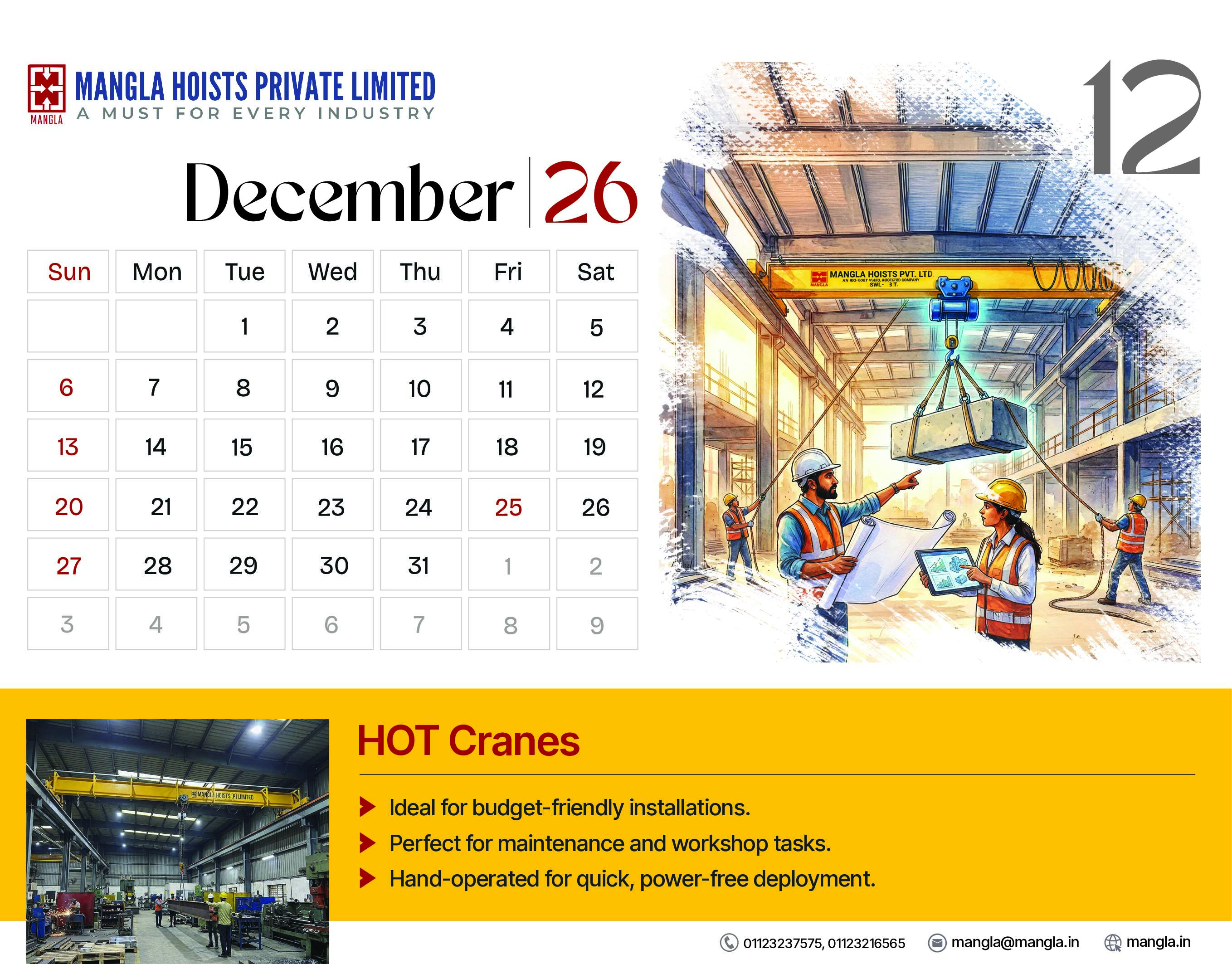
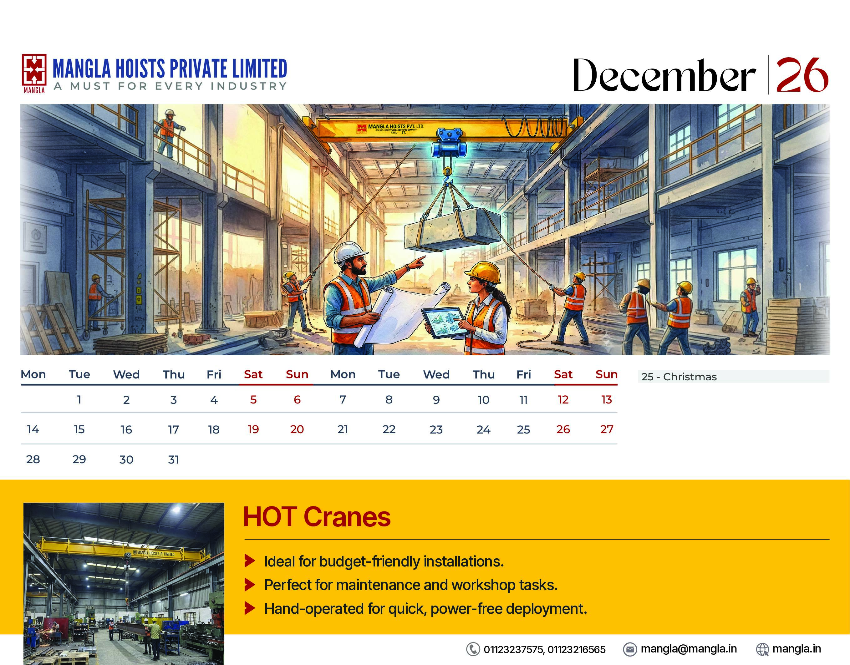
Branditify created an annual calendar design system for MangaHoists with a structured monthly layout, consistent branding, clean typography, and print-ready composition. The calendar design was crafted to ensure strong visibility of the brand name, readable dates, balanced spacing, and a premium corporate feel. Every page was prepared with print usability in mind, making it suitable for office use, client gifting, vendor communication, and internal branding. The final output gave MangaHoists a polished annual collateral piece that could support brand recall throughout the year and create a more professional impression across business touchpoints.
What we delivered
- Annual calendar design
- Monthly calendar layout system
- Print-ready artwork
- Corporate collateral design
- Brand-aligned visual system
- Typography and spacing structure
- Office-use calendar format
- Client gifting collateral
- Vendor communication asset
- Final export-ready design files